


Unifying the GoodRx experience
As GoodRx expanded into new healthcare products and services, its navigation became increasingly fragmented. I led the creation of Universal Navigation, establishing a cohesive experience that balanced user needs, business priorities, discoverability, and long-term scalability.
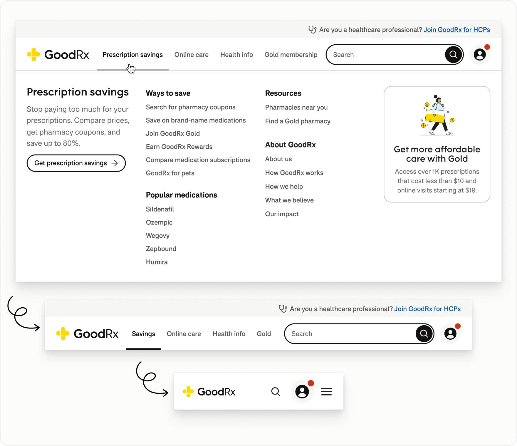
My Role
As Staff Product Designer for Platform & Design Systems, I led the information architecture and interaction design of Universal Navigation, aligning stakeholders across the organization and partnering closely with Engineering through implementation.
The Challenge
As GoodRx expanded into a broader healthcare ecosystem, navigation evolved independently across product areas, creating inconsistent terminology, account patterns, and visual experiences.
New offerings also competed for prominence in an increasingly crowded navigation.
The challenge was to create a unified framework that balanced user needs, business priorities, discoverability, and long-term scalability.
The Approach
I partnered with Analytics, SEO, Content Design, Research, and product teams to understand user behavior, identify key destinations, and develop a shared information architecture.
I validated the proposed structure through usability research, using the findings to refine navigation patterns, terminology, and interactions.
The resulting framework balanced user needs with business priorities and was refined through iterative design, cross-functional collaboration, and implementation.
a fragmented experience
Fragmented navigation created disconnected experiences
As GoodRx expanded into new business lines, each product area developed its own navigation patterns, branding, terminology, and account entry points.
The result was an experience that often felt more like a collection of separate microsites than one cohesive product ecosystem.
Moving between Drug Savings, Doctor Visits, Gold, and Health could mean losing familiar navigation, encountering different support links, or seeing inconsistent account and sign-in patterns.
This created both a usability problem and a systems problem: there was no shared navigation model connecting the broader GoodRx experience.
establishing a shared hierarchy
Creating a navigation model that could scale
I led the development of a shared information architecture to connect GoodRx's growing product ecosystem.
I partnered closely with SEO and Analytics to understand search behavior, traffic patterns, and which destinations warranted greater prominence. Combined with insights from Content Design and product teams, this helped me refine terminology and organize navigation around users' primary goals rather than internal business structure.
To prevent competing business priorities from dictating the hierarchy, I established clear ownership and decision rights. Platform and Design Systems led the work, and I shared decision-making authority with Design and Product leadership. Other stakeholders contributed expertise without independently determining navigation priorities.
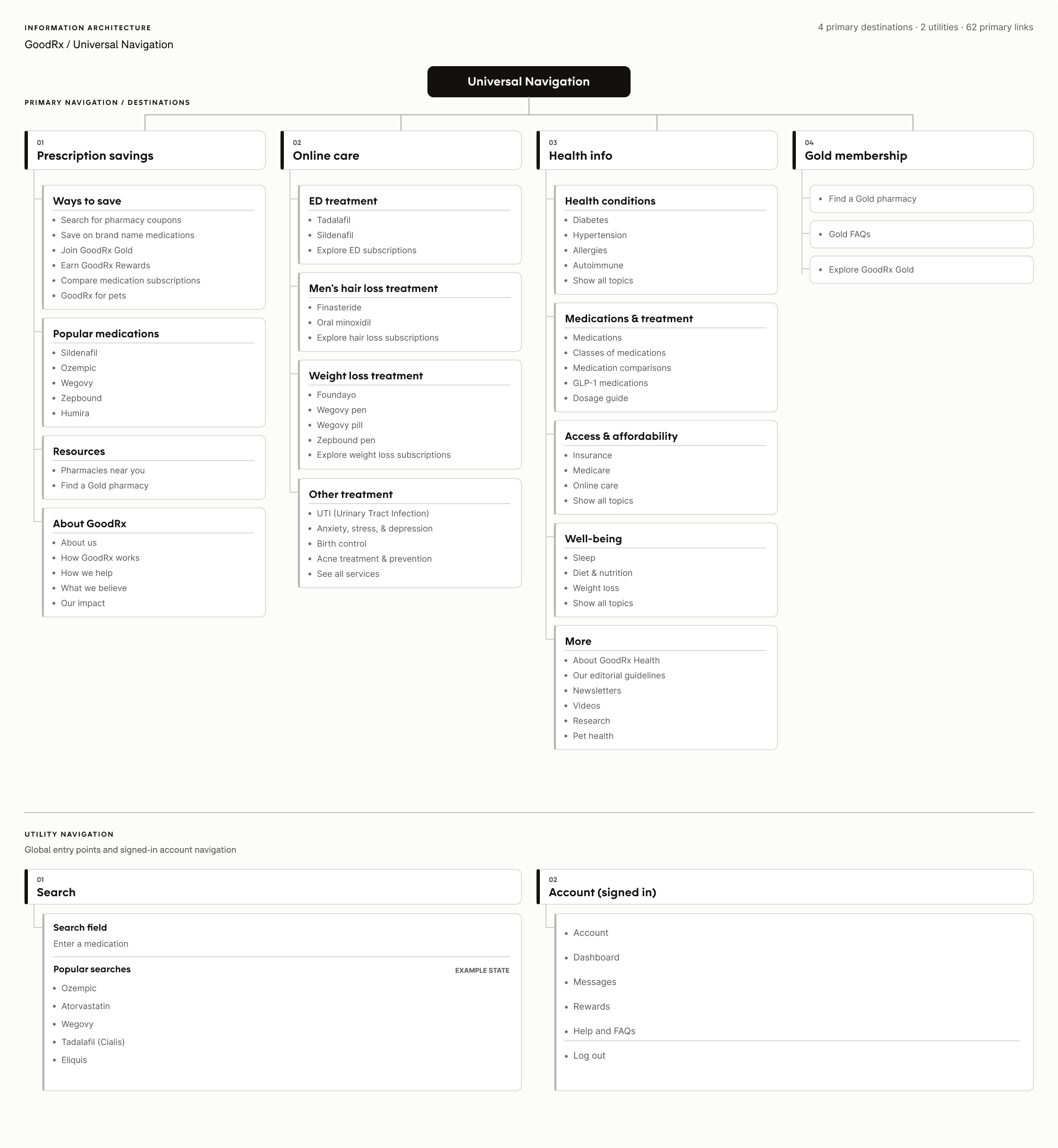
Defining principles for a shared experience
To guide the information architecture and evaluate competing priorities, I established four navigation principles centered on the tasks users came to GoodRx to accomplish.

focus on the fundamentals
Prioritize core offerings, prescription search, and account access. Keep other business initiatives discoverable without competing with essential tasks.

orient the user
Help users understand where they are, what's available, and how to navigate between GoodRx experiences.

meet users where they are
Organize navigation around user goals and mental models, not GoodRx's internal organizational structure.

prioritize utility over promotion
Keep global navigation focused on utility, not permanent promotions. Surface relevant offerings through contextual, next-best-action opportunities based on user intent.
Validating the structure through real user journeys
Once I established the initial hierarchy, I partnered with UX Research to test whether it supported the jobs people actually came to GoodRx to accomplish.
Representative research scenarios:

finding prescription savings
Looking up a specific medication, comparing prices, and accessing a pharmacy coupon.

exploring telehealth services
Discovering available care options and navigating toward a relevant treatment.

from content to action
Reading health editorial content and finding a path back to medication information or savings.

accessing an account
Finding the appropriate path to sign up or log in.
Refining the hierarchy through usability testing
Rather than asking users which navigation they preferred visually, we tested whether the structure made sense in the context of real tasks.
I used the findings to refine the hierarchy, improve discoverability, and clarify terminology and interactions.
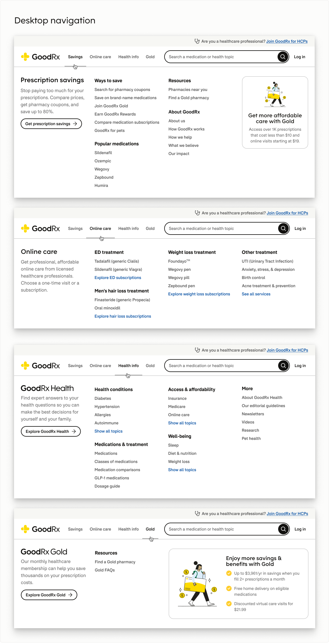
The resulting hierarchy provided a consistent structure for navigating prescription savings, healthcare services, and educational content.
designing for two audiences
Balancing user priorities with business needs
GoodRx served two distinct audiences: consumers looking for affordable healthcare and healthcare professionals (HCPs) using a dedicated, more task-oriented version of the site.
The HCP team strongly advocated for a prominent entry point, including a “For healthcare professionals” button directly in the primary consumer navigation.
Usability testing revealed a mismatch with users' mental models. Some consumers interpreted the button as a way to find or access a doctor through telehealth. The problem wasn't simply that the button occupied valuable navigation space. It was that an entry point for a fundamentally different audience was competing with consumer destinations.
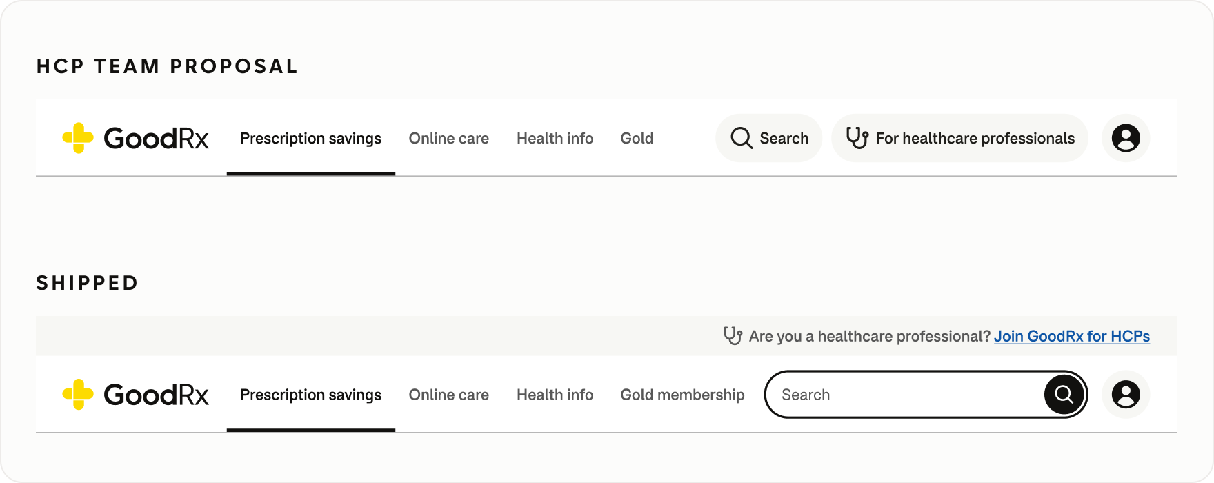
I advocated for moving HCP access into a lightweight meta-navigation above the primary nav that disappeared on scroll. This maintained visibility while providing room for clearer, more descriptive language without competing with core consumer tasks.
Making mode switching explicit
Because the consumer and HCP experiences served different audiences, users needed a clear way to move between them.
The meta-navigation adapted its language to the user's context. First-time visitors were invited to join GoodRx for HCPs, returning HCP users could switch directly into the professional experience, and users in HCP mode had a clear path back to the consumer site.
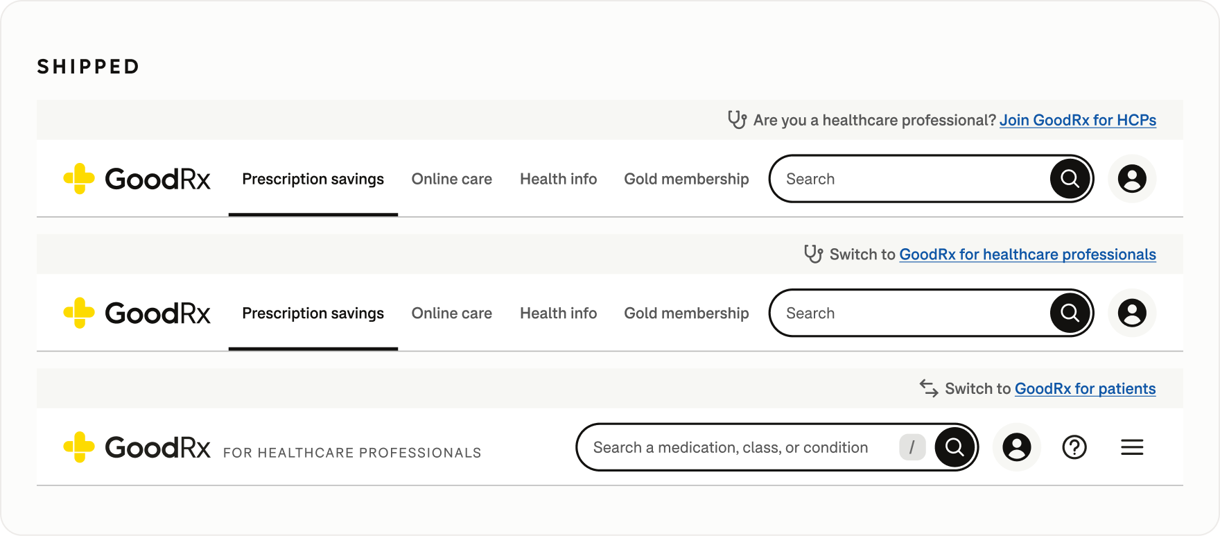
On desktop, the meta-navigation disappeared on scroll, keeping the professional entry point discoverable without making it permanently visible.
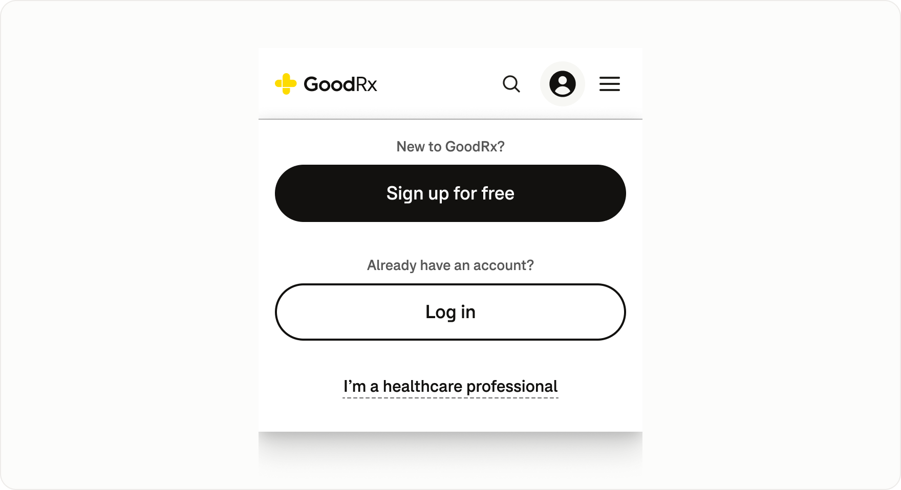
With mobile navigation space at a premium and most HCPs accessing GoodRx on desktop, I kept HCP access in the mobile account dropdown rather than replicating the dedicated desktop mode switch.
rethinking search
Making Search more discoverable
Search was one of the most important features of GoodRx, helping users find medications and access savings through pharmacy coupons and other options.
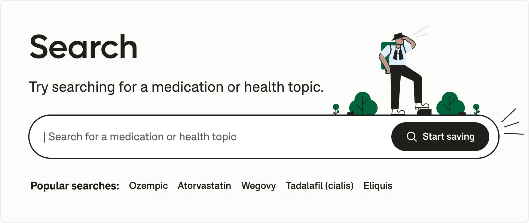
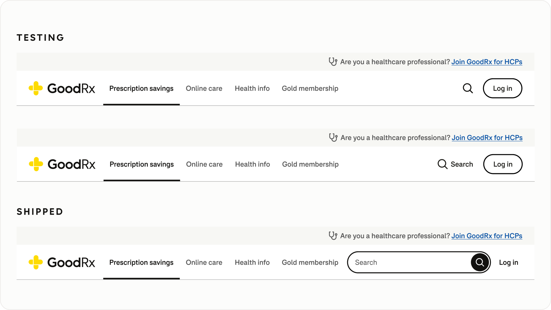
Yet early desktop designs relied on a magnifying-glass icon button. Although a familiar web pattern, it performed poorly in usability testing when users were asked to find a coupon for a specific medication.
Adding an explicit Search label improved results, but I saw an opportunity to push the design further. I evolved the control to visually resemble an input field, making it more immediately recognizable as the starting point for a search.
Designing a contextual Search experience
Beyond its entry point in Universal Navigation, Search served as a reusable discovery pattern that adapted to user behavior.
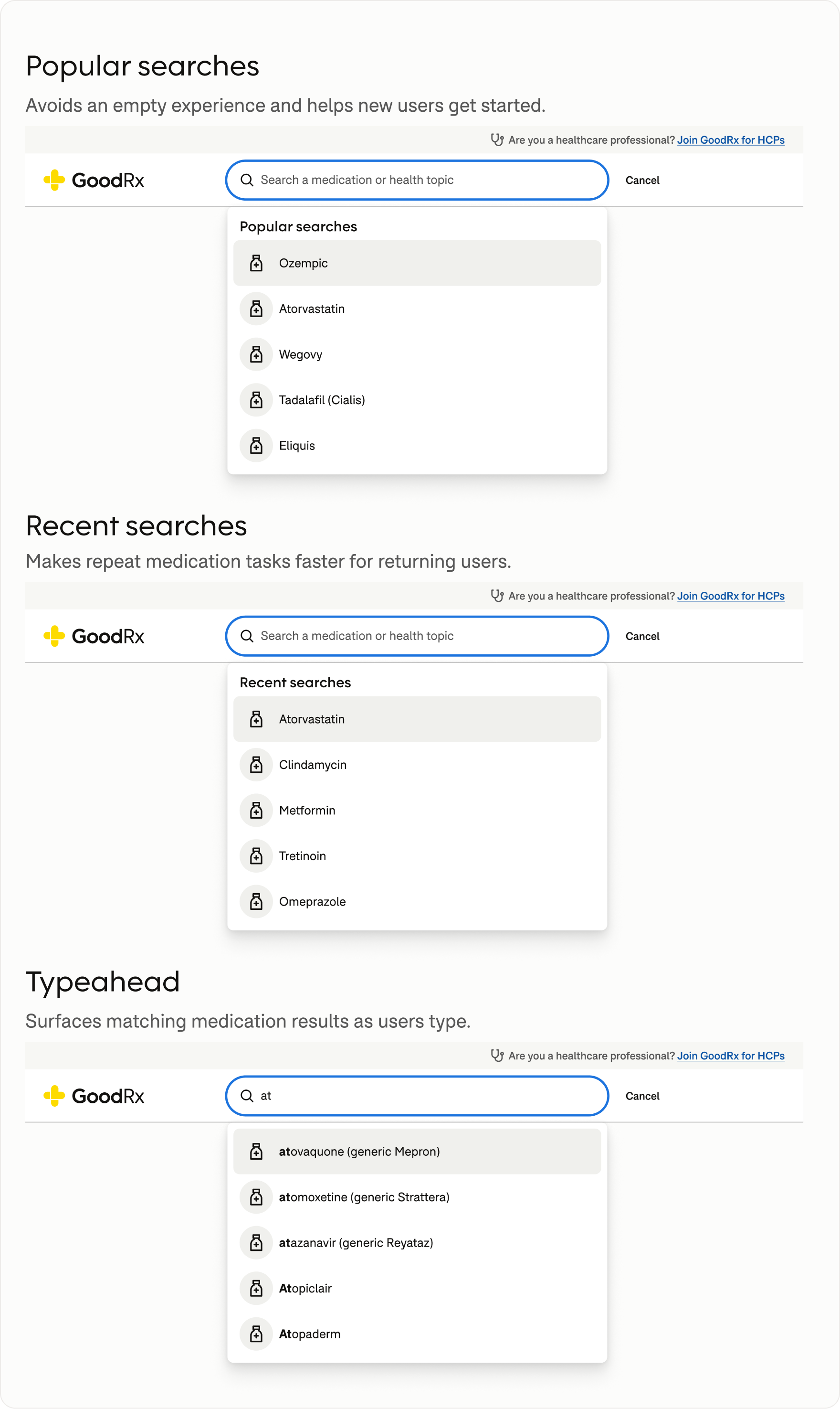
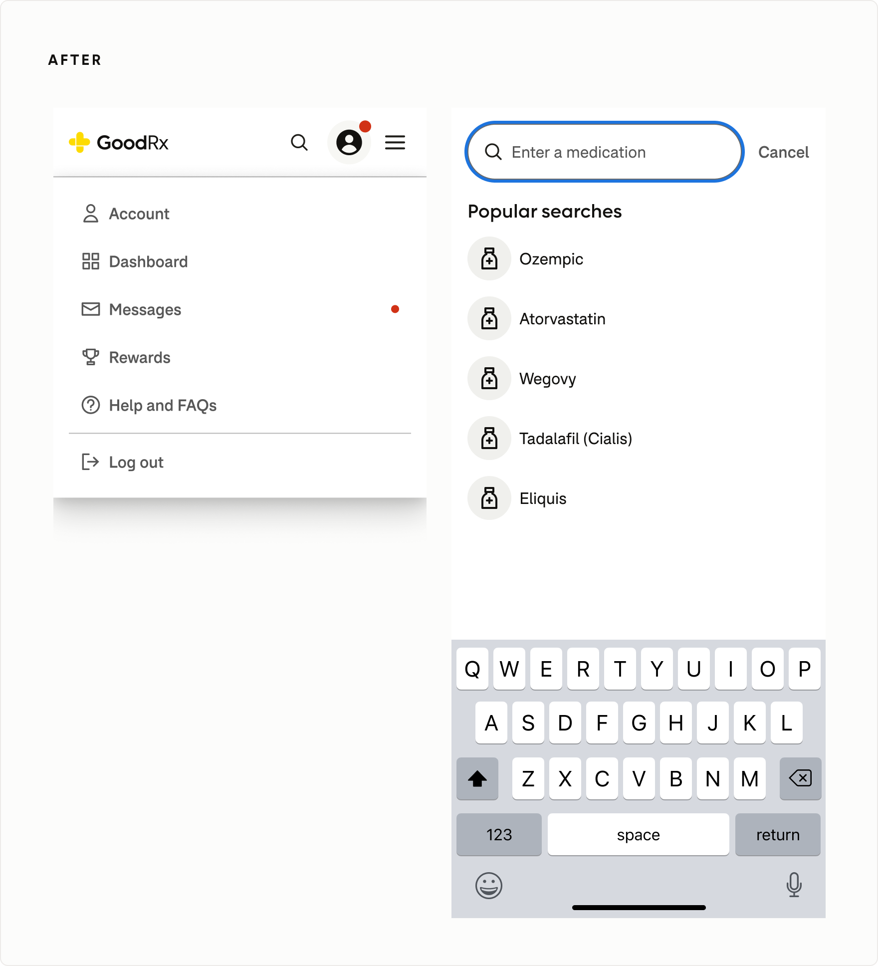
Rather than presenting everyone with the same empty state, Search supported different stages of discovery through popular searches, recent searches, and real-time typeahead suggestions.
Supporting informational and transactional intent
Users came to Search with different goals. Someone searching for a health condition might want to understand symptoms, explore medications, or seek treatment. Medication-specific searches often led to price comparisons and pharmacy coupons.
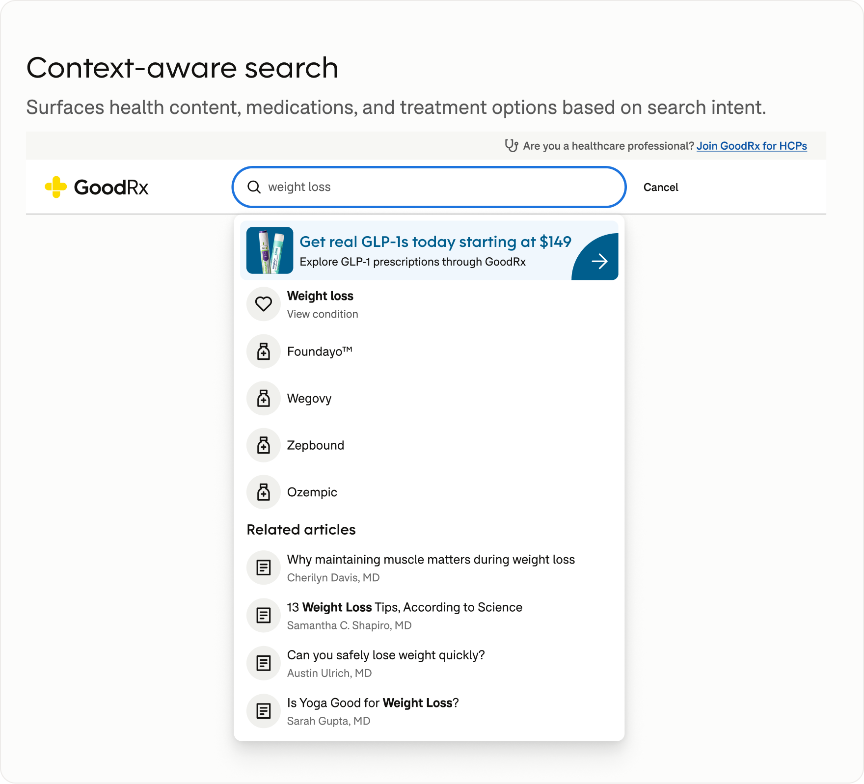
Search accommodated informational and transactional intent within the same experience, surfacing health editorial content alongside relevant medications, savings, and treatment options.
This also created opportunities for contextual, next-best-action recommendations. For example, a weight-loss search could introduce a relevant treatment subscription alongside educational and medication results, helping users discover care options while giving GoodRx a more targeted way to introduce its services.
navigating competing priorities
When business models don't match user expectations
As GoodRx expanded, business teams often advocated for dedicated placement in the primary navigation. One example was a proposal to give Subscriptions its own top-level tab.
Unlike Gold Membership, which offered broad prescription savings, Subscriptions combined ongoing treatment and medication fulfillment for specific conditions. They also required a telehealth visit through Online Care, complicating where they belonged in the navigation.
Usability testing revealed that users struggled to distinguish Membership from Subscriptions. Placing them side by side in the primary navigation introduced confusion rather than clarity.
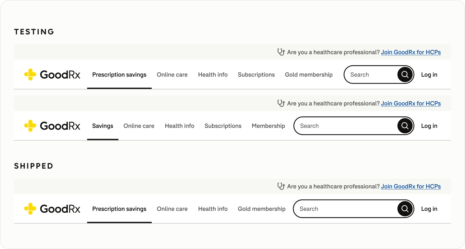
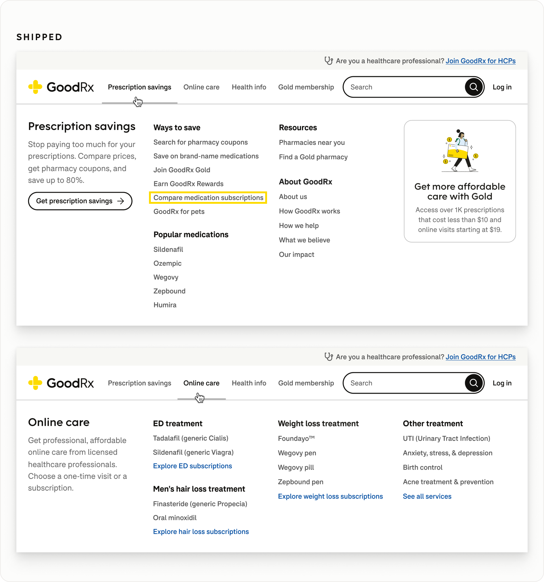
I advocated for keeping the primary navigation focused on broader user goals, making subscriptions discoverable through Prescription Savings and Online Care rather than introducing another top-level category.
simplifying account access
Clarifying Sign Up and Log In
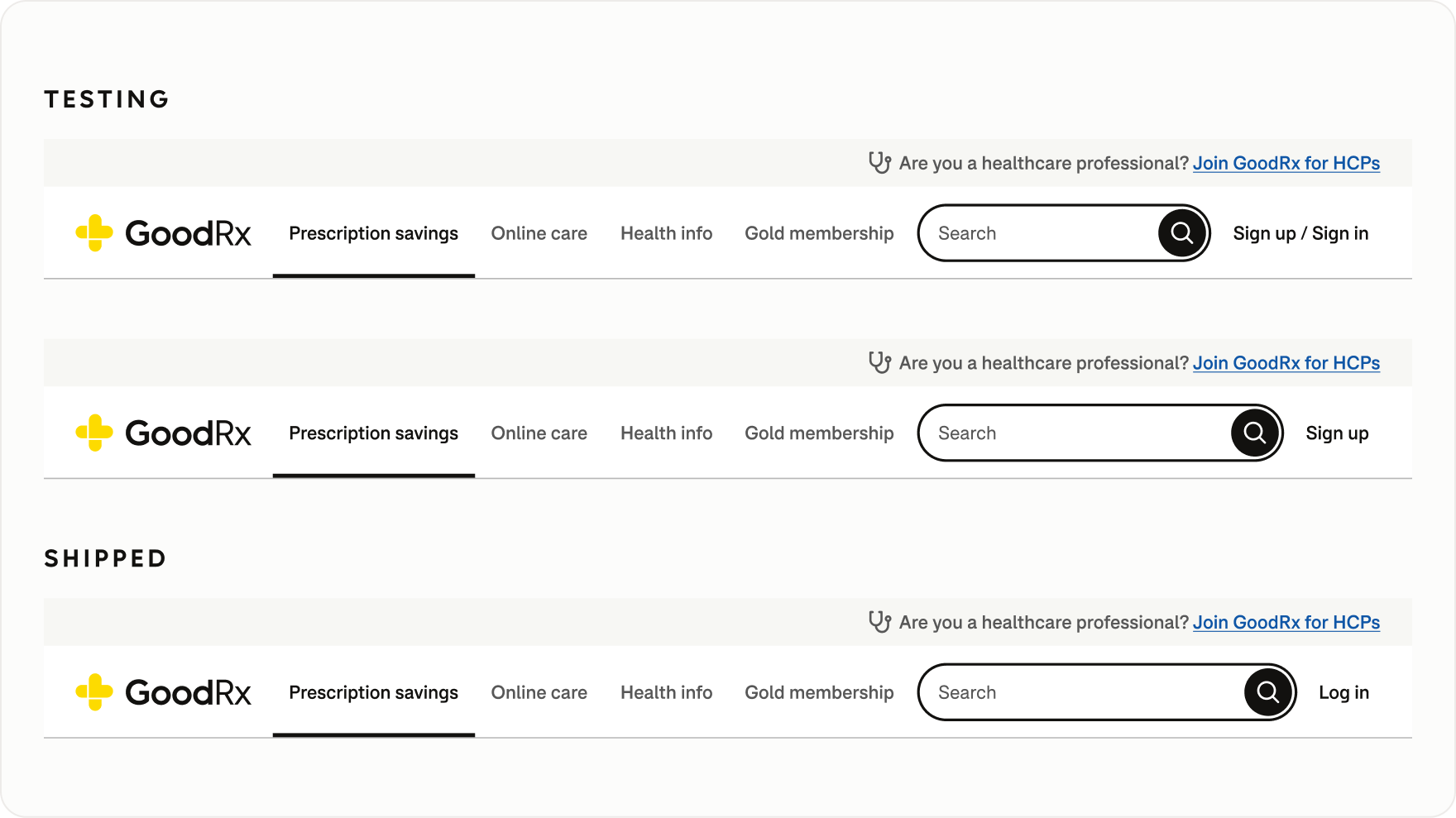
An inherited “Sign up / Sign in” label occupied valuable space in the global navigation. I advocated for simplifying it to a single label, initially reducing it to “Sign up” to support the organization's goal of increasing account registrations.
As Marketing introduced landing pages for GoodRx's new condition-based subscription programs, another issue emerged. Users could encounter Sign Up in the navigation alongside a Sign Up call-to-action on a marketing landing page—one for creating a GoodRx account, the other for enrolling in a condition-based treatment program.
I advocated for a single “Sign in” control, following a familiar web convention for account access. Working with Marketing and Content Design, we ultimately adopted “Log in”—an equally recognizable pattern that preserved navigation space while clearly distinguishing account access from treatment enrollment.
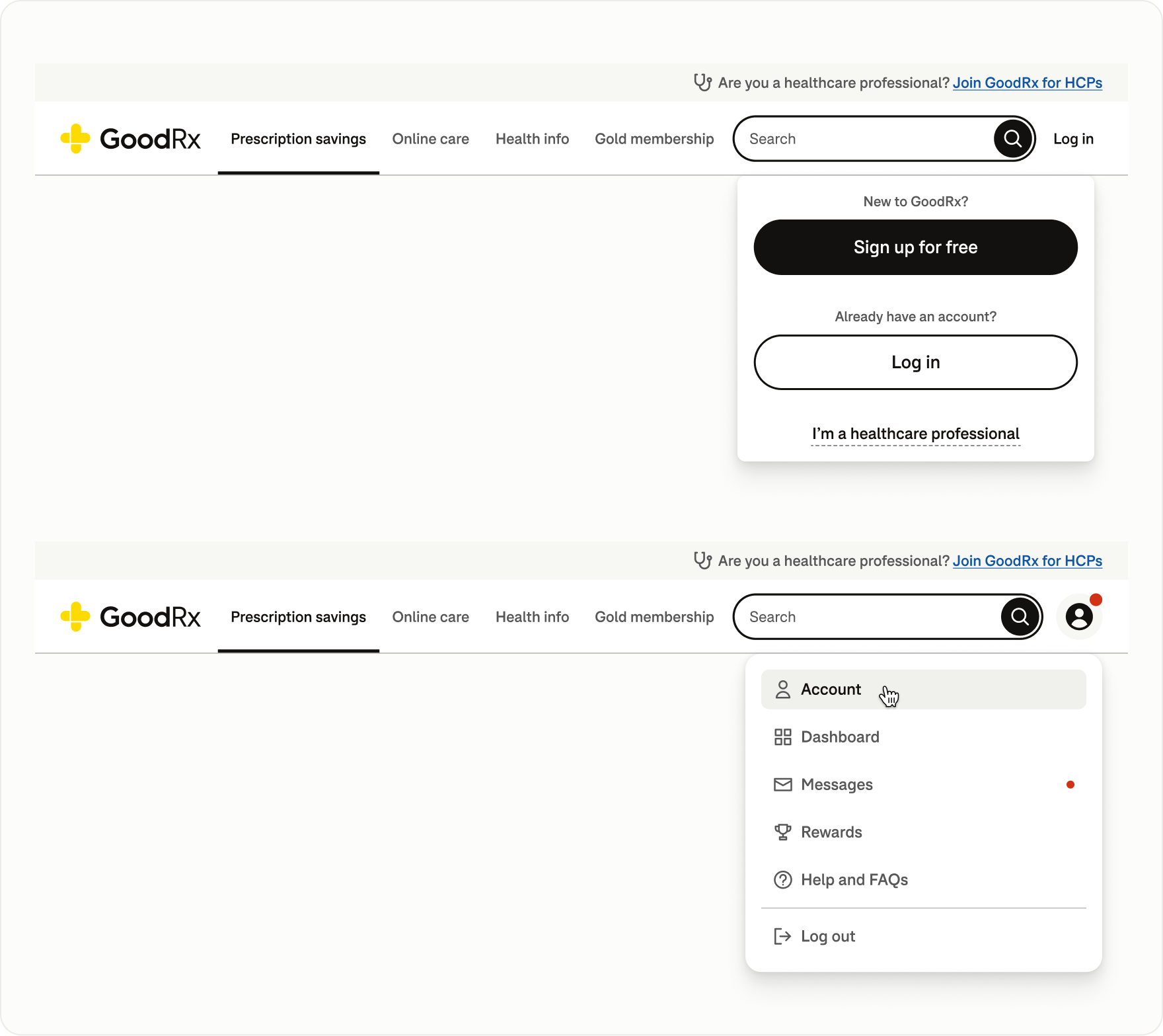
The final design also accommodated different account states. Logged-out users could access both sign-up and log-in options through the dropdown, while authenticated users saw an account icon with quick access to their dashboard, messages, rewards, and support.
responsive navigation
Extending the system across breakpoints
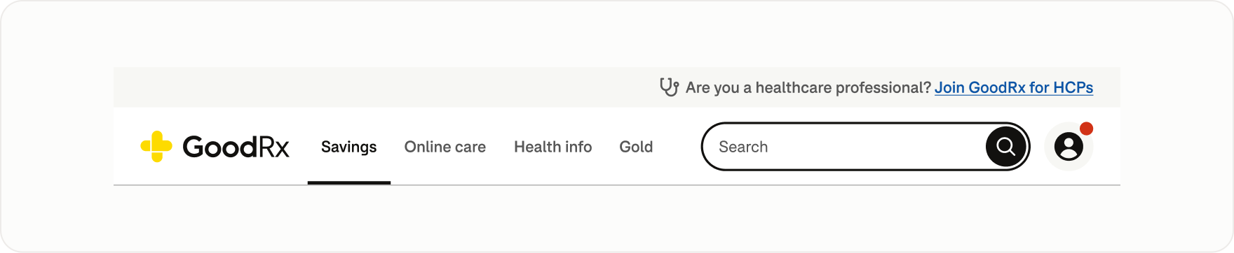
The navigation model adapted across breakpoints while preserving a consistent hierarchy and terminology.
Rather than simply shrinking the desktop navigation, I evaluated what needed to remain prominent, what could collapse, and which labels could shorten without losing meaning. For example, Prescription Savings became Savings, and Gold Membership became Gold at smaller breakpoints.
Designing the mobile navigation
On mobile, primary navigation moved into a hamburger menu that consolidated product destinations and supporting links into a compact, scalable pattern.
Expandable sections provided access to deeper content without overwhelming the initial view, while supporting resources remained easily discoverable.
For logged-out users, Sign up and Log in were prominently displayed at the top of the menu, making account access easy to find.
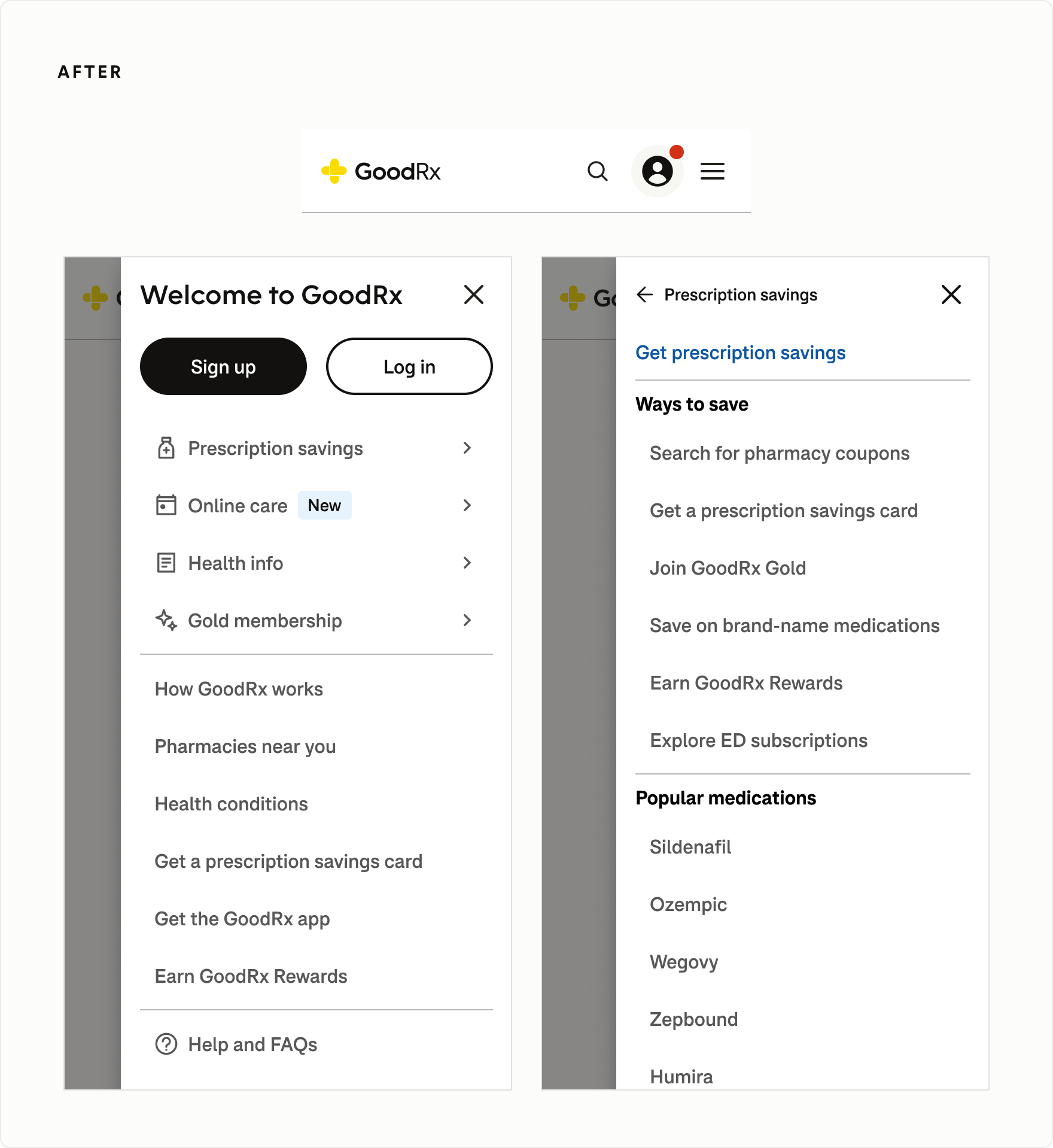
Beyond the hamburger menu, Account and Search remained directly accessible from the mobile header. Authenticated users could quickly reach their dashboard, messages, rewards, and support, while Search opened a focused discovery experience with contextual suggestions.
production rollout
Partnering through implementation
I partnered closely with Engineering to bring Universal Navigation into production, working through consumer and HCP variants, responsive behavior, and supporting components.
I also conducted extensive implementation QA to ensure 1:1 design parity, identifying and resolving discrepancies between the approved designs and the production experience.
Navigating platform and ownership debt
Rollout exposed inconsistencies beyond the navigation itself. Some destinations already used the design system, while legacy pages relied on outdated components, typography, and styling.
A consistent header alone couldn't create a cohesive experience. Legacy pages were added to the modernization roadmap, with the goal of ensuring every destination in the new information architecture adopted both Universal Navigation and the design system.
Organizational changes added another layer of complexity, as some legacy pages no longer had clear owners. Addressing these gaps required coordination across Product, Design, and Engineering to determine ownership and plan the necessary updates.
outcomes and impact
One connected experience across GoodRx
Universal Navigation established a shared framework for navigating GoodRx's growing healthcare ecosystem, replacing fragmented patterns with a consistent approach to product discovery, Search, and account access. Beyond the interface, the work established scalable navigation patterns, research-informed design decisions, and clearer ownership to support continued product evolution.

a cohesive experience
Unified navigation across previously disconnected GoodRx products, establishing a consistent information architecture across desktop and mobile.
Connected consumer and healthcare professional experiences through contextual navigation and mode switching.

research-informed design
Used usability findings to refine navigation hierarchy, improve Search discoverability, and clarify terminology and interactions.
Research also informed key decisions around HCP access and the placement of new healthcare offerings.

a scalable foundation
Established reusable navigation patterns across devices and partnered with Engineering to ensure 1:1 design parity.
Identified legacy experiences for modernization, creating a roadmap toward consistent navigation and design system adoption.

user-centered decision-making
Established shared navigation principles and clear decision rights to guide future changes.
Created a framework for balancing business priorities with user needs, preventing organizational complexity from dictating the navigation experience.
Looking Back
The most important outcome wasn't a particular set of tabs or even one final version of the navigation. It was establishing a shared foundation that could evolve alongside GoodRx's growing ecosystem.
Clear ownership and shared navigation principles provided a framework for ongoing improvement. Insights from usability research, search behavior, and traffic data could guide future refinements, without allowing competing business priorities to dictate the hierarchy.
The goal wasn't to get navigation right once. It was to create a system that could be measured, challenged, and continuously improved.
company
GoodRx
Work shown is the property of its respective clients and employers.
categories
Product Design
Platform Design
Information Architecture
UX Research
Interaction Design
Responsive Design
Usability Testing
Design Strategy
Cross-functional Leadership
Design Governance