


Evolving the GoodRx Design System
About GoodRx
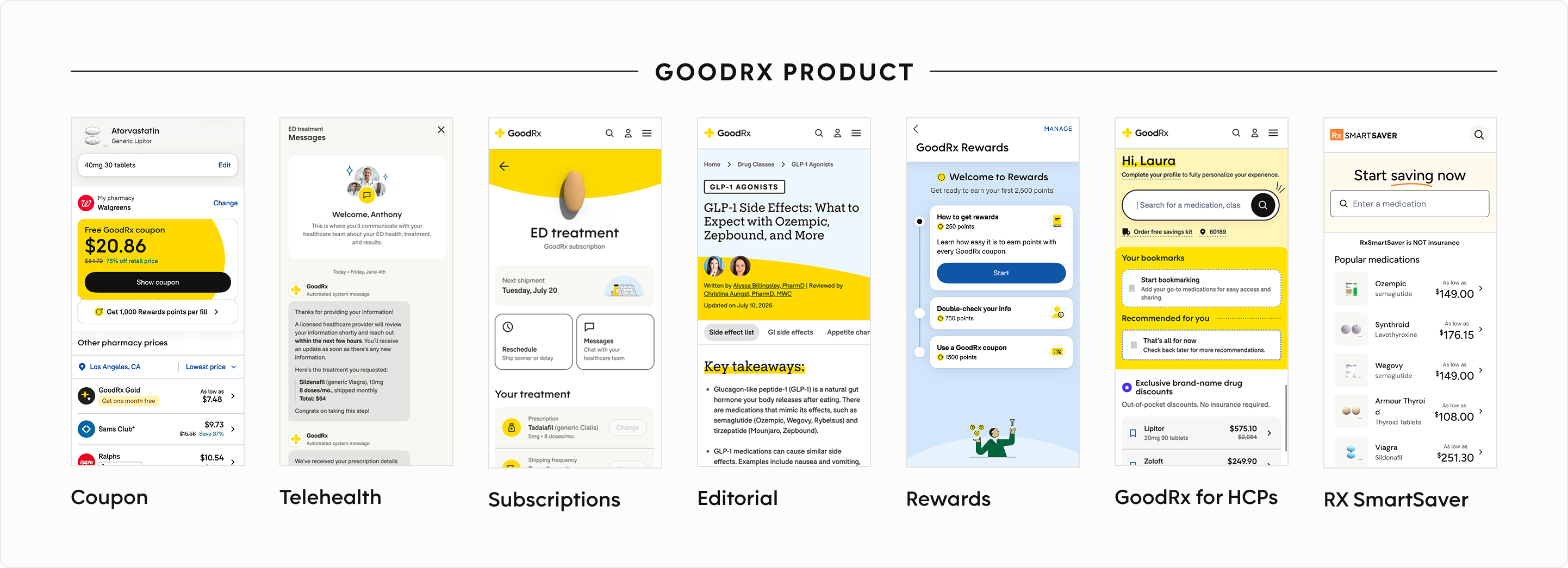
GoodRx is a digital healthcare platform that helps people access affordable care through prescription savings, memberships, telehealth, and trusted health information. As the business expanded into subscriptions, editorial, Rewards, healthcare-provider experiences, and white-label pharmacy products, the design system needed to support an increasingly diverse product ecosystem.
My Role
As Staff Product Designer for Platform & Design Systems, I led the evolution of GoodRx's Design System to support a company-wide rebrand and long-term platform scalability.
My work spanned system strategy, token architecture, foundations, accessibility, documentation, governance, and design-to-engineering alignment. I partnered with two designers and four engineers across Product, Brand, and Engineering, helping carry the work from system definition through cross-platform rollout.
The Challenge
GoodRx was undergoing a major visual rebrand at the same time its product ecosystem was becoming more complex.
The existing system had accumulated drift across tokens, components, and implementation—including gaps between Figma and production. At the same time, teams were continuing to ship and increasingly solving shared UX problems in different ways.
The challenge wasn’t simply to apply a new visual language. It was to modernize an active design system while the organization kept shipping—without creating another generation of fragmented patterns.
The Approach
Rather than treating the rebrand as a surface-level refresh, I used it as a forcing function to modernize the system itself.
I focused the work across four connected areas: architecture, foundations, reusable product patterns, and adoption—creating a system that could absorb visual change, support evolving product needs, improve design-to-code alignment, and scale more intentionally across the organization.
token architecture
Building a resilient design foundation
The rebrand exposed a structural problem: the system had become too tightly coupled to visual values and implementation details. I redesigned the token architecture around semantic intent, separating raw values from component implementation and creating a shared language between design and code. That architecture became the mechanism that allowed the new visual language to scale without rebuilding every experience individually.
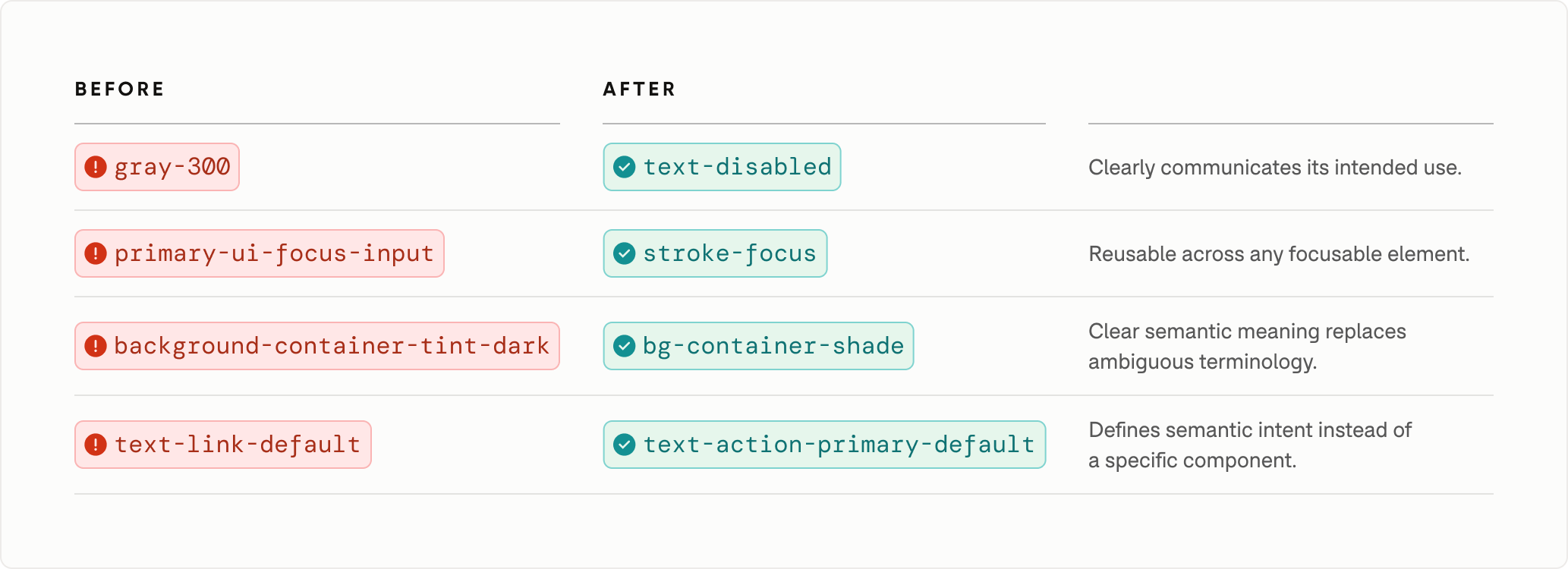
Naming by intent, not appearance
Legacy token names reflected colors, products, and implementation details rather than purpose. I introduced semantic naming that improved clarity, encouraged reuse, and created a more scalable foundation for future evolution.
A shared language for design and code
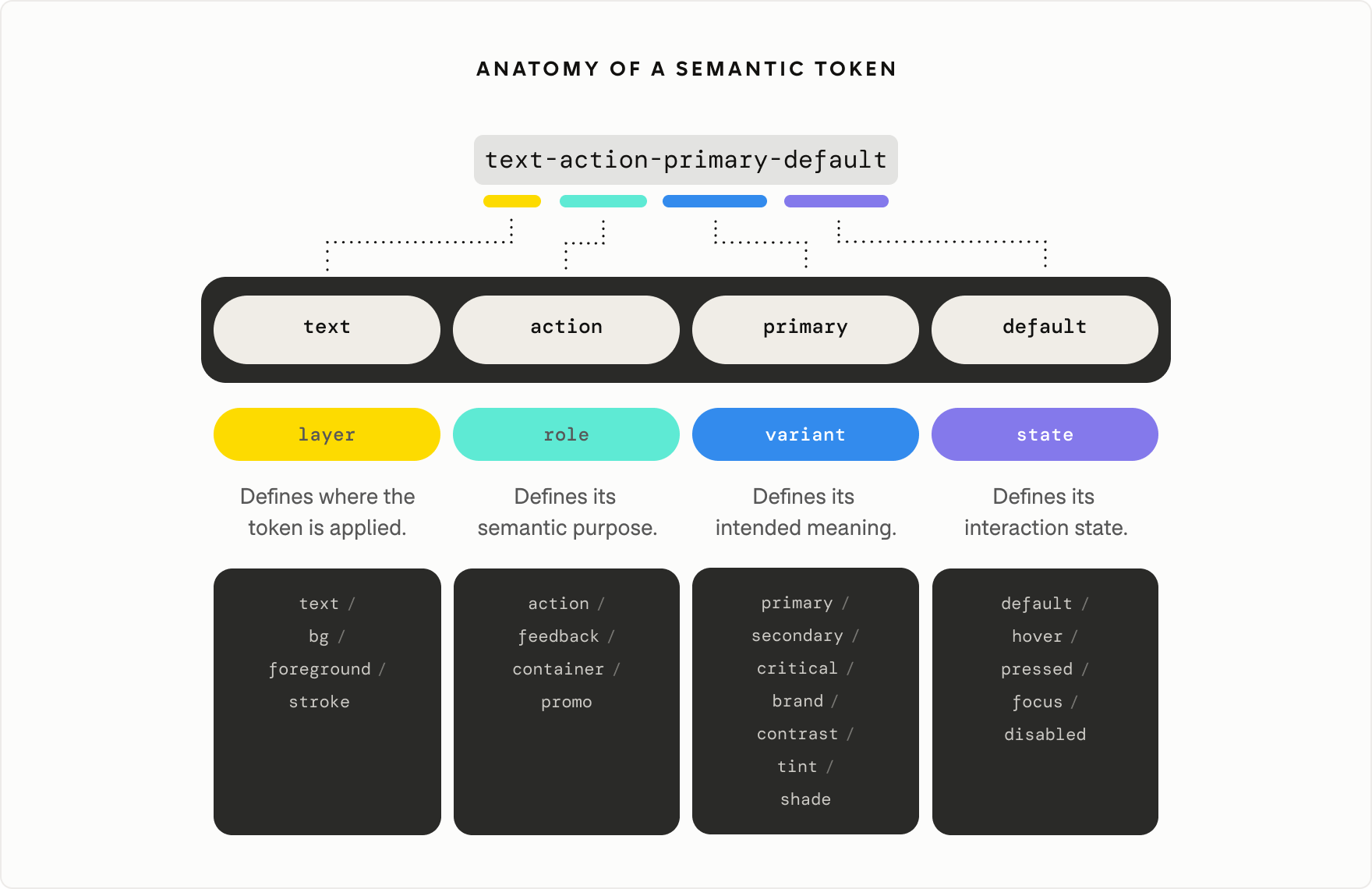
I established a predictable semantic naming convention based on layer, role, variant, and state, using familiar conventions such as text, bg, and stroke. This made token purpose easier to understand in both design and code while creating a vocabulary that could scale with the system.
A layered token architecture
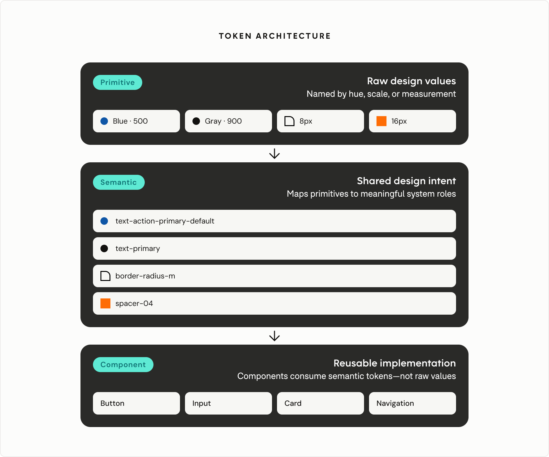
The naming convention became the foundation of a layered architecture that separated raw values, semantic intent, and component implementation—creating a flexible system that could evolve without rebuilding components.
Built for change
Separating semantic intent from primitive values made large-scale visual updates significantly easier. Components continued referencing the same semantic tokens while only the underlying primitive values changed. The system could absorb a new theme without requiring teams to redesign or rebuild every component individually.
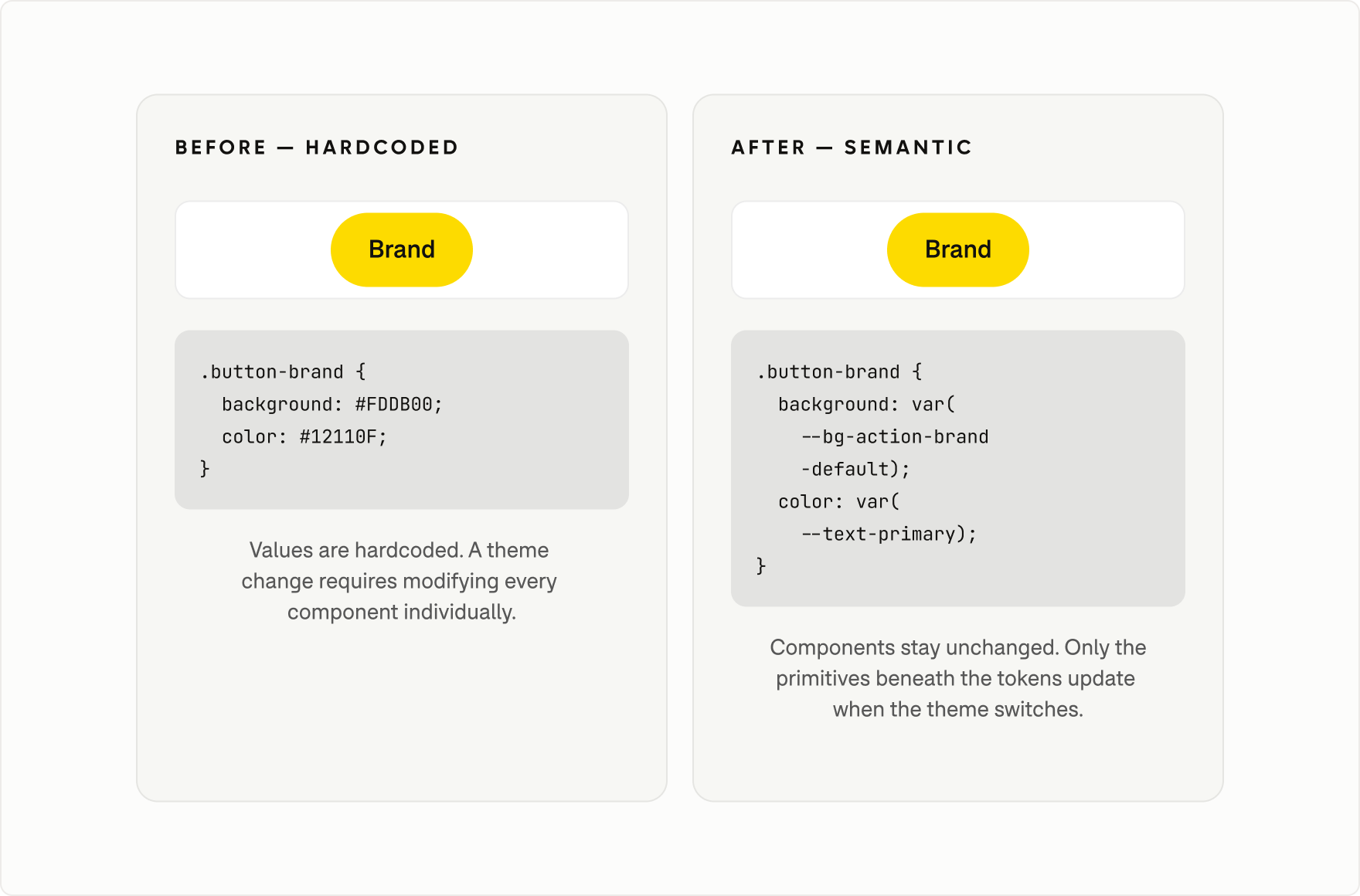
This same structured architecture also creates useful context for AI-assisted workflows, where semantic tokens, documentation, and production mappings can help tools understand how the system is intended to be used.
modernizing the foundation
Translating a new brand into a scalable product system
A brand identity defines how a company looks. A product system has to define how that identity behaves across real interactions, states, platforms, and accessibility requirements. I translated the refreshed identity into shared foundations for color, typography, shape, elevation, accessibility, illustration, and iconography—giving teams reusable rules rather than requiring each product to interpret the brand independently.
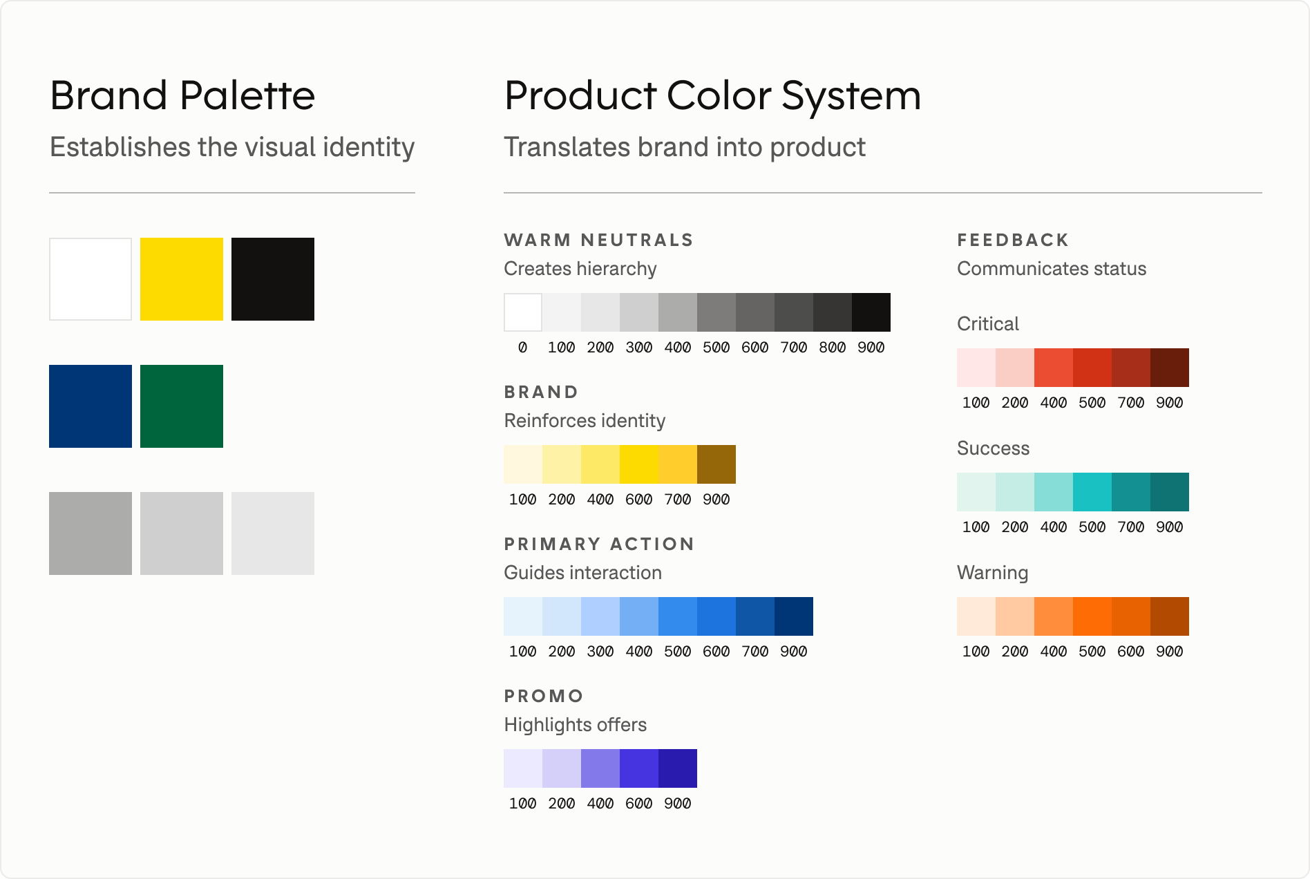
Turning a brand palette into a product language
I translated the refreshed palette into semantic roles for hierarchy, interaction, feedback, and promotion, giving teams a consistent way to apply color across product experiences.
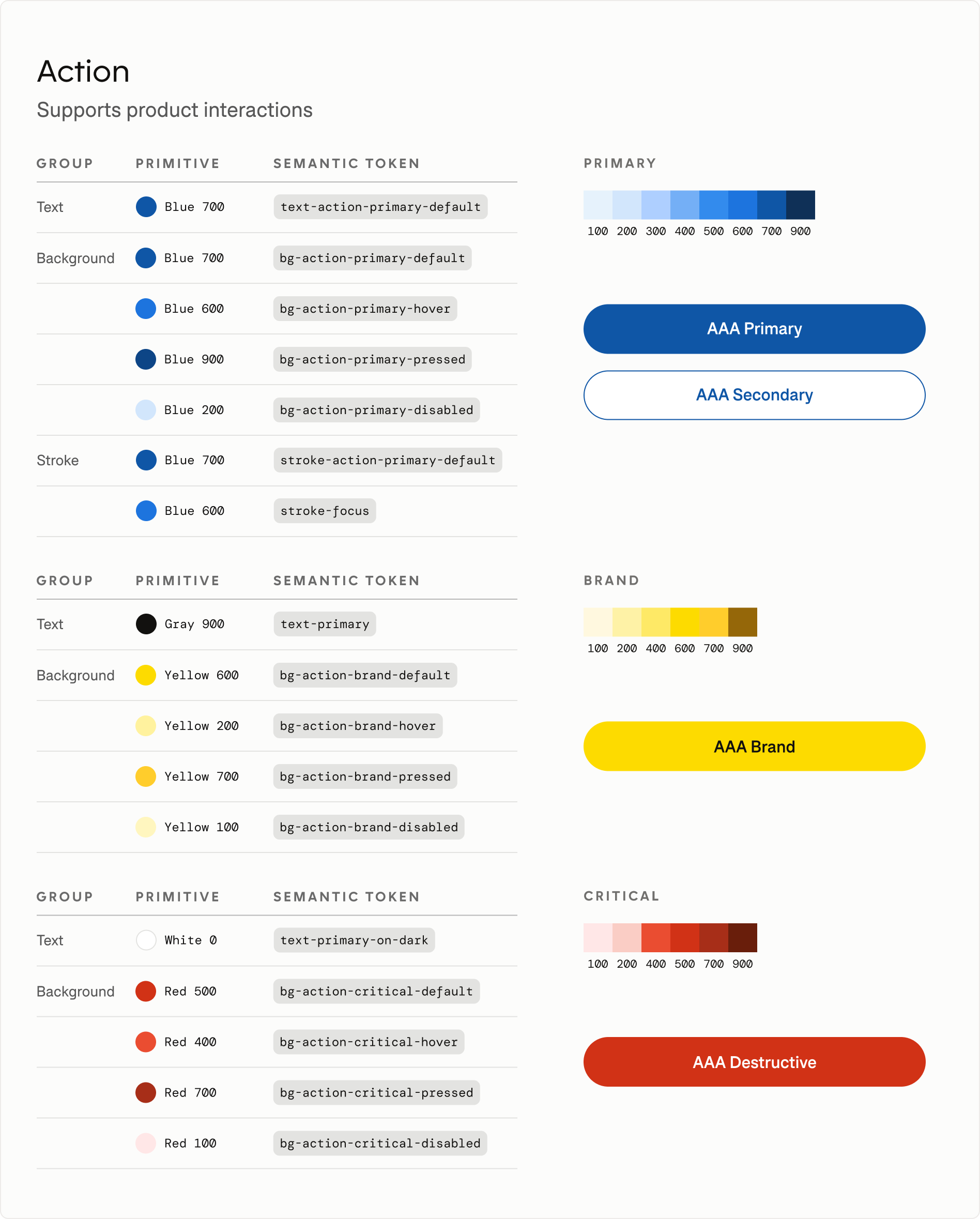
Supporting interaction
I defined reusable color states for primary, brand, and critical actions—including hover, pressed, focus, and disabled states—creating a shared interaction language across components.
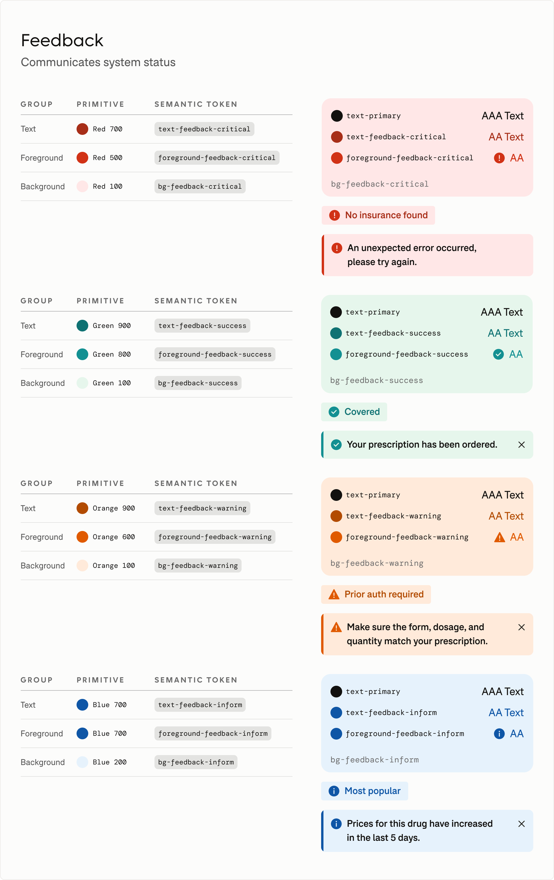
Communicating system status
Feedback states paired color with iconography, typography, and supporting copy so meaning never relied on color alone.
Bringing a new brand voice to product experiences
I translated the refreshed brand typography into a scalable product system, pairing expressive display type with highly readable content typography.
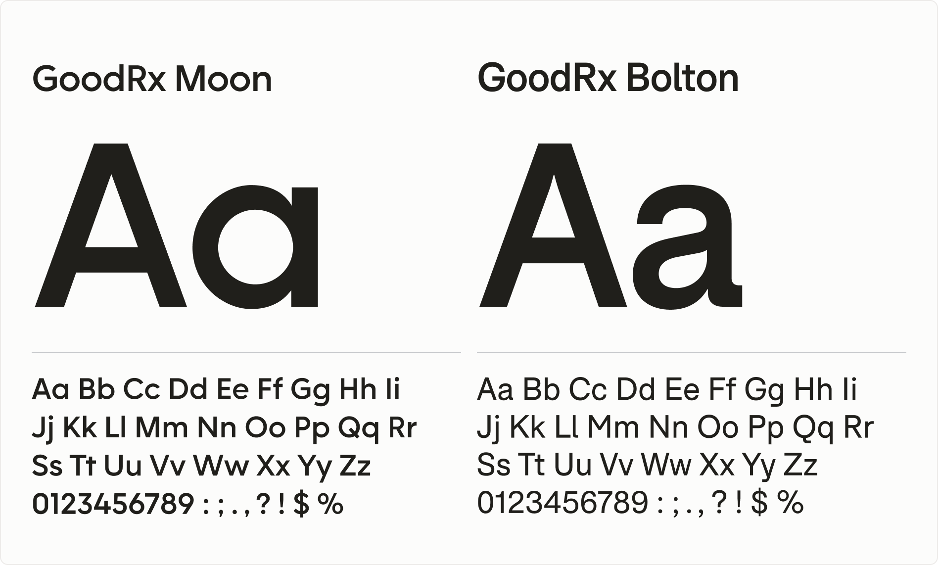
Creating a more consistent visual hierarchy
I redesigned the typography scale to establish more predictable relationships between heading levels. Replacing irregular size jumps with a systematic progression improved visual rhythm, strengthened hierarchy, and created a foundation that could scale with future product needs.
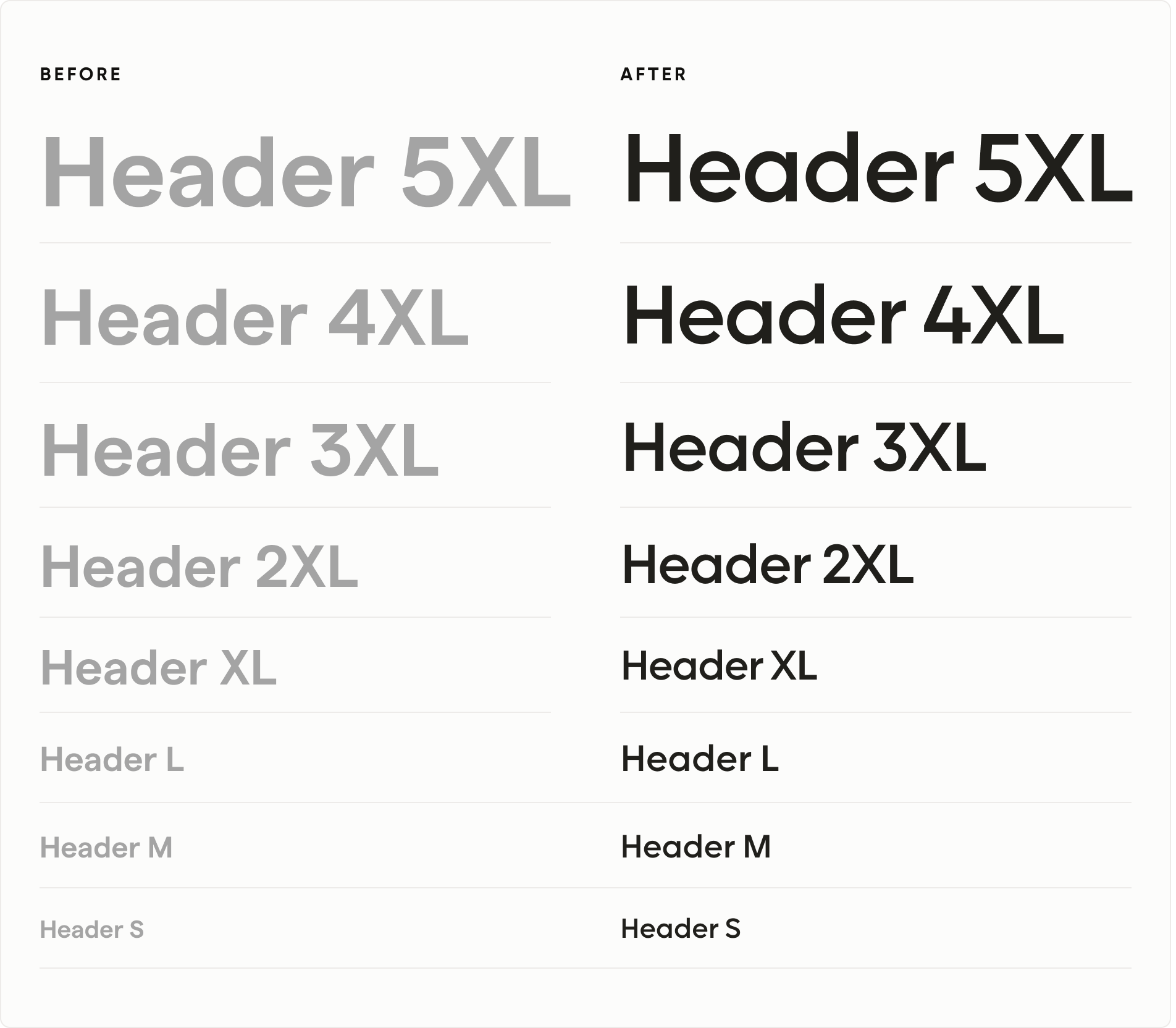
Typography scale should have rhythm, not accidents
The previous scale relied on arbitrary size jumps that lacked a clear pattern. I established a systematic 12px and 4px progression, creating stronger visual hierarchy and a more scalable foundation.
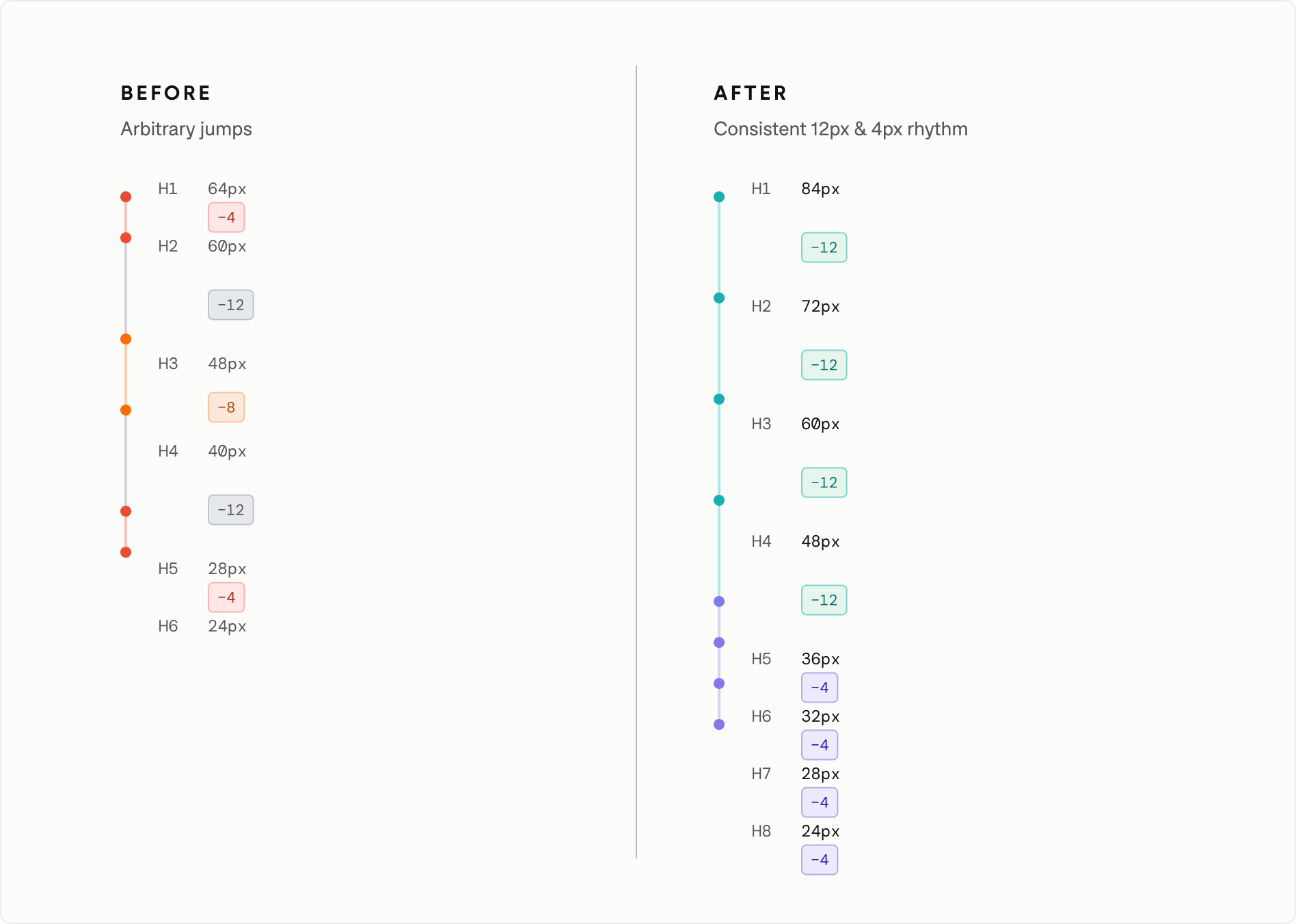
Modernizing typography tokens for design and code
By standardizing sizing around a 16px base and converting tokens to rem values, I created a more accessible, responsive, and scalable foundation while improving design-to-engineering alignment.
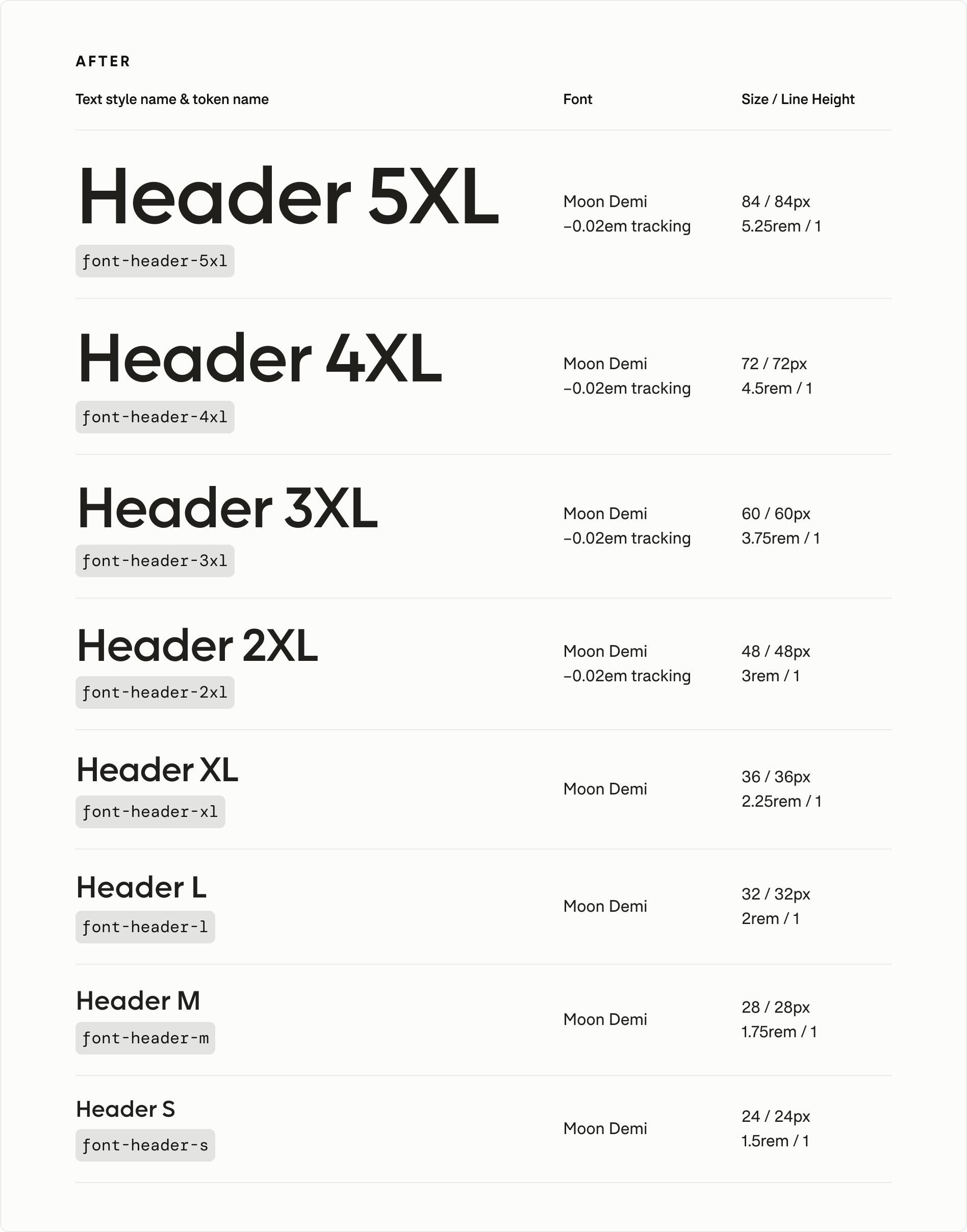
Establishing a clearer shape language
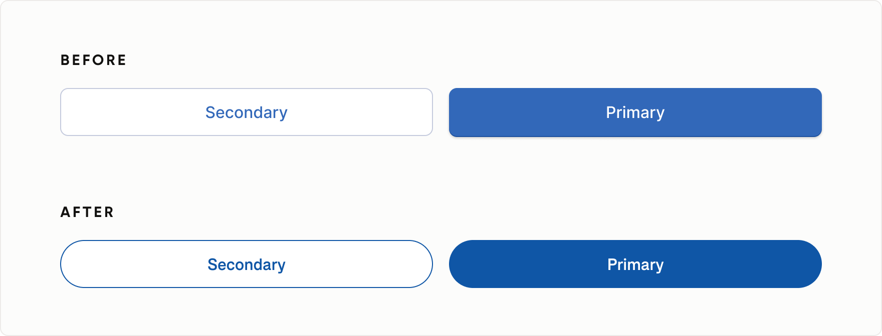
The rebrand introduced a more expressive visual language, creating an opportunity to standardize shape across the system. I established a radii framework based on component role, moving interactive controls from 8px to fully rounded treatments while using more structured corners for non-interactive elements.
Preserving hierarchy through shape
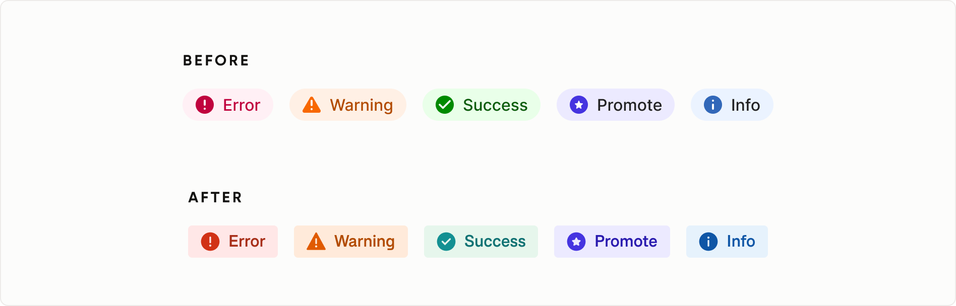
To avoid making every element feel equally actionable, informational and static components retained more structured corner treatments. Badges, for example, shifted from fully rounded to 4px corners, creating a clearer distinction between interactive, informational, and structural elements.
Refining depth and hierarchy through elevation
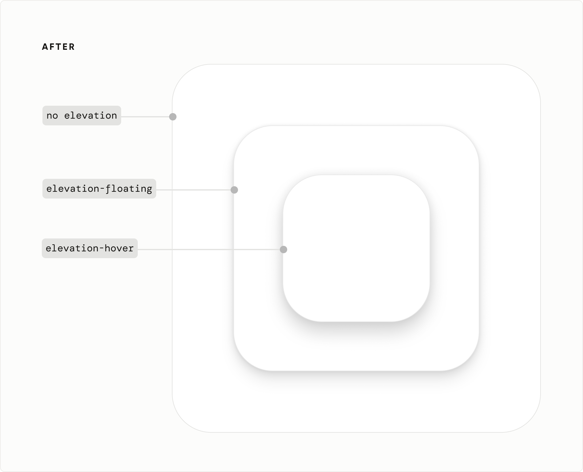
I introduced a new elevation token system that defined consistent depth relationships across components and surfaces. Standardized elevation values improved implementation consistency, strengthened design-to-code alignment, and created a scalable foundation for future component development.
Creating meaningful depth and affordance
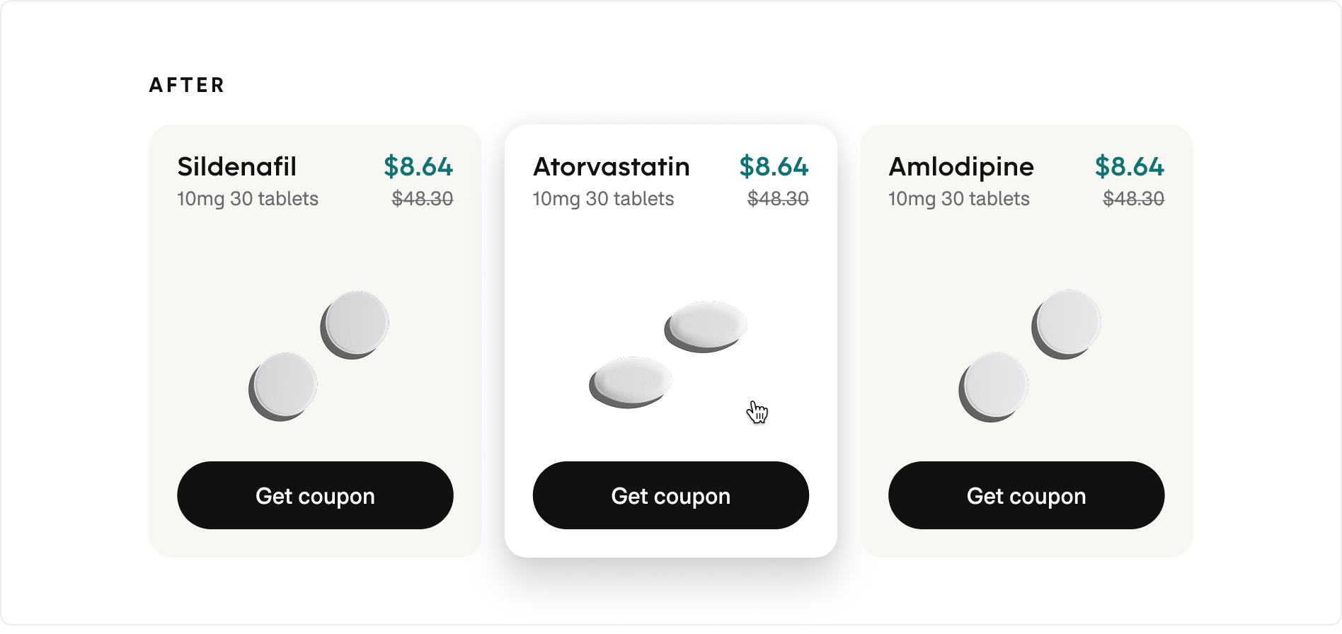
The existing interface relied heavily on elevation in default component states, creating visual noise while diminishing its ability to communicate hierarchy. Hover interactions were similarly understated, often relying on barely perceptible color shifts to indicate interactivity.
If everything has elevation, nothing has elevation. If hover is only a tiny color shift, users may not perceive it.
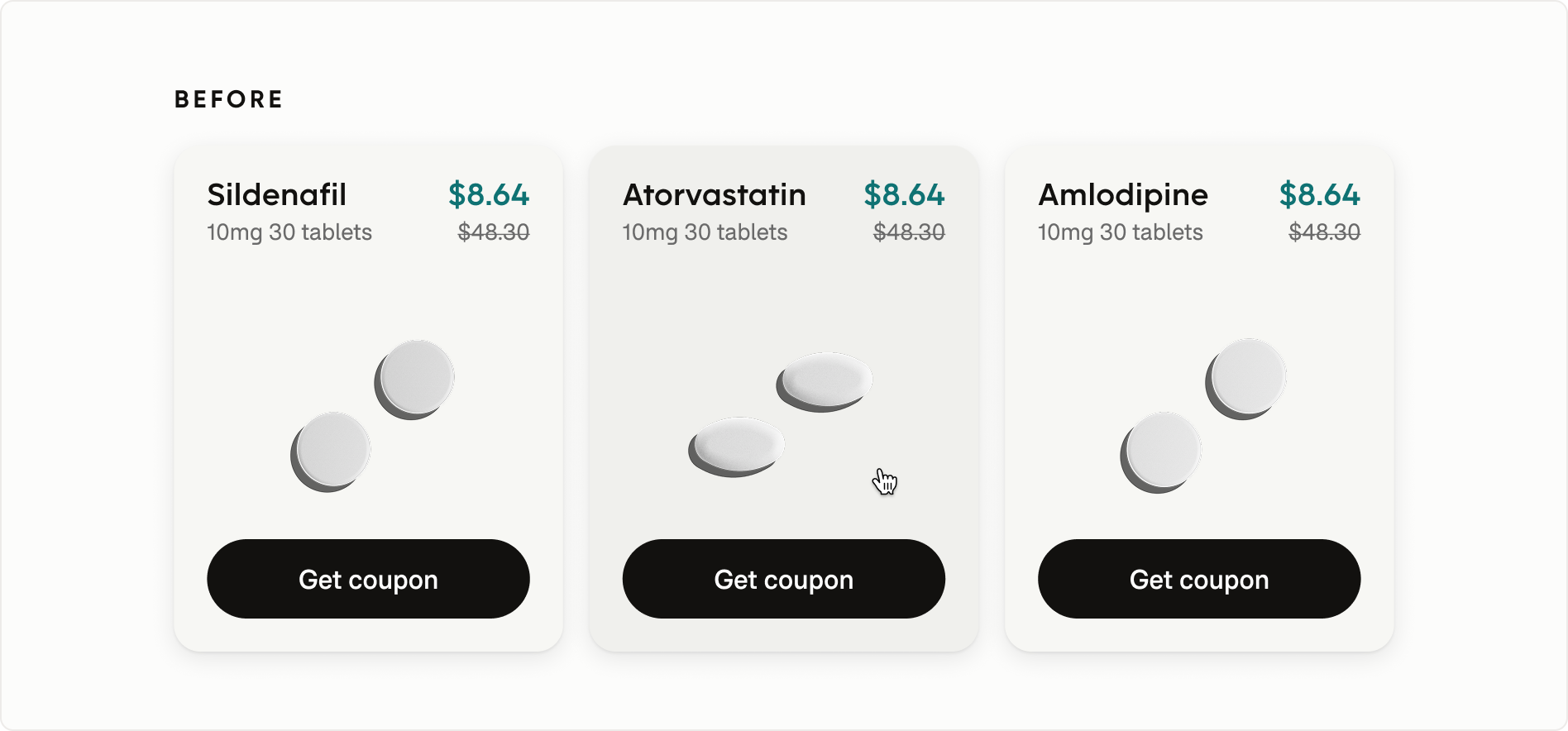
I established a standardized elevation system that removed shadows from default states and reserved them for hover, focus, and floating surfaces, creating clearer affordance and a more intentional sense of depth throughout the experience.
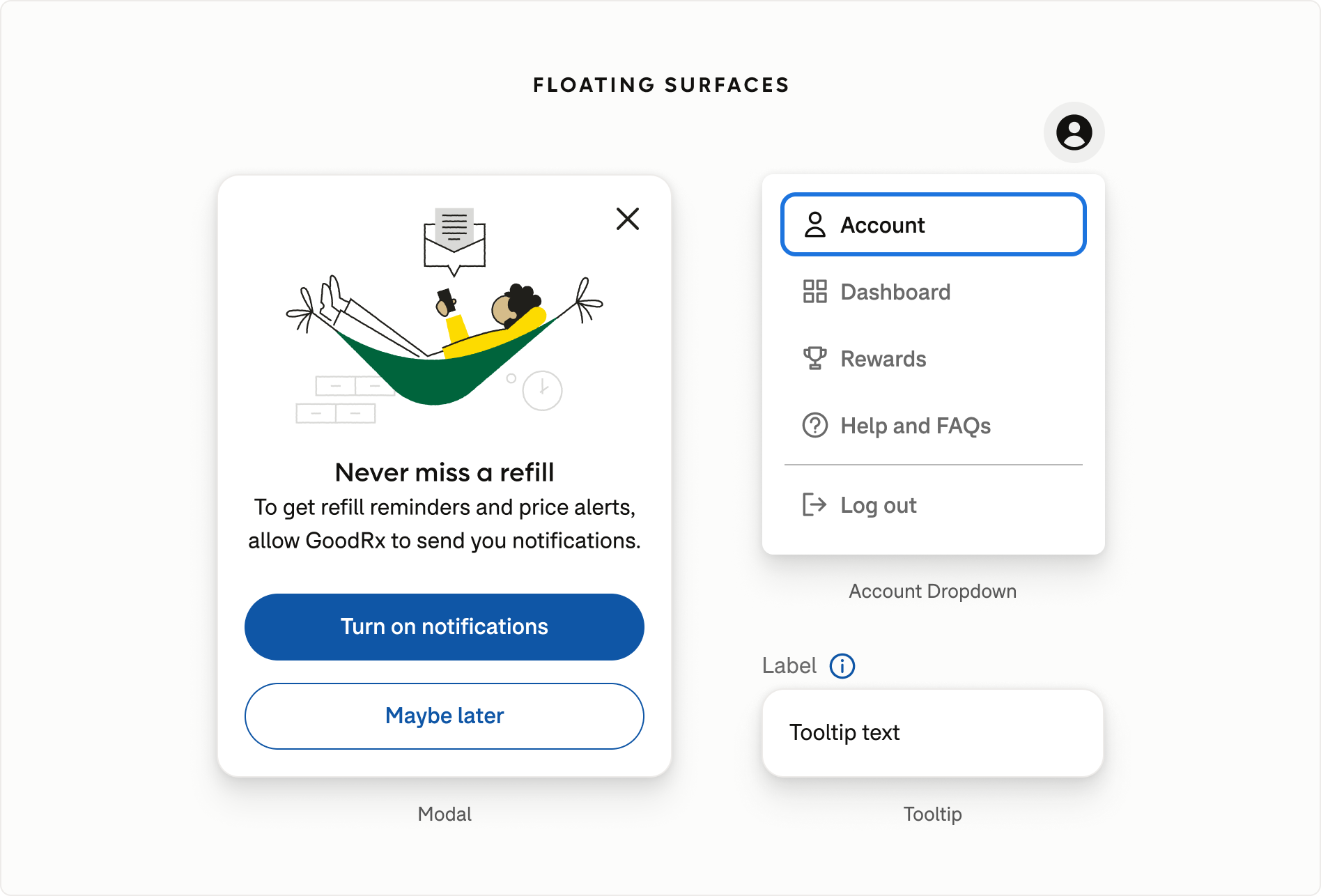
Standardizing floating surfaces
The floating elevation token was applied consistently across modals, dropdown menus, and tooltips, reinforcing hierarchy and reducing visual inconsistency across the system.
Auditing accessibility across the system
As part of the rebrand, I conducted a system-wide accessibility audit across foundational colors, components, and interaction states, reviewing both color contrast and broader WCAG requirements. The audit surfaced opportunities to improve contrast, focus visibility, state differentiation, and interaction affordances through shared foundations rather than one-off fixes.
Modernizing inputs for accessibility and clarity
The legacy input component relied on low-contrast stroke colors that failed accessibility requirements in default and focus states. I updated the color system to achieve compliant contrast ratios, strengthen focus affordances, and create clearer interaction feedback.
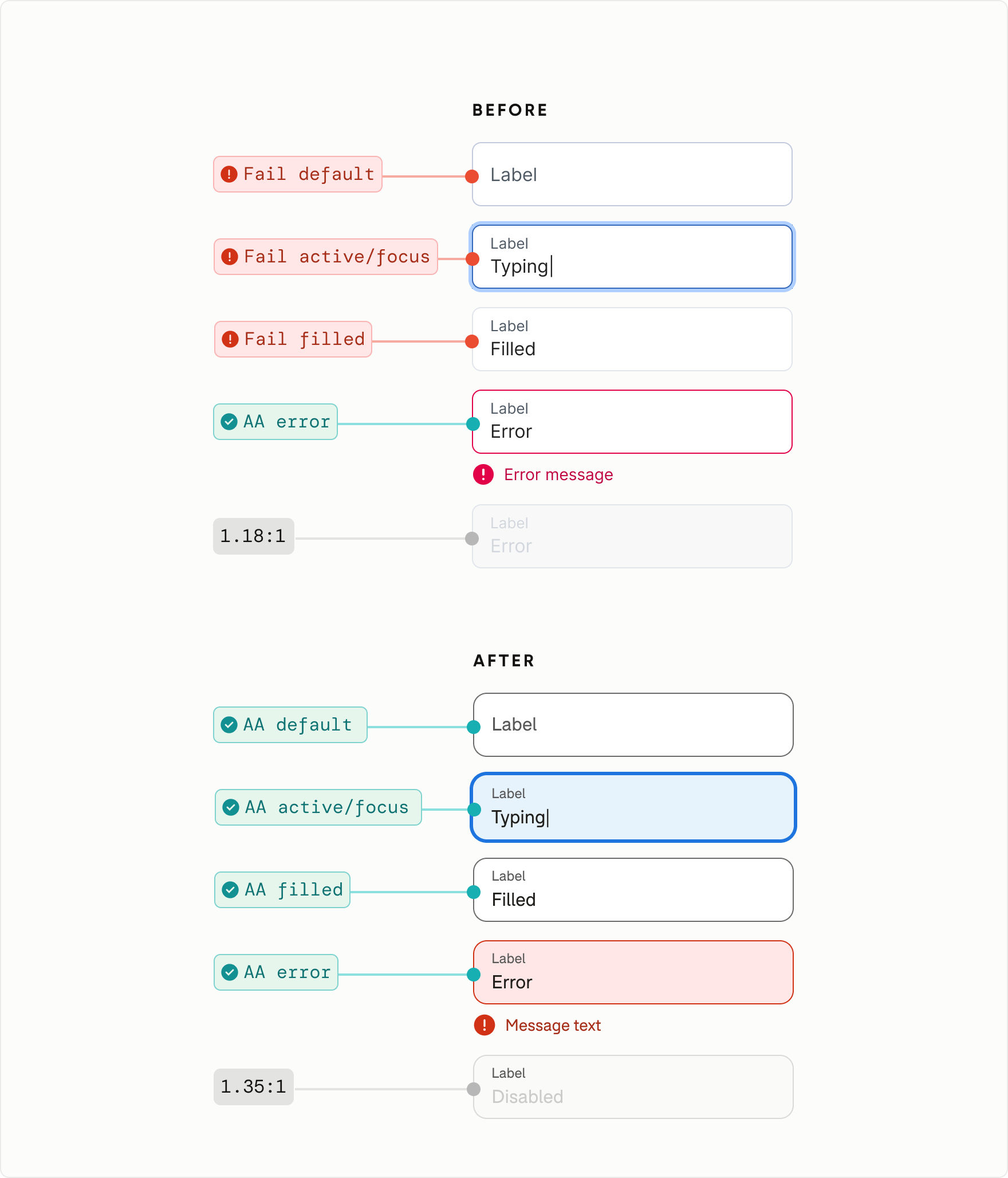
Designing beyond minimum compliance
Although disabled controls are exempt from WCAG non-text contrast requirements, I refined disabled text and stroke colors to improve readability beyond minimum compliance.
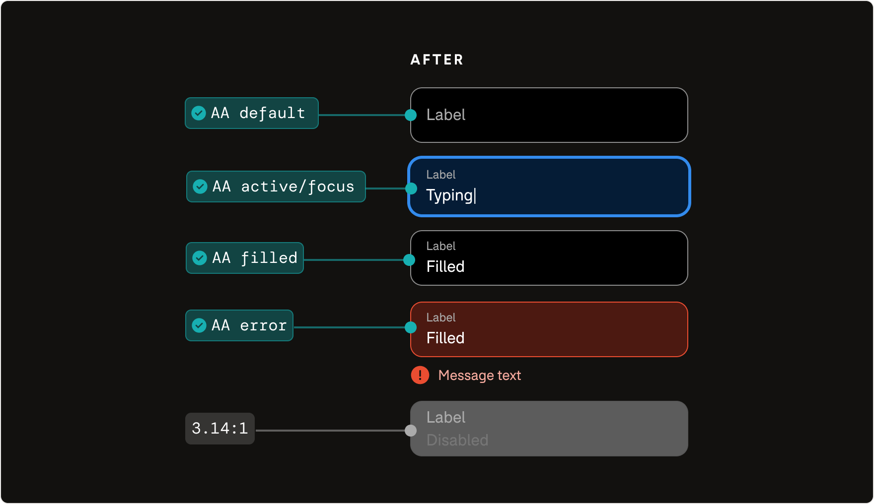
Extending accessibility to dark surfaces
Rather than optimizing inputs for a single background color, I defined state-specific color tokens that could adapt across light and dark surfaces. This approach ensured accessibility requirements, visual hierarchy, and interaction affordances remained consistent throughout the system.
Bringing personality to functional experiences
I incorporated the updated illustration system into product experiences, creating a consistent visual language that reinforced the GoodRx brand while making functional healthcare workflows feel warmer and more approachable.
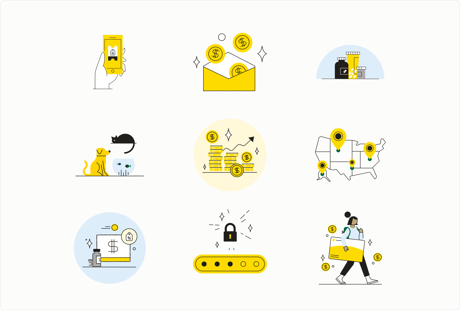
Expanding the visual language through spot illustrations
I extended the design system to support Brand's spot illustration library, providing reusable patterns and documentation that encouraged consistent adoption across the product.
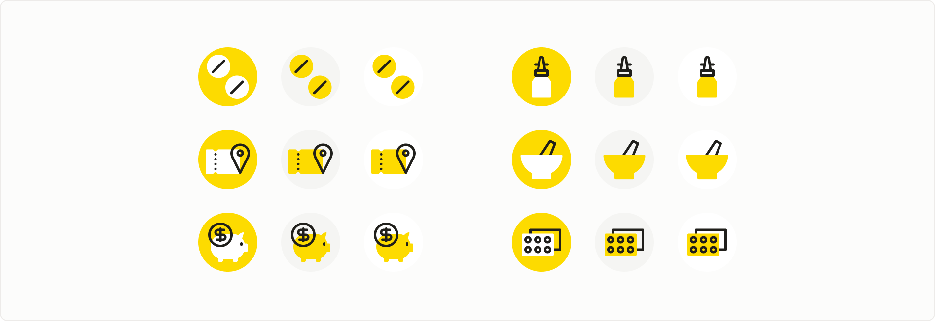
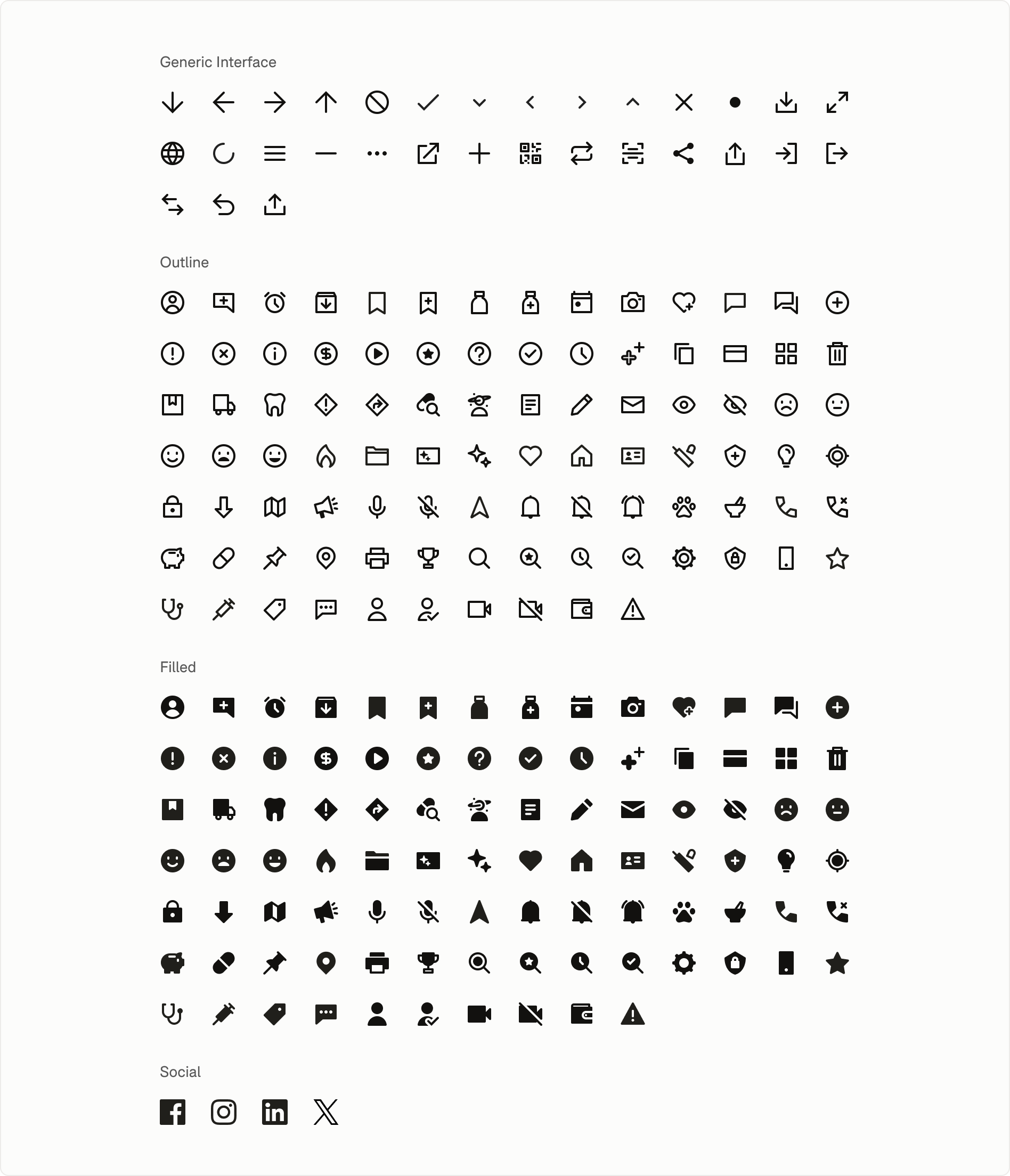
Modernizing iconography for consistency and clarity
I integrated the updated utility icon library into the design system, collaborating closely with the icon designer as new icons were introduced. This established consistent implementation patterns and created a scalable foundation for future product needs.
production rollout
A single theme, applied everywhere.
The rebrand was implemented as a shared theme rather than a series of one-off redesigns. Because product experiences were built from shared foundations and components, the new visual language could scale across the ecosystem while preserving existing layouts, content, and workflows.
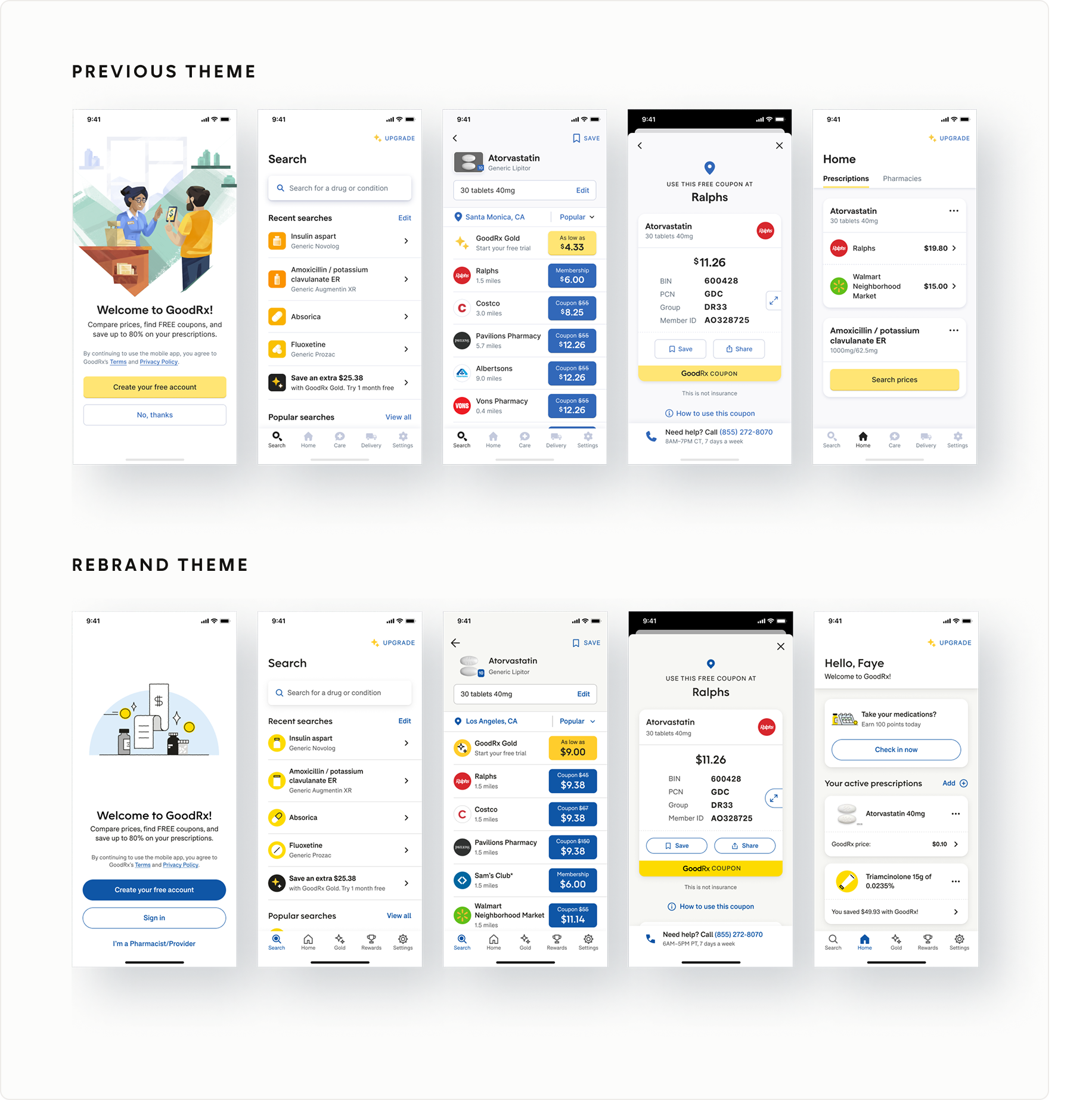
A seamless theme transition
Shared components referenced semantic design tokens rather than hard-coded brand values, allowing existing experiences to inherit the refreshed visual language without changing their underlying structure.
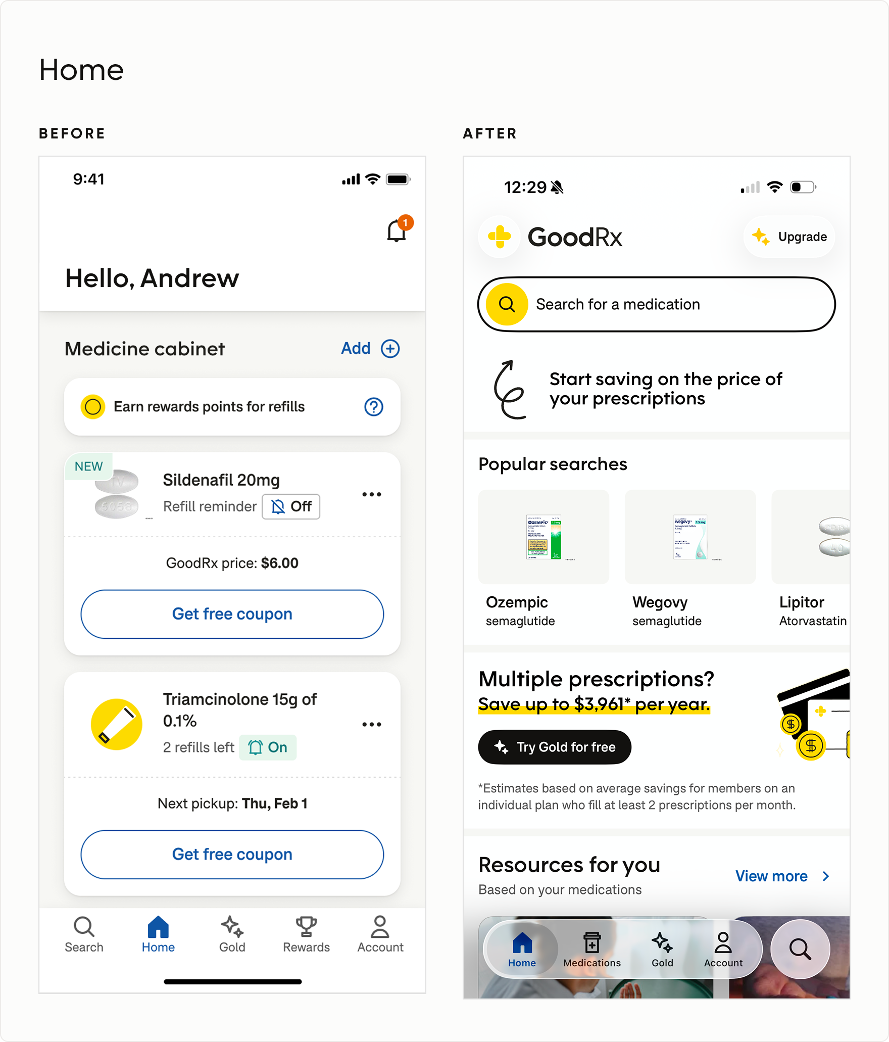
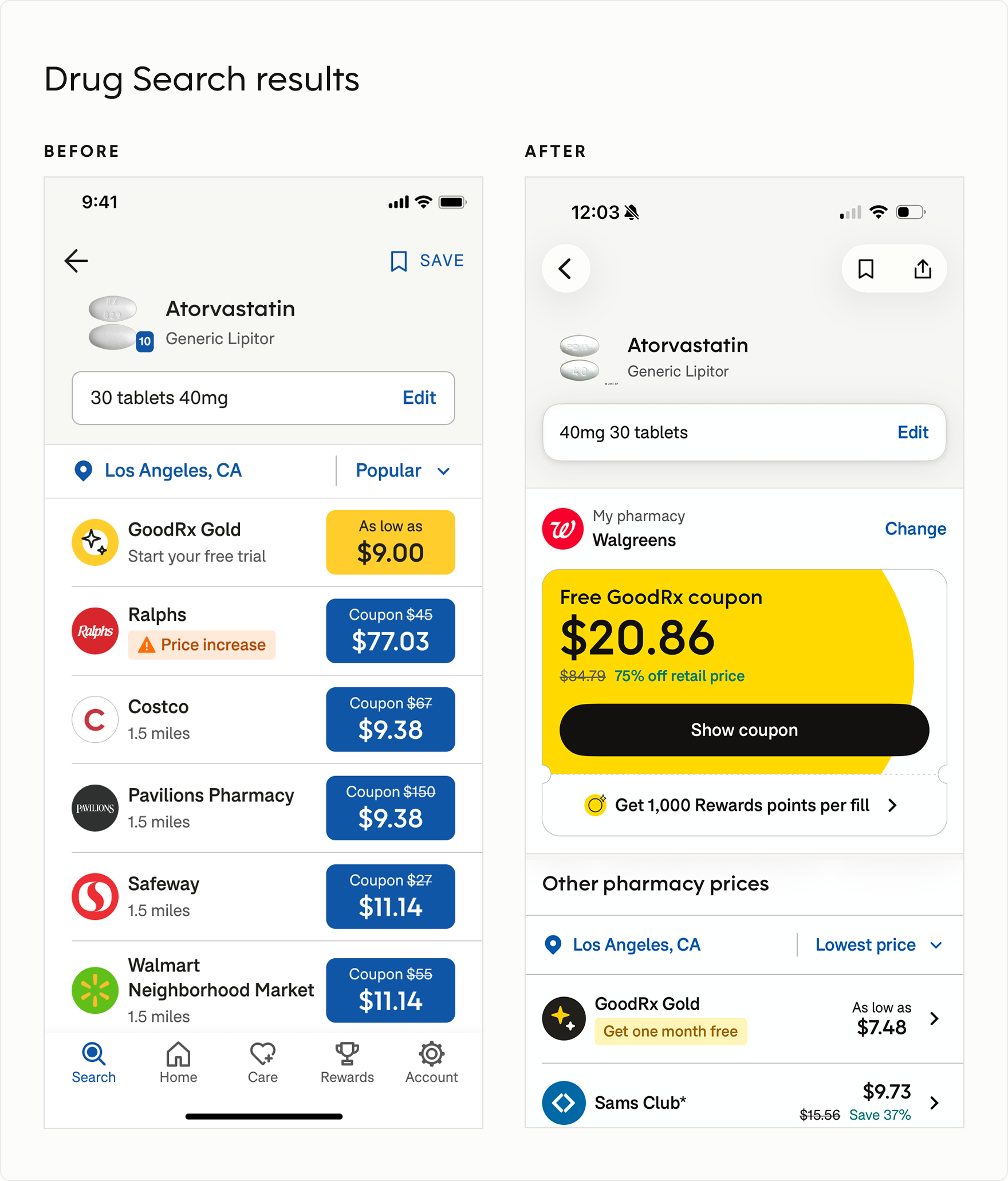
Layout, Content, and Workflow
Components, Colors, Typography, Icons, and Elevation
Validating the theme in production
The new theme was deployed behind a feature flag and tested across shared components, legacy surfaces, and bespoke product UI.
I partnered with Engineering to triage issues based on whether they belonged in the design system, implementation, or an individual experience. Shared issues were resolved centrally before broader rollout.
This turned the rebrand into a controlled system migration: validate in production, fix systemic issues once, and scale consistently.
interaction strategy
Evolving the brand without sacrificing affordance
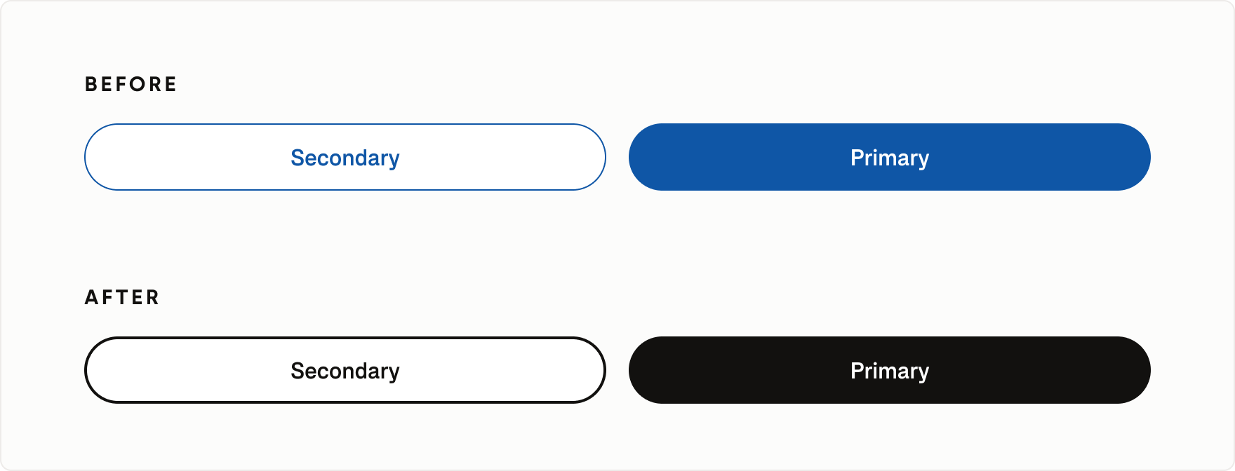
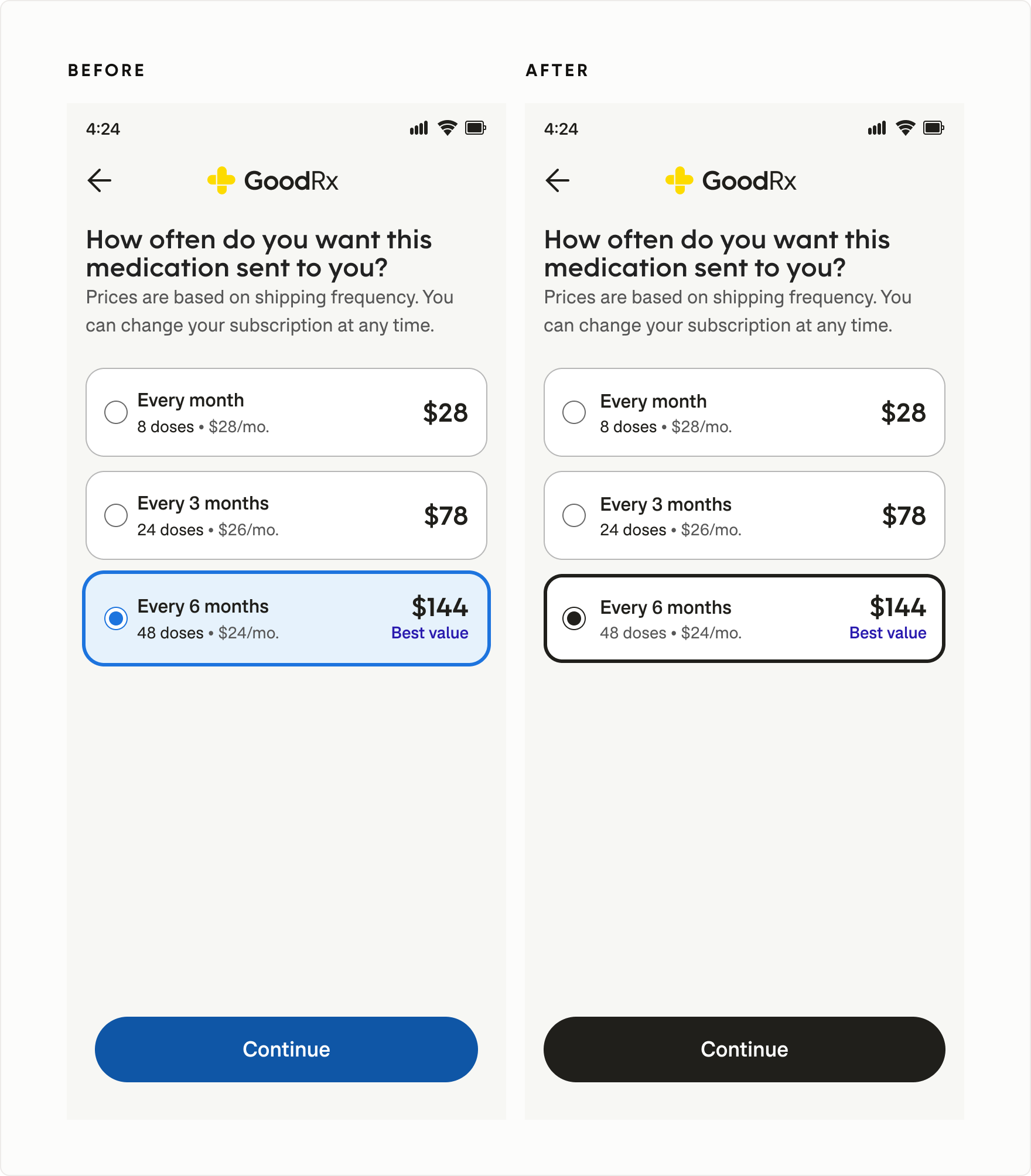
As part of the rebrand, GoodRx transitioned its primary UI color from blue to black. But blue had also become an important signal for interactivity across the product. Rather than applying the new brand rigidly, I established interaction standards that used color, shape, stroke, fill, iconography, and contrast together to maintain clear affordance and accessible states.
Redefining primary and secondary actions
I updated button styles for the new black primary action while preserving a clear distinction between primary and secondary actions.
Knowing where the brand rule should bend
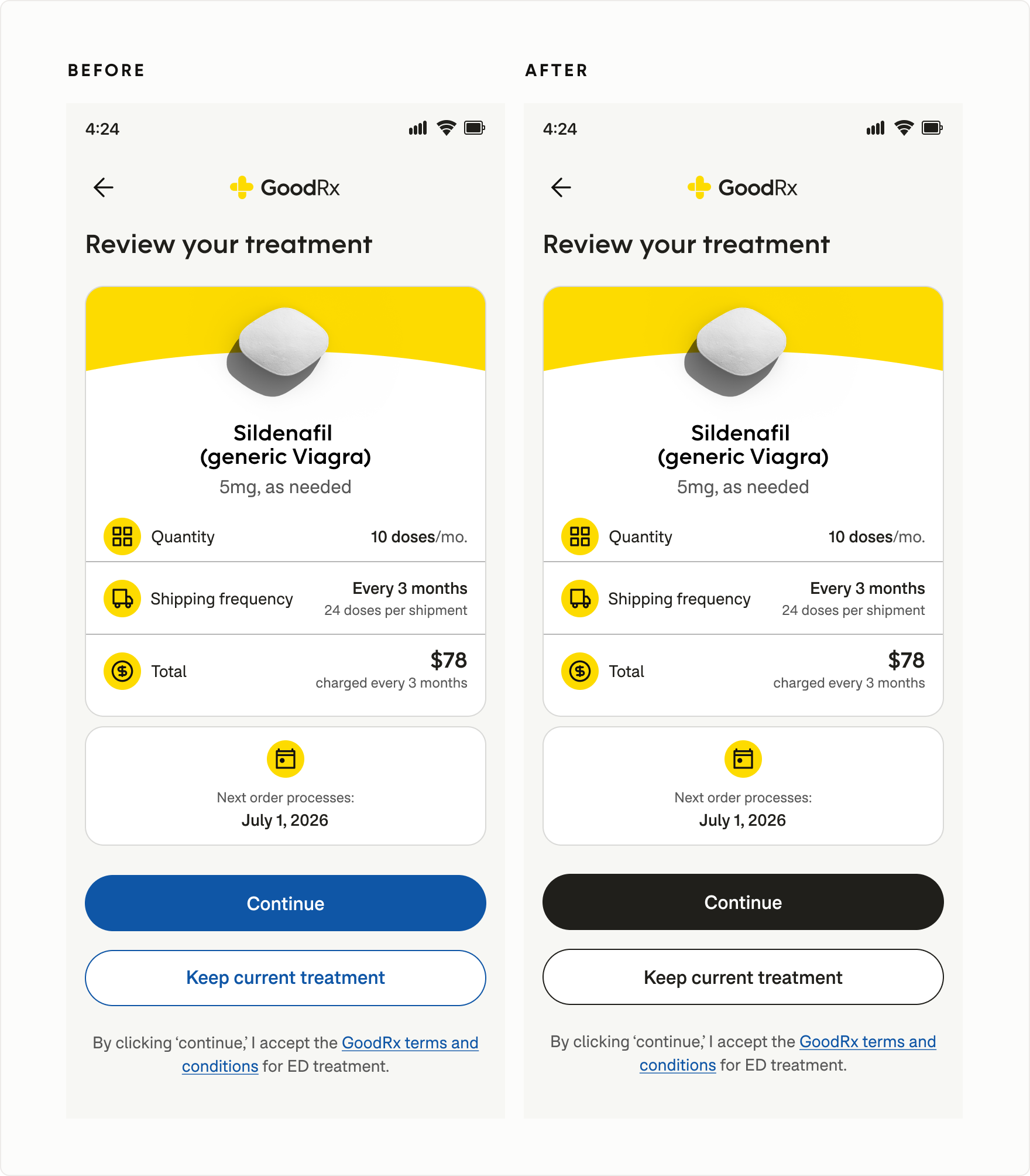
Not every interaction benefited from removing blue. In complex workflows, black links could become too visually similar to body copy—even when underlined. I retained blue where it provided an important affordance cue, balancing brand consistency with usability.
Strengthening selection states
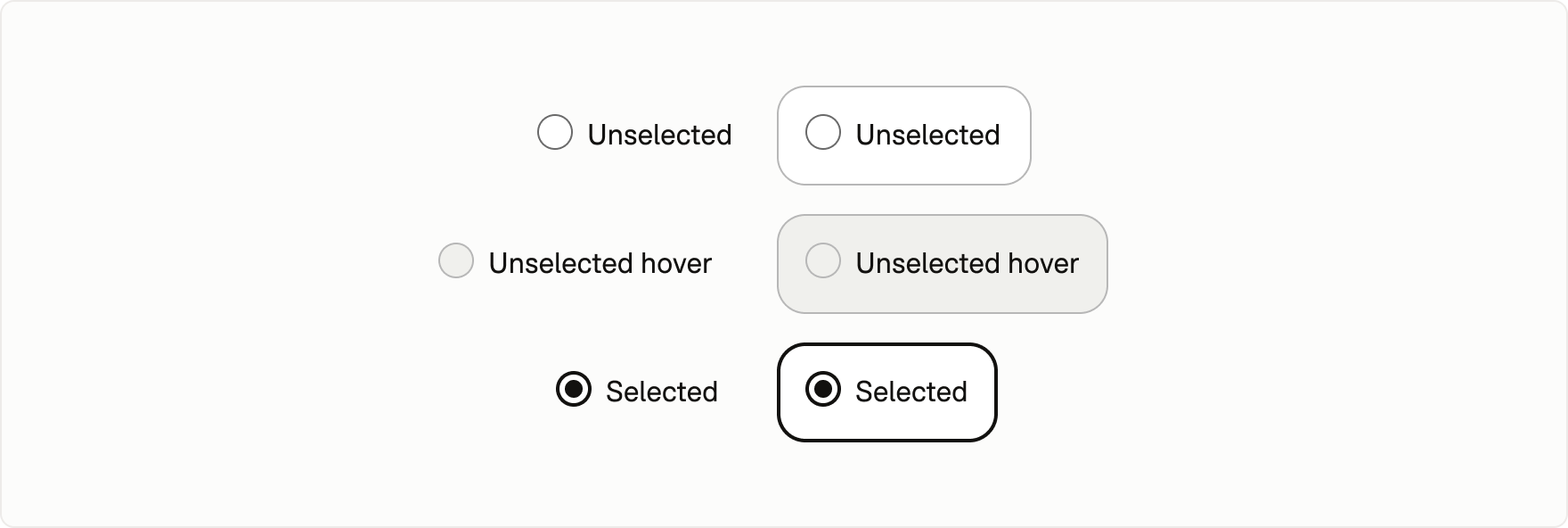
Selection controls were redesigned to communicate interaction states through more than color alone. Updated patterns used shape, stroke, fill, iconography, and contrast to make hover, focus, selected, and unselected states easier to distinguish.
expanding the system
Supporting new healthcare experiences through reusable components
As GoodRx expanded into more complex healthcare workflows, the system needed to grow beyond foundational components. I worked with product teams to identify recurring interaction problems and translate them into reusable patterns that could serve multiple experiences.
Designing a reusable search pattern for different user intents
As Search became more important across GoodRx, I created a reusable pattern that helped users find medications, treatments, and health content consistently across the product.
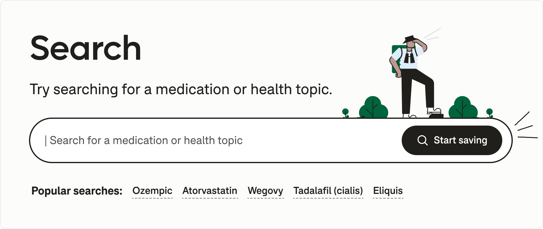
For first-time users, the experience could surface popular searches rather than an empty state. Returning users could see recent searches, making repeat tasks faster.
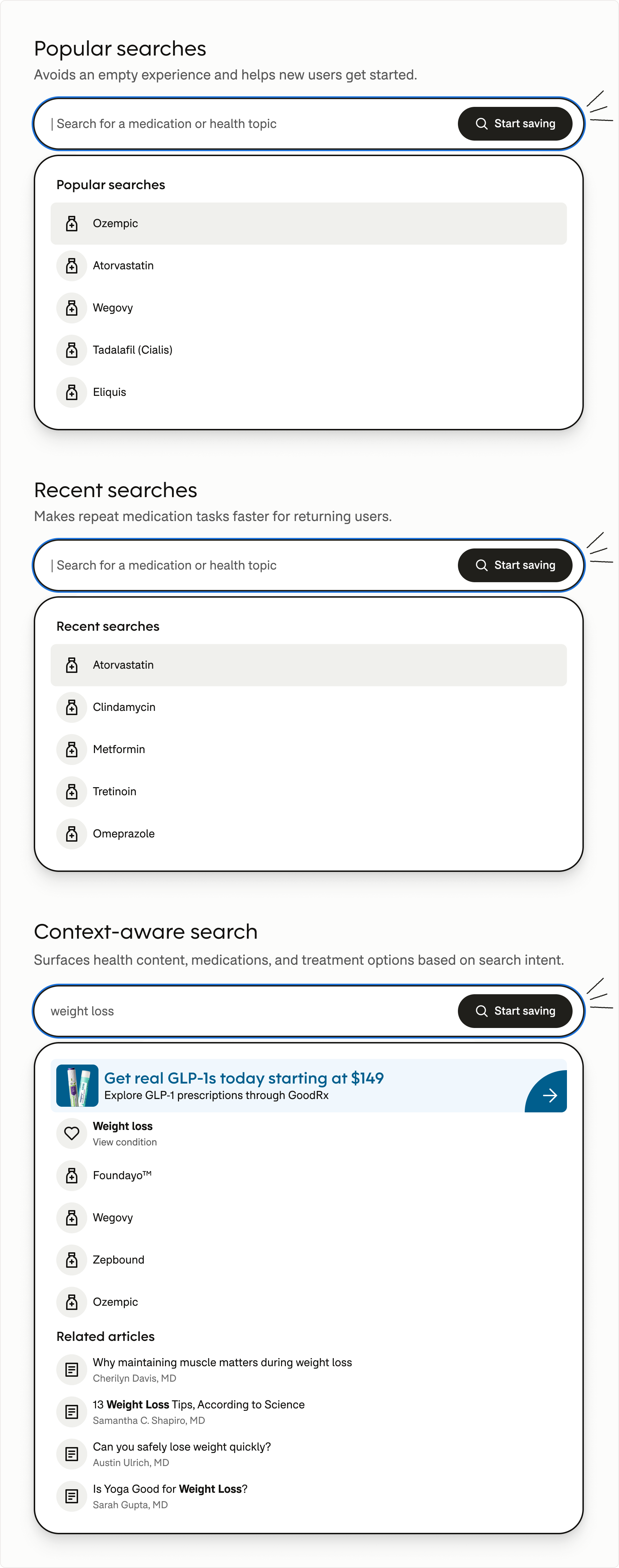
In health-content contexts, Search could support more informational intent by surfacing health articles alongside medication-related results.
Search wasn’t just typeahead. The result model adapted based on user history, intent, and context—surfacing popular searches for new users, recent searches for returning users, and health content alongside medication-related results.
Helping users navigate complex healthcare workflows
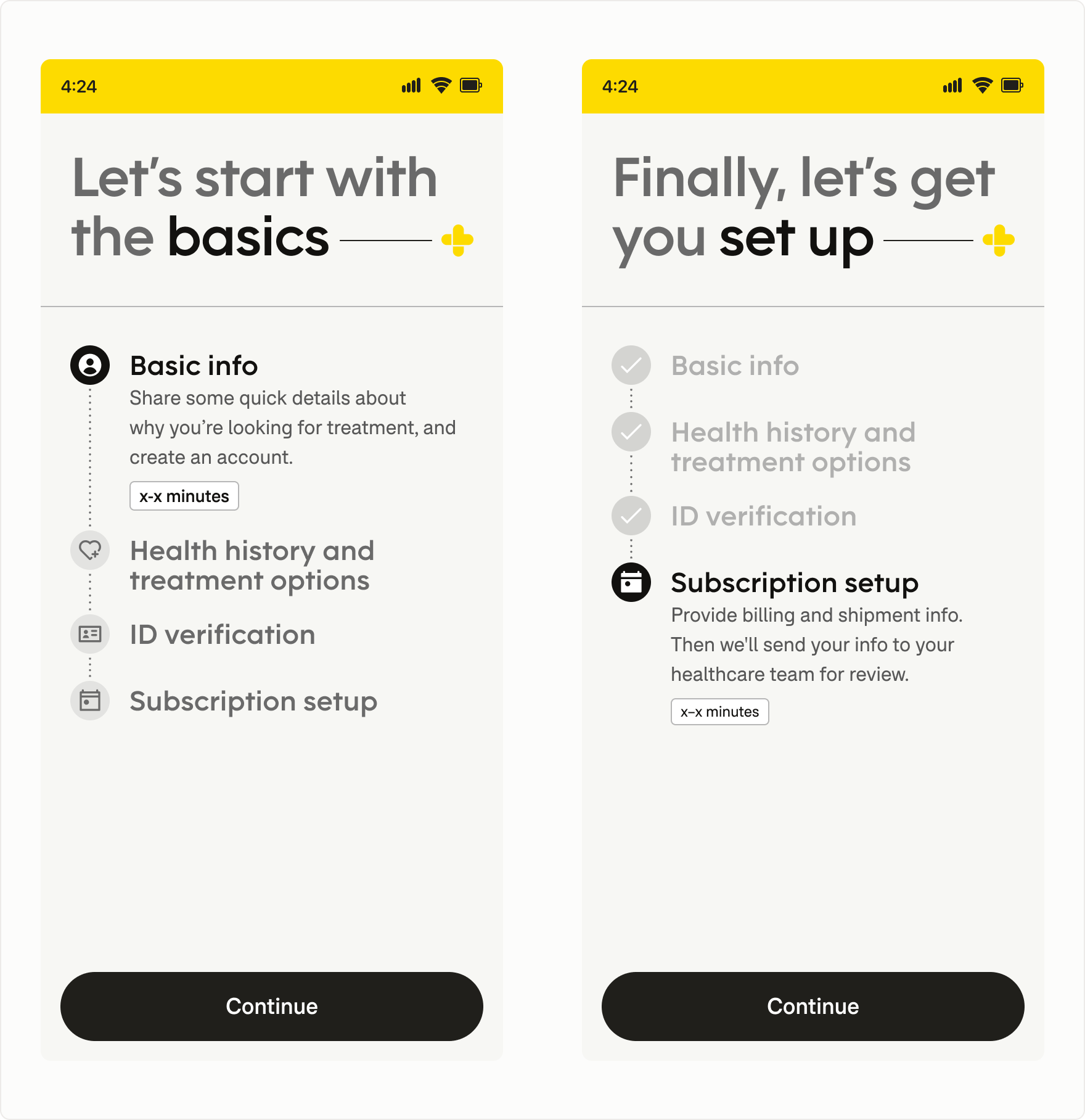
I established a reusable progress pattern for multi-step healthcare workflows, giving users consistent visibility into where they were and what came next.
Solid utility icons identified the current step while outlined icons represented upcoming steps, creating a clear visual distinction between present and future actions. The pattern could then scale across onboarding, treatment, and subscription journeys.
Creating transparency throughout medication delivery
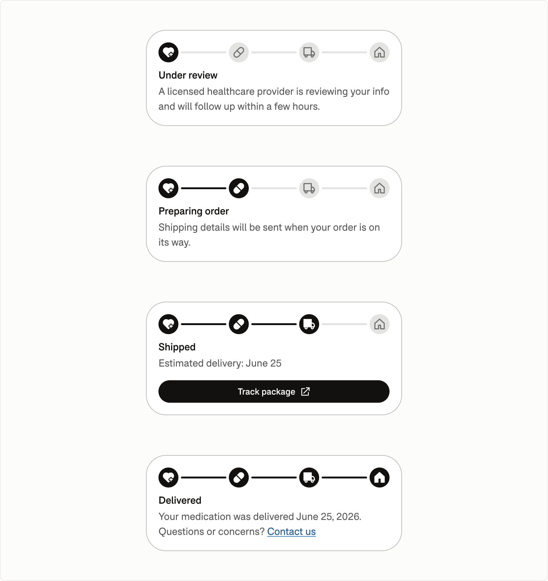
I designed a reusable status tracking component that gave users visibility into each stage of the medication fulfillment process, supporting both home delivery and pharmacy pickup.
Consistent iconography and progressive status indicators distinguished completed and upcoming milestones, while contextual messaging and actions helped users understand what was happening and what to do next.
documentation as a product
Reducing ambiguity through better documentation
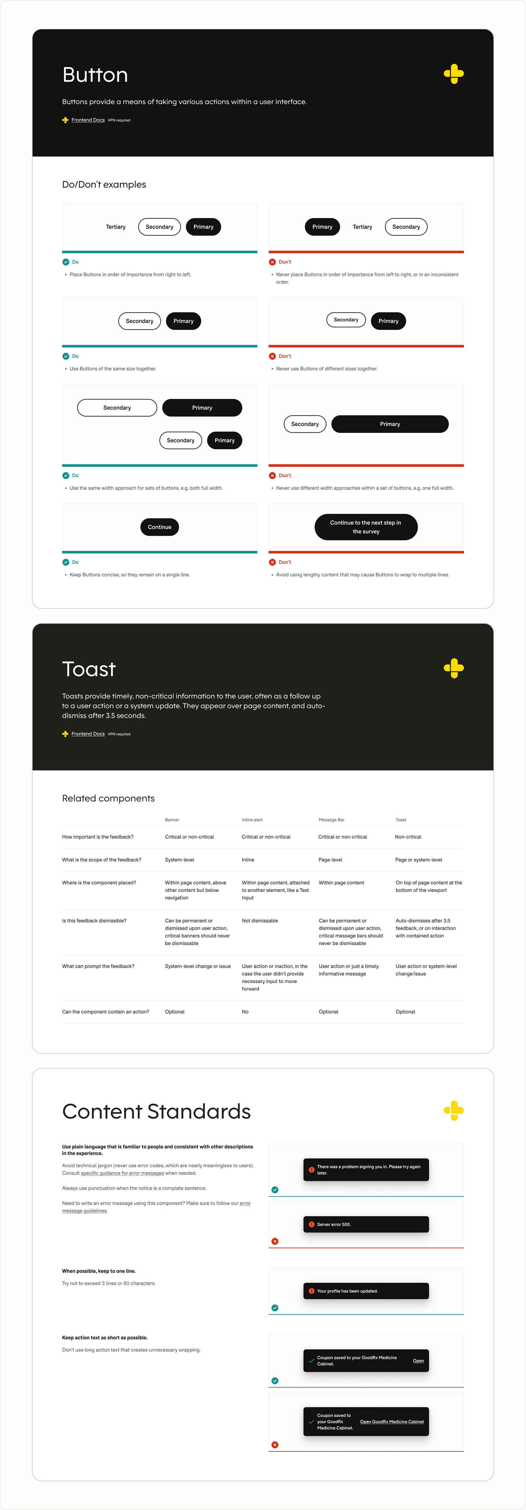
As GoodRx’s design system expanded, documentation evolved beyond basic component specifications into a more comprehensive resource for design and implementation decisions. I created a consistent documentation model that brought together component guidance, UX best practices, content standards, and implementation details in one place.
The original documentation captured the basics, but left many of the practical questions teams encountered unanswered. Rather than documenting what a component was, the new documentation focused on helping teams understand how and when to use it.
The new documentation answered questions teams actually had:
- - How do I build it?
- - When should I use it?
- - When shouldn’t I use it?
- - How do I write content for it?
- - What mistakes should I avoid?
- - Which component should I use instead?
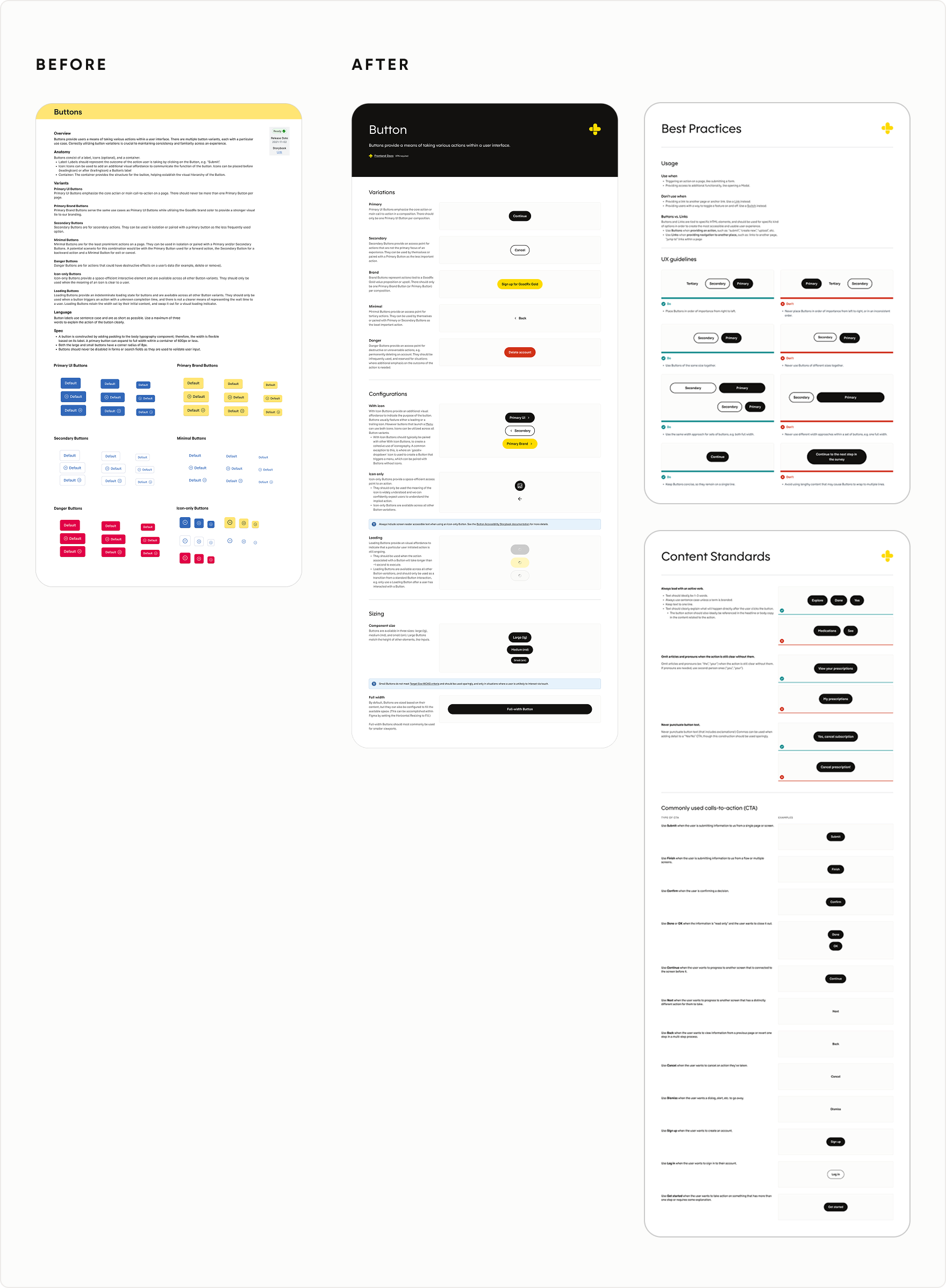
Each component followed a standardized documentation structure that clearly defined how it should be built and behave across contexts.
Documentation consistently covered:
- - Component anatomy, including required and optional elements
- - Supported variations and configurations
- - Responsive behavior across desktop and mobile
- - Platform-specific guidance when web, iOS, and Android implementations differed
- - Static and interactive behavior
- - Sizing guidance and common patterns
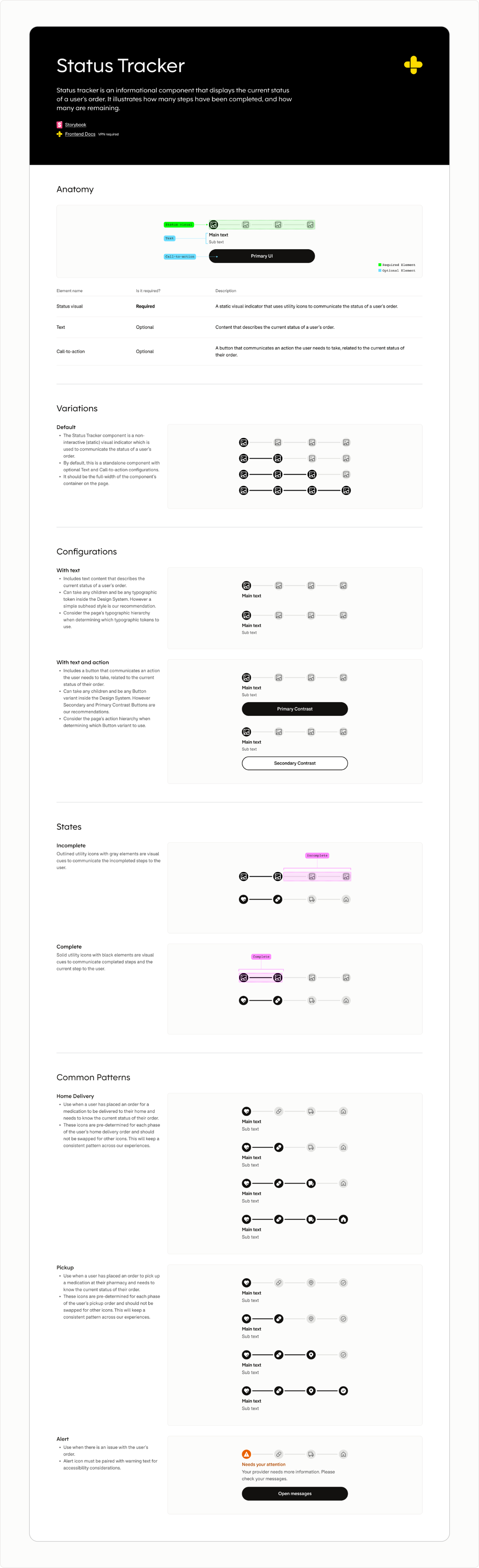
Documentation also captured guidance that had previously lived in critiques, conversations, or individual experience.
New guidance included:
- - Do & Don’t examples
- - UX best practices
- - Related component comparisons
- - Content standards
- - Standardized error messaging
This transformed documentation from a reference library into an everyday decision-making tool.
governance and adoption
Helping a Design System grow with the organization
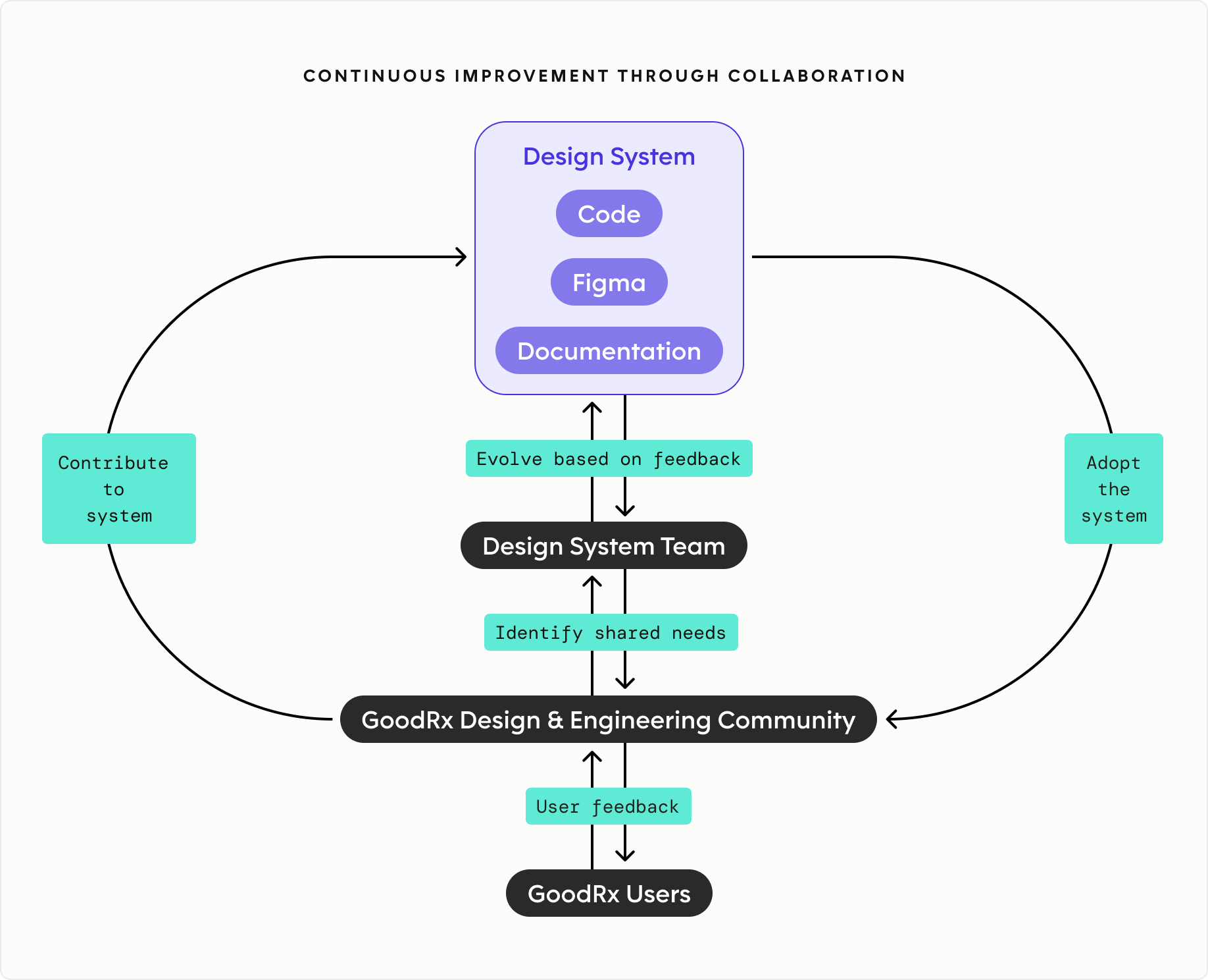
A successful design system requires more than reusable components. I established governance, education, and support practices that helped teams adopt the system, contribute back to it, and maintain quality as the organization grew.
Driving adoption through education
Adoption required more than publishing components. I created onboarding resources that helped teams understand how the system worked, where it fit into the product process, and how to design effectively within it. This reinforced the design system as a shared product, not a static library.
Supporting teams through proactive partnership
I supported teams through office hours, design critiques, Slack support, mentoring, and ongoing collaboration with product and engineering. These touchpoints helped teams navigate tradeoffs, surface gaps, and determine when existing system patterns were no longer enough.
Building systems fluency
As the system evolved, I created practical education to help designers use newer system capabilities confidently in day-to-day work. Tutorials covered topics like Figma variables, design tokens, and applying system primitives through real examples.
Growing the system together
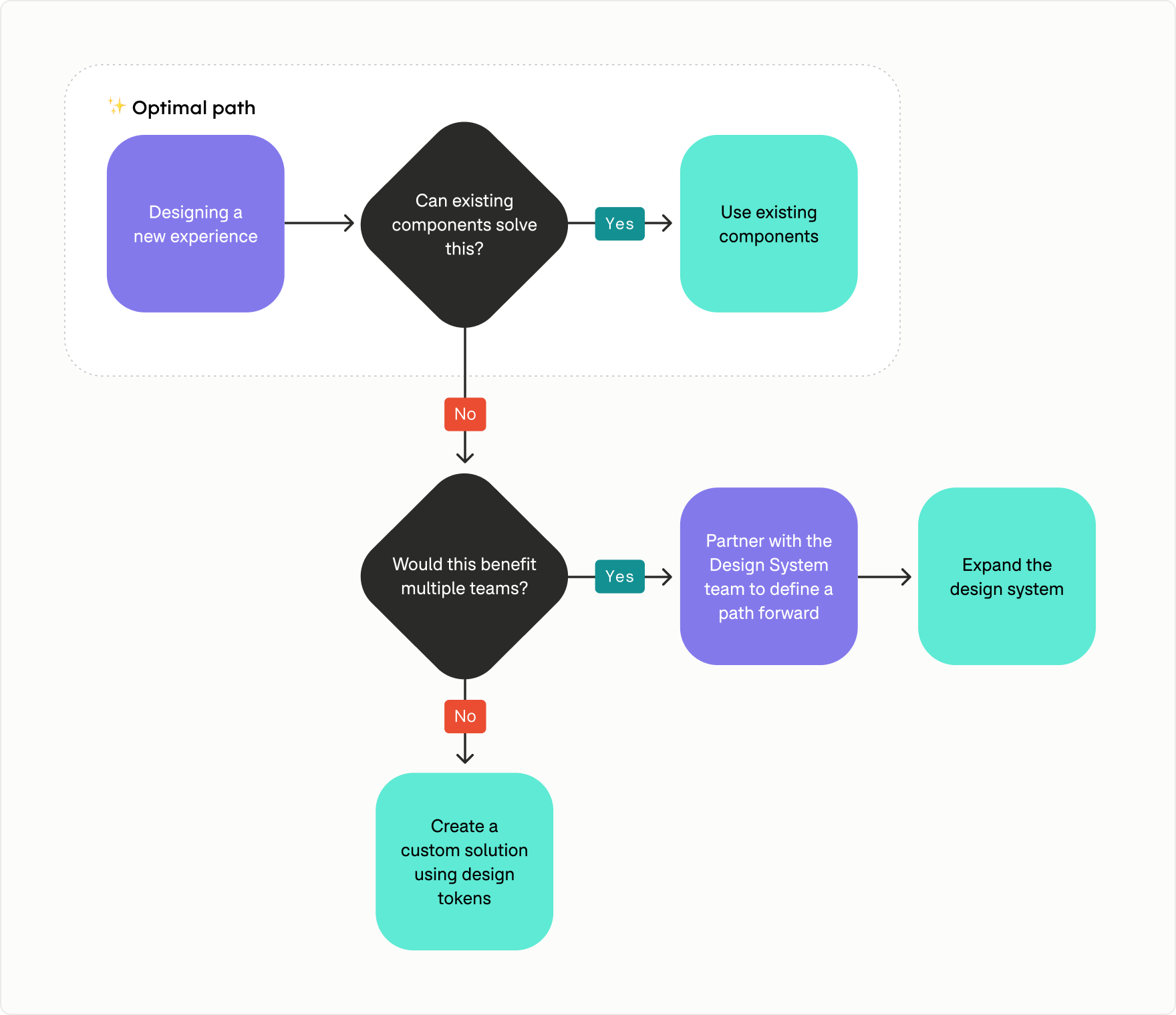
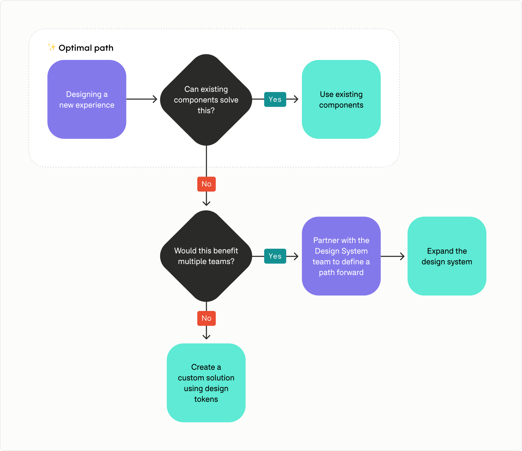
The system wasn’t intended to solve every product challenge. I created a decision framework that helped teams determine when to reuse an existing component, evolve the system, or build a custom solution using shared foundations.
This gave teams a clearer path forward while helping the system grow intentionally rather than through one-off additions.
Establishing a quality bar
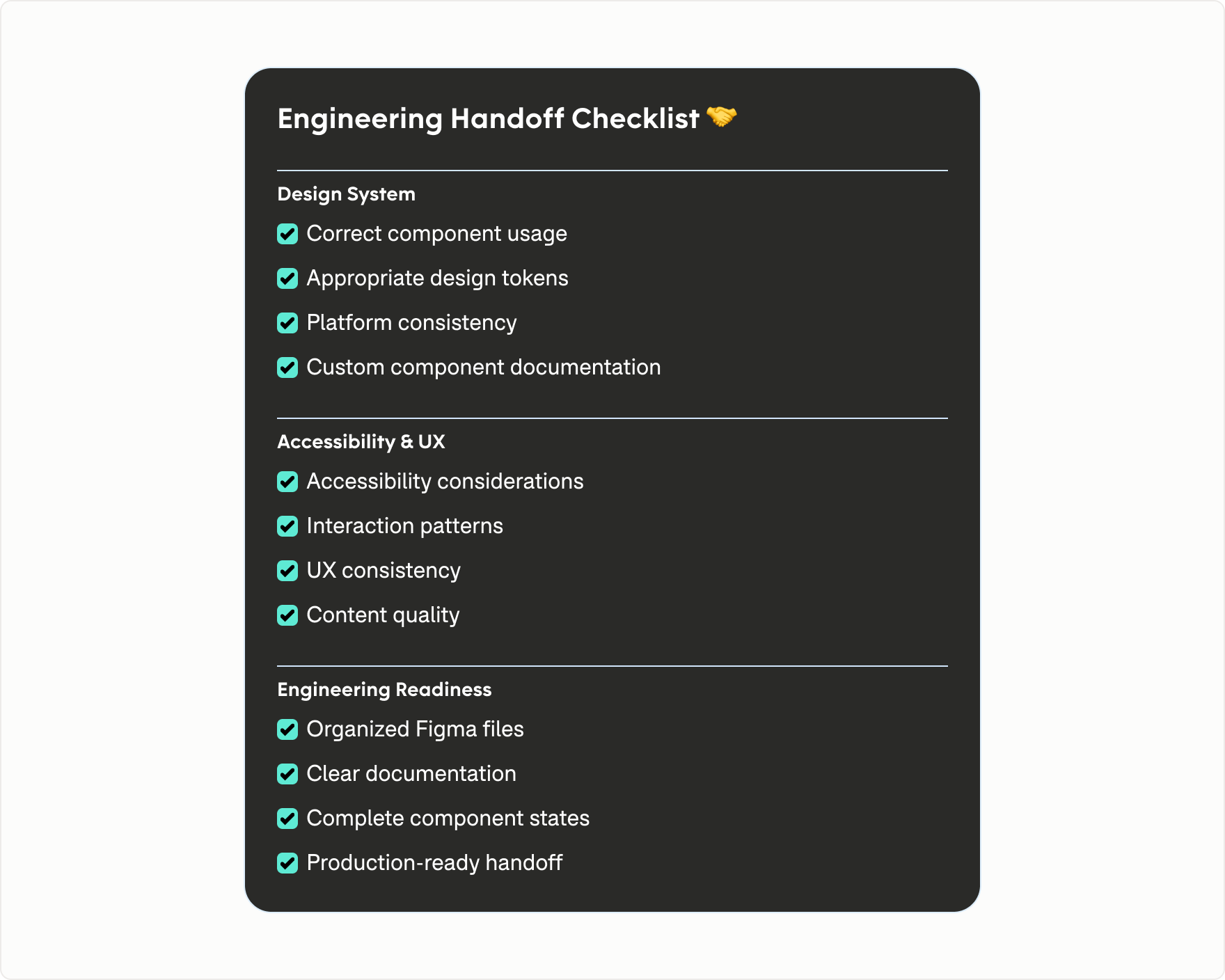
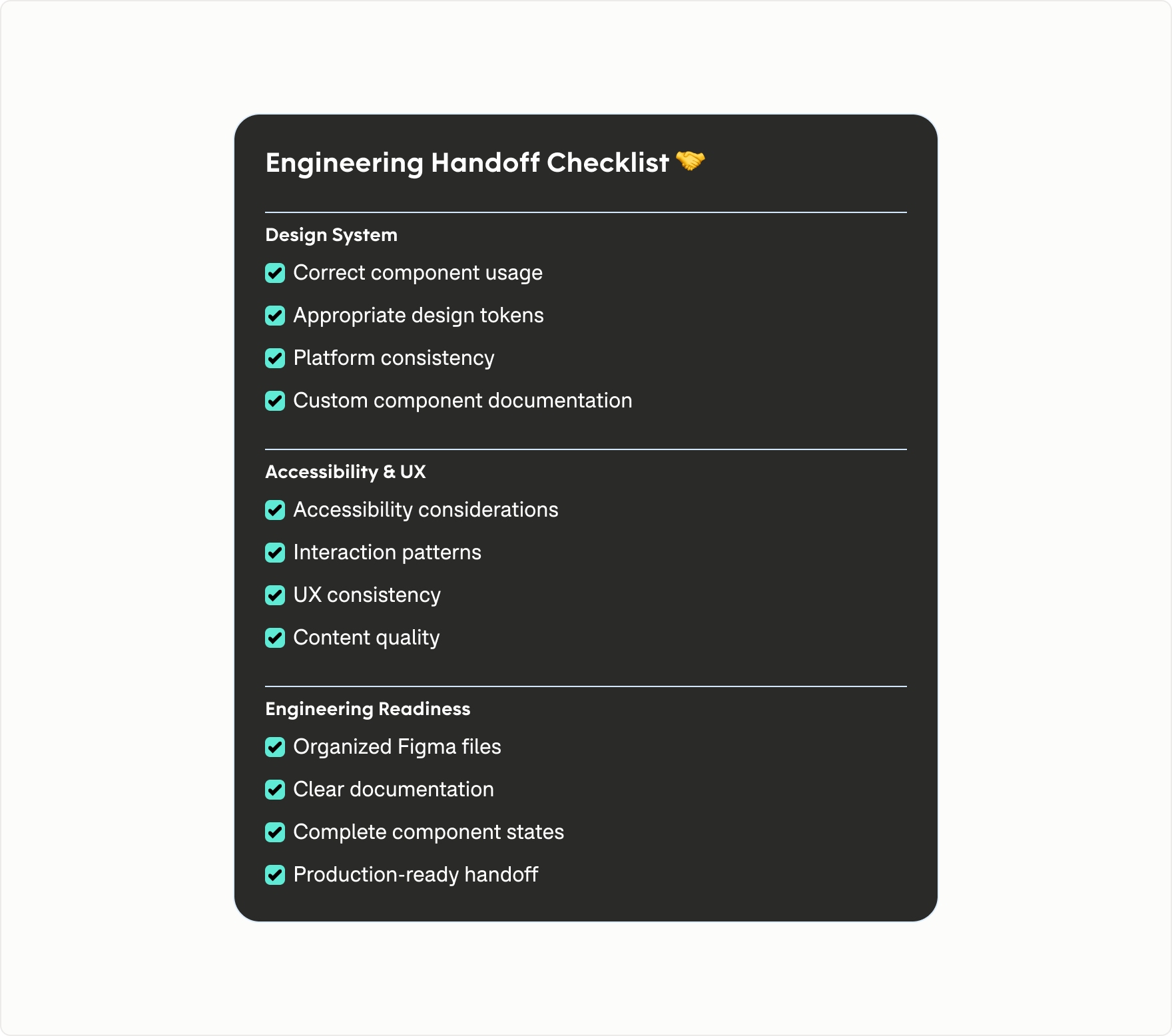
Before experiences moved into development, I ran an Engineering Handoff Review to catch quality and implementation issues earlier.
I reviewed designs for:
- - Correct use of design system components
- - Opportunities to simplify or reuse existing patterns
- - Accessibility and inclusive design
- - Platform consistency and interaction quality
- - Engineering readiness and implementation details
Rather than acting as an approval gate, the review helped teams resolve issues earlier and maintain a consistent quality bar before development.
Governance wasn't about enforcing rules—it was about enabling teams to build better products together.
Through documentation, support, and continuous feedback, the system became easier to adopt, easier to evolve, and better equipped to grow with the organization.
outcomes and impact
Lasting impact beyond the rebrand
What began as a visual rebrand became a broader modernization of how GoodRx designed, built, and evolved shared product experiences. The work decoupled visual change from individual implementation, established clearer interaction and product standards, improved accessibility and design-to-code alignment, and created stronger mechanisms for teams to adopt and evolve the system over time.

built for what's next
Established a scalable system architecture through semantic tokens, predictable component patterns, and richer documentation, creating a foundation for continued product evolution and emerging AI-assisted workflows.

improved consistency
Expanded reusable coverage across core product experiences, with 25+ new or evolved components adopted across product surfaces in 2025.
Shared foundations and interaction patterns helped reduce fragmentation and support broader redesign efforts that contributed to a 35% increase in visitors.

accessibility at scale
Strengthened accessibility through system-wide color contrast and WCAG audits, improved interaction affordances, and more accessible component standards.
These improvements made inclusive patterns easier for product teams to adopt by default rather than solve independently.

stronger engineering alignment
Improved design-to-code parity through shared standards, tokenized foundations, and closer collaboration with engineering.
39 components were rebuilt to Tailwind standards, creating more predictable implementation patterns and stronger alignment between Figma and production.
company
GoodRx
categories
Design Systems
Design Tokens
Component Design
Theming
Accessibility
Documentation
Platform Design
Design Operations
Cross-functional Leadership
Product Design