I lead the creation of a comprehensive Design System to support the product, Basis. This new Design System became a collection of visual and experience guidelines as well as technical standards for application development. Flexible and scalable, the system is comprised of reusable artifacts that create a common visual language and consistent experience throughout Basis. The collection of elements and components became much more than a style guide or a component library — it's a set of best practices that will help product owners, developers, and designers create new solutions for its users.
1. Make the product more consistent and accessibility compliant
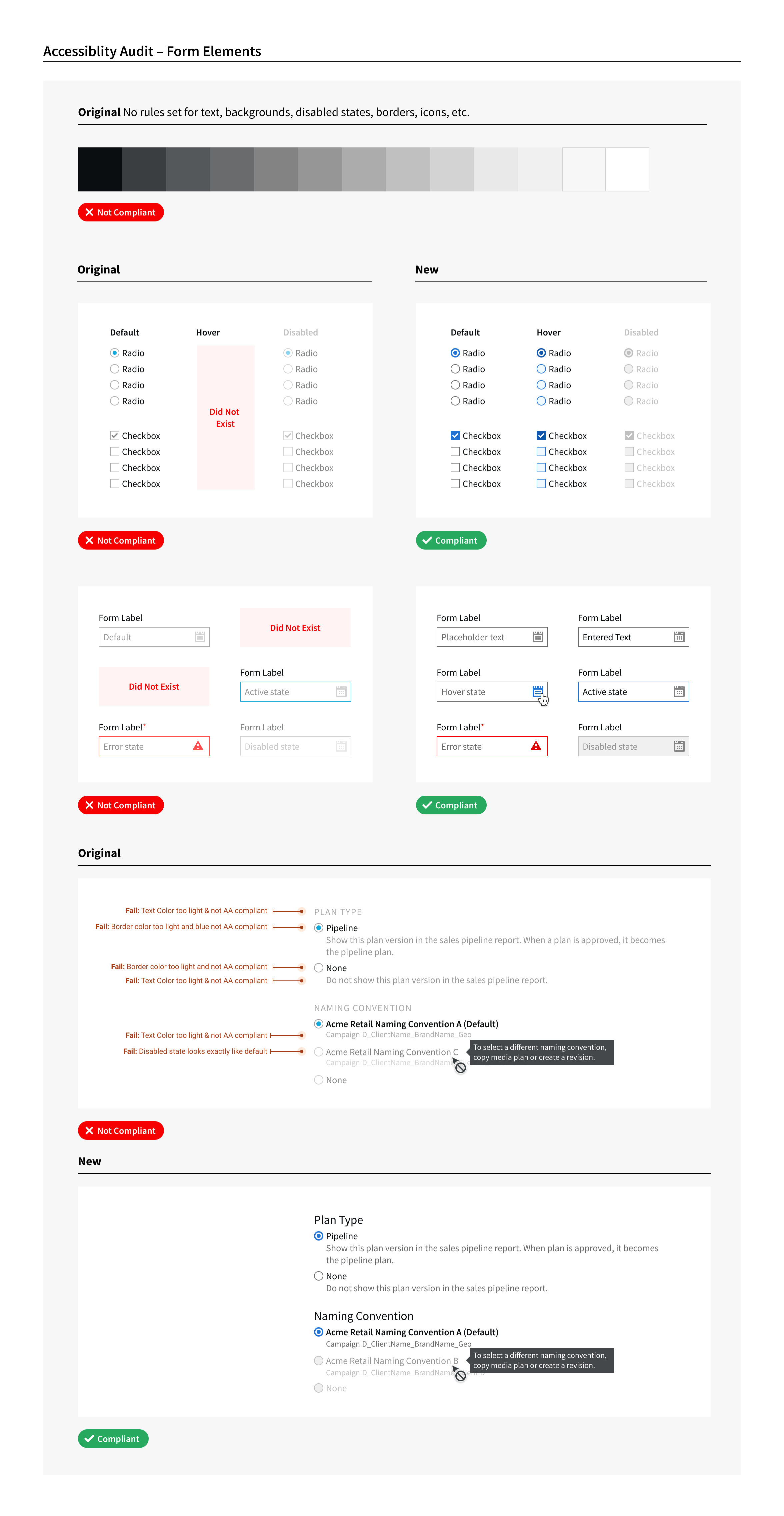
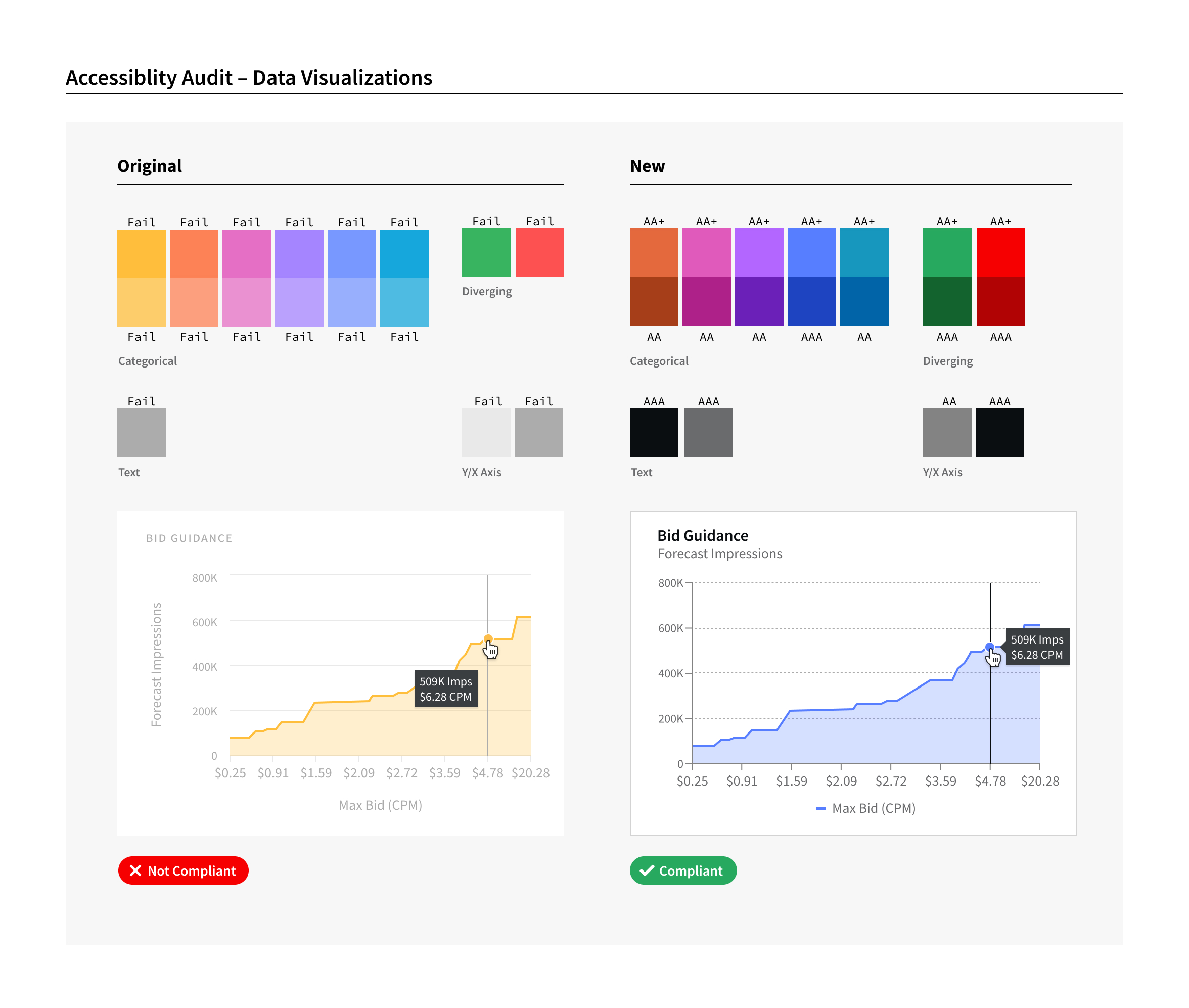
Audit existing components from both a code and design perspective for inconsistencies, redundancies, and accessibility considerations.
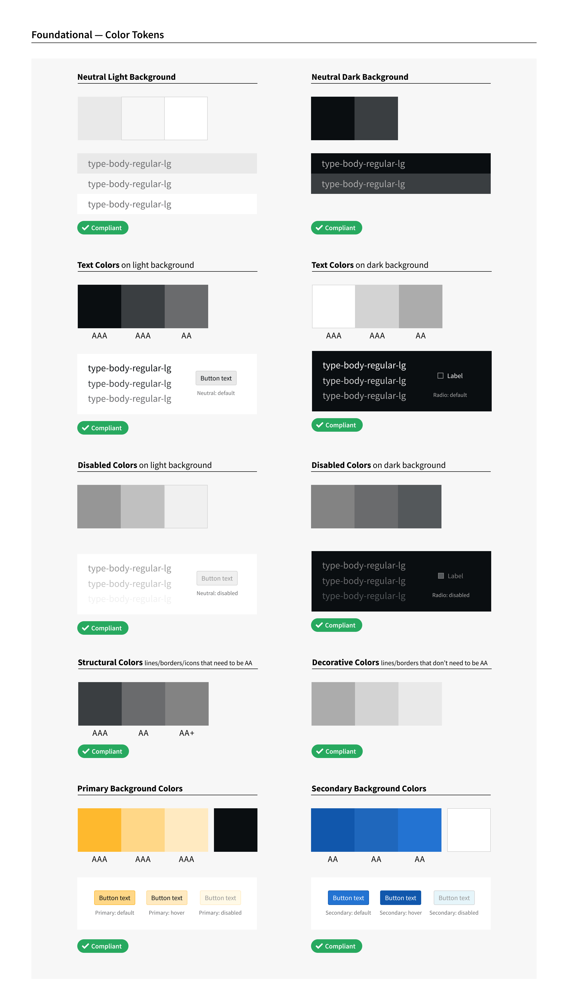
Establish foundational design tokens and guidelines (ex. color, spacing, typography, elevation, icon library, etc.) in addition to naming conventions for designers and developers.
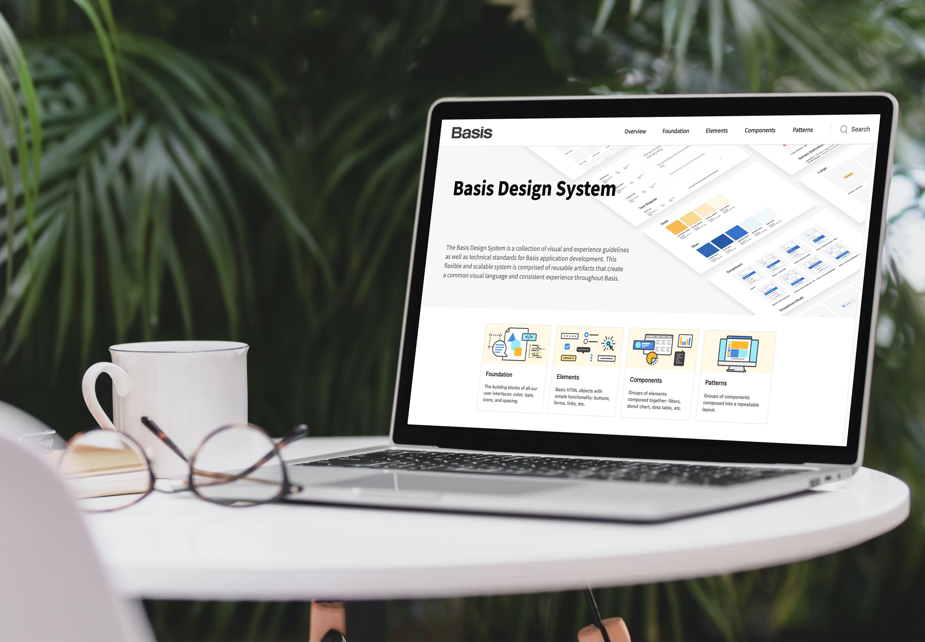
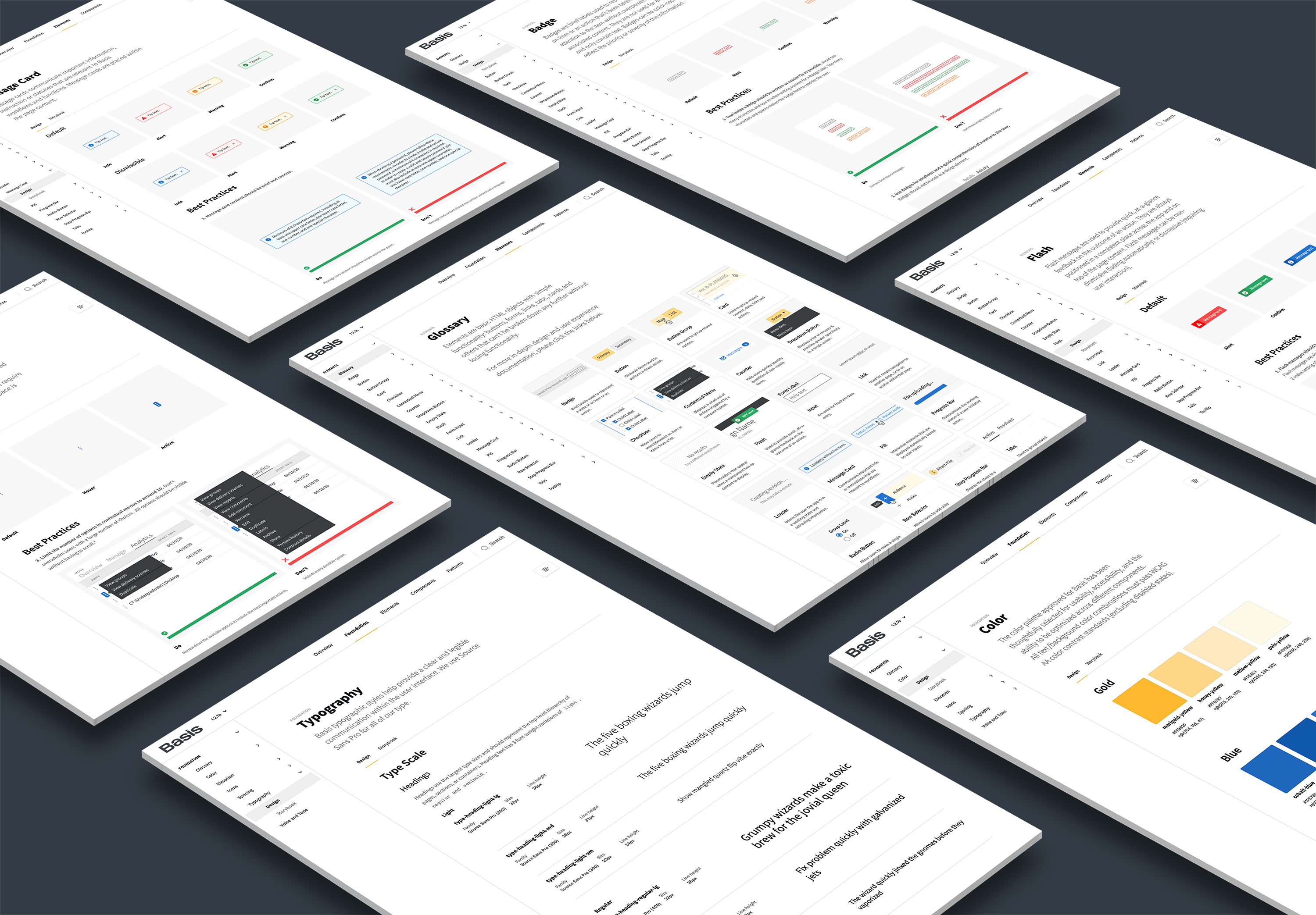
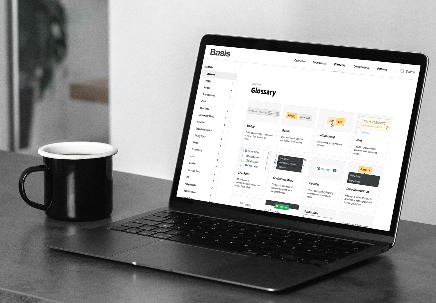
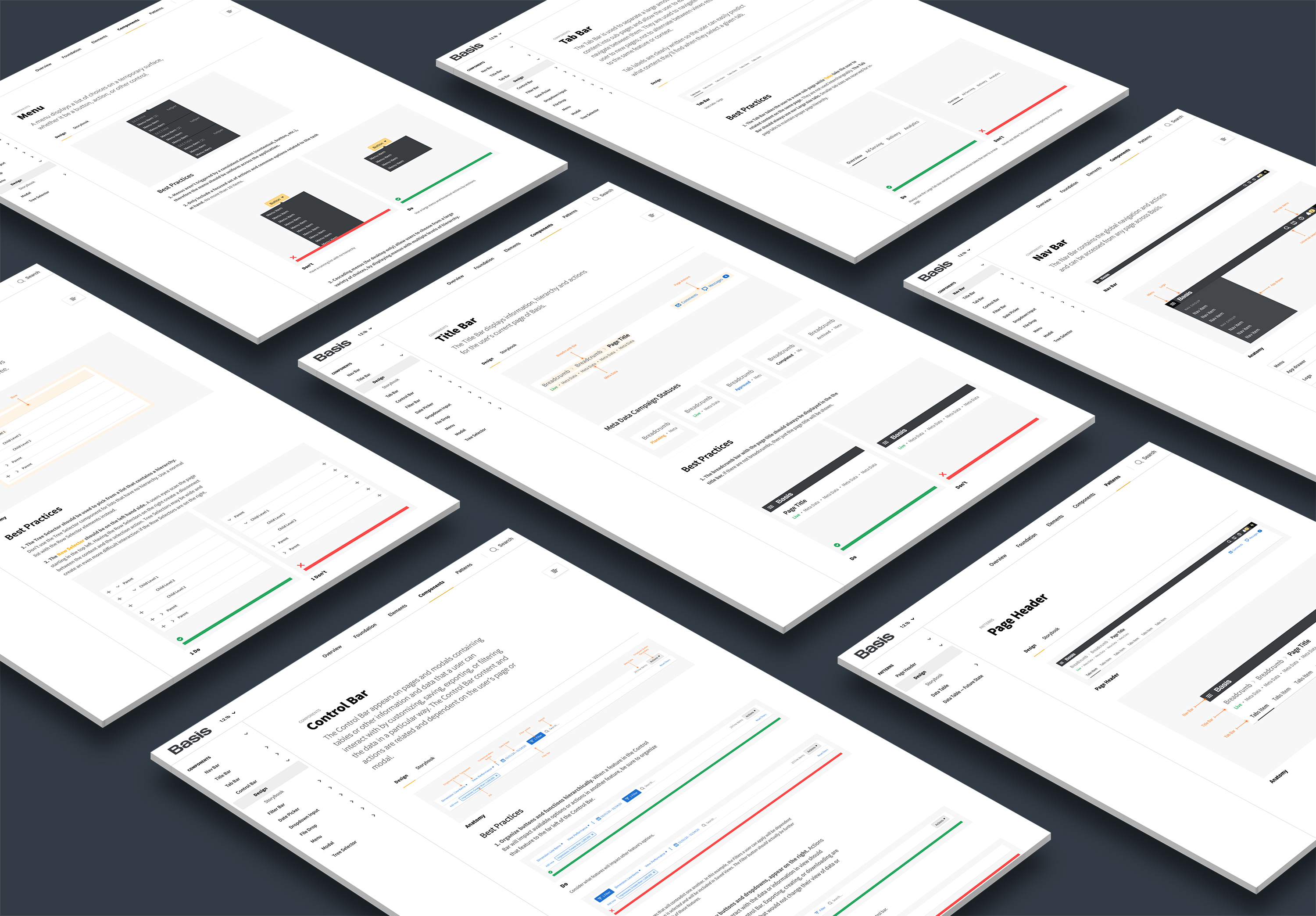
Build a documentation site that explains component variants and UX best practices that all team members can reference.
Build an extensive Figma library file of the Design System components.
Build components in a systematic way with flexible variants that can easily be updated in the future.
Educate the tech organization (developers, product owners, and design) on what a design system is and how to use new tokens and components.
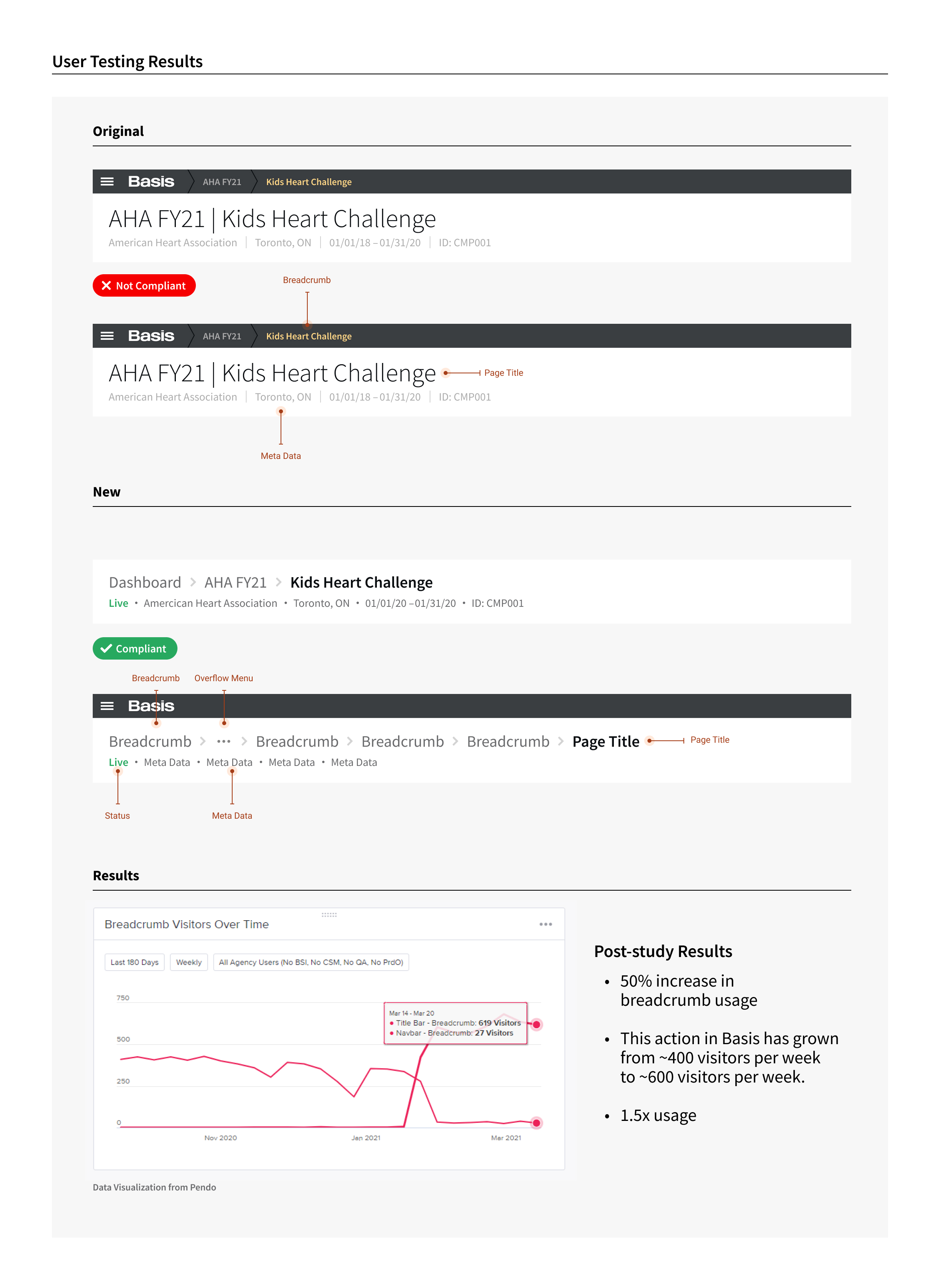
Validate Design System components by studying analytics and conducting user testing.
Continue updating existing components and create new ones based on upcoming Feature Team needs.
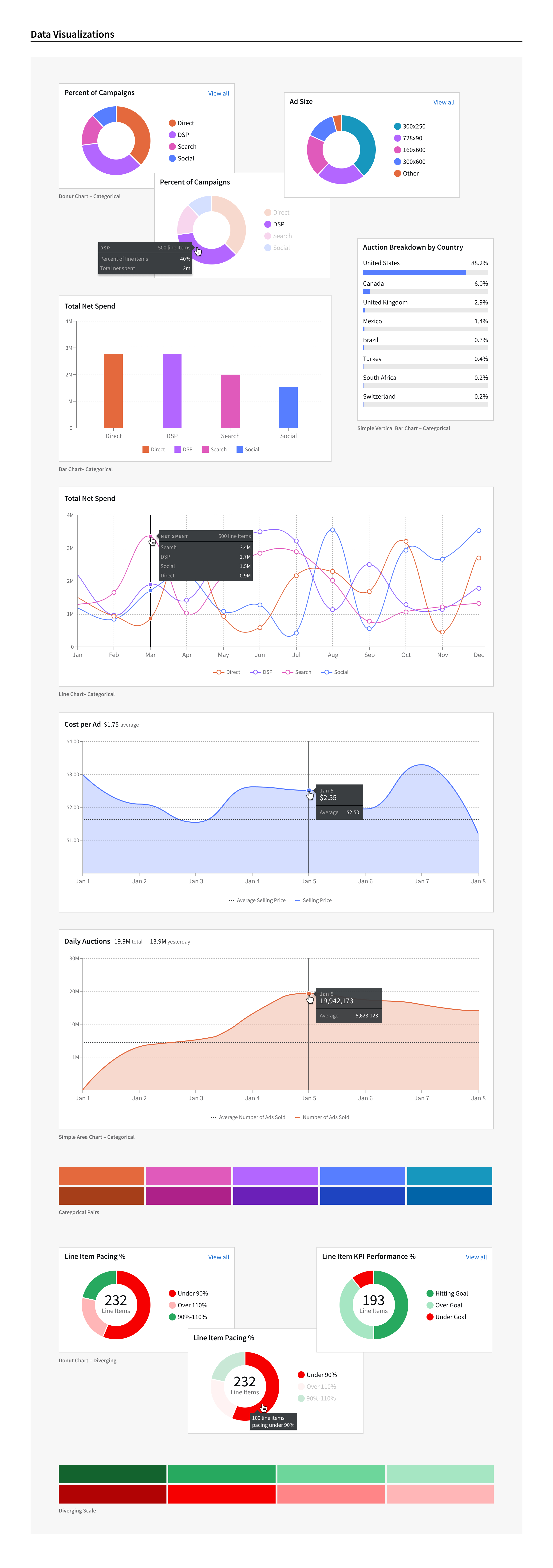
As the Lead Designer of this design system, it was my responsibility to oversee execution of the project, ensure design standards were met, participate in user testing, manage the work of other designers, and meet with feature team Product owners to determine their upcoming component needs.
the goals of the project were to:
1. Make the product more consistent and accessibility compliant
Audit existing components from both a code and design perspective for inconsistencies, redundancies, and accessibility considerations.
2. Create a common visual design language
Establish foundational design tokens and guidelines (ex. color, spacing, typography, elevation, icon library, etc.) in addition to naming conventions for designers and developers.
3. Have a single source of truth
Build a documentation site that explains component variants and UX best practices that all team members can reference.
4. Decrease design time
Build an extensive Figma library file of the Design System components.
5. Decrease development time
Build components in a systematic way with flexible variants that can easily be updated in the future.
6. Ensure the Design System is adopted
Educate the tech organization (developers, product owners, and design) on what a design system is and how to use new tokens and components.
7. Evaluate components through testing
Validate Design System components by studying analytics and conducting user testing.
8. Continuously iterate
Continue updating existing components and create new ones based on upcoming Feature Team needs.
Examples from the Accessibility Audit


Examples of Foundational Tokens

Examples from the Design System Documentation Site


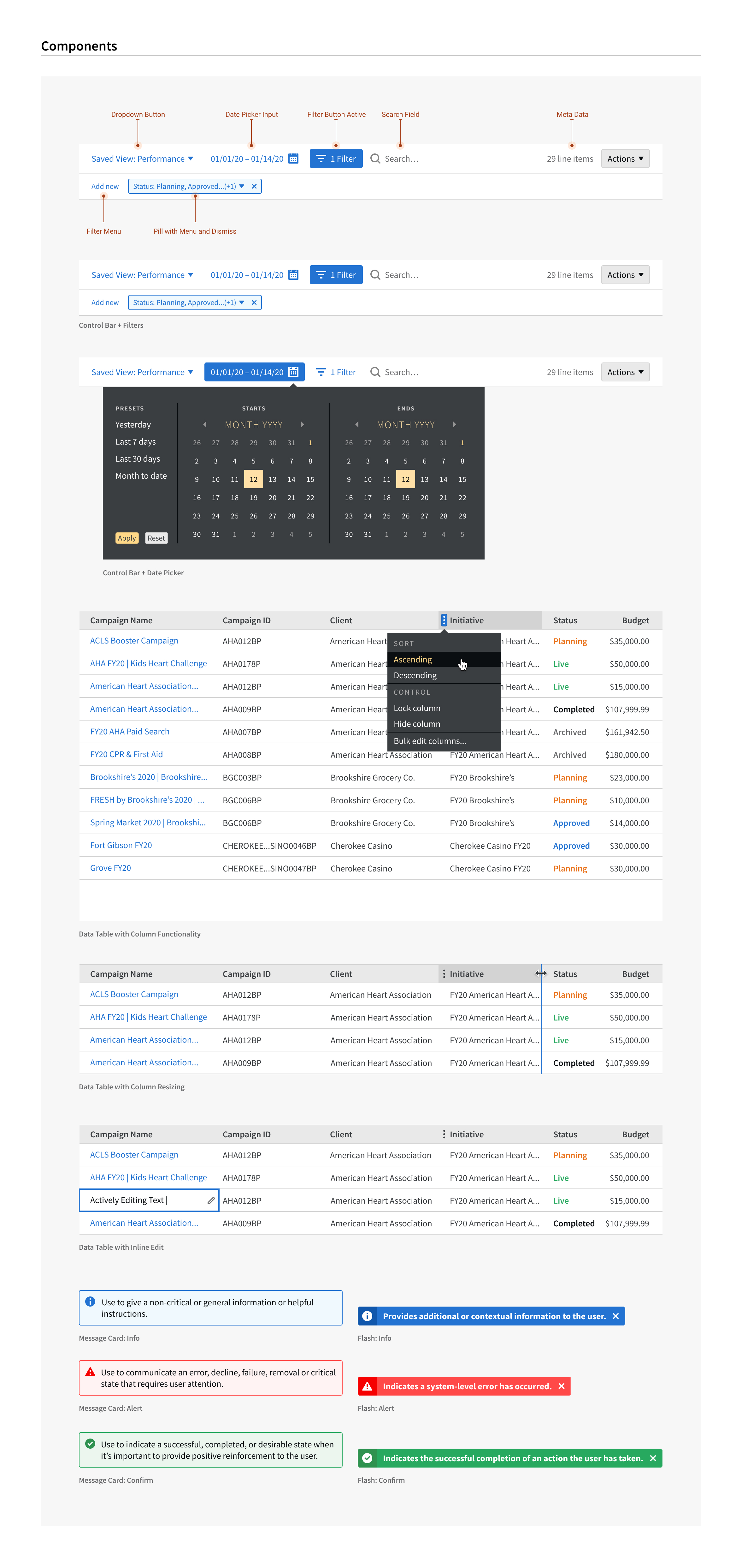
Examples of Components


Example from User Testing Validation

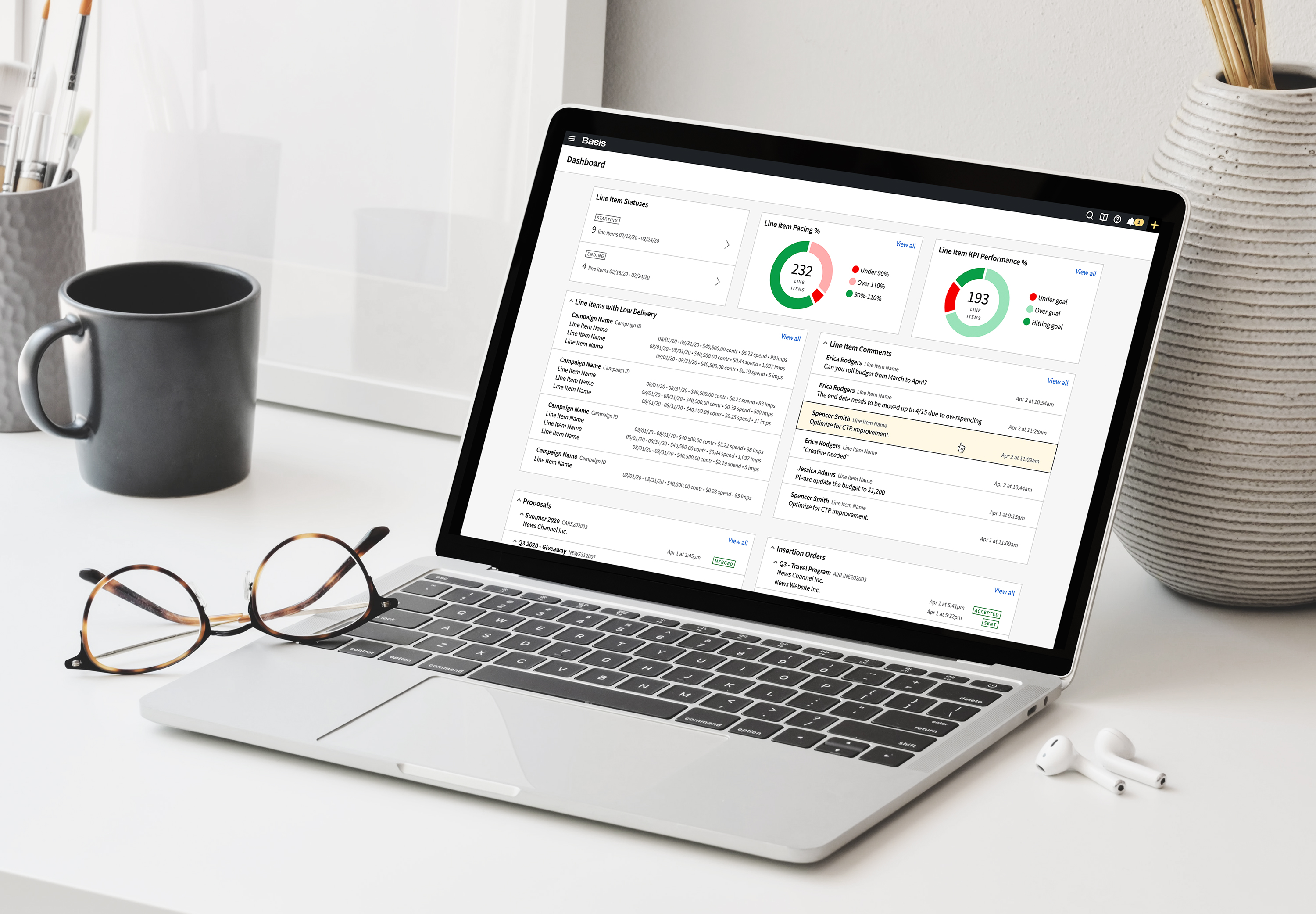
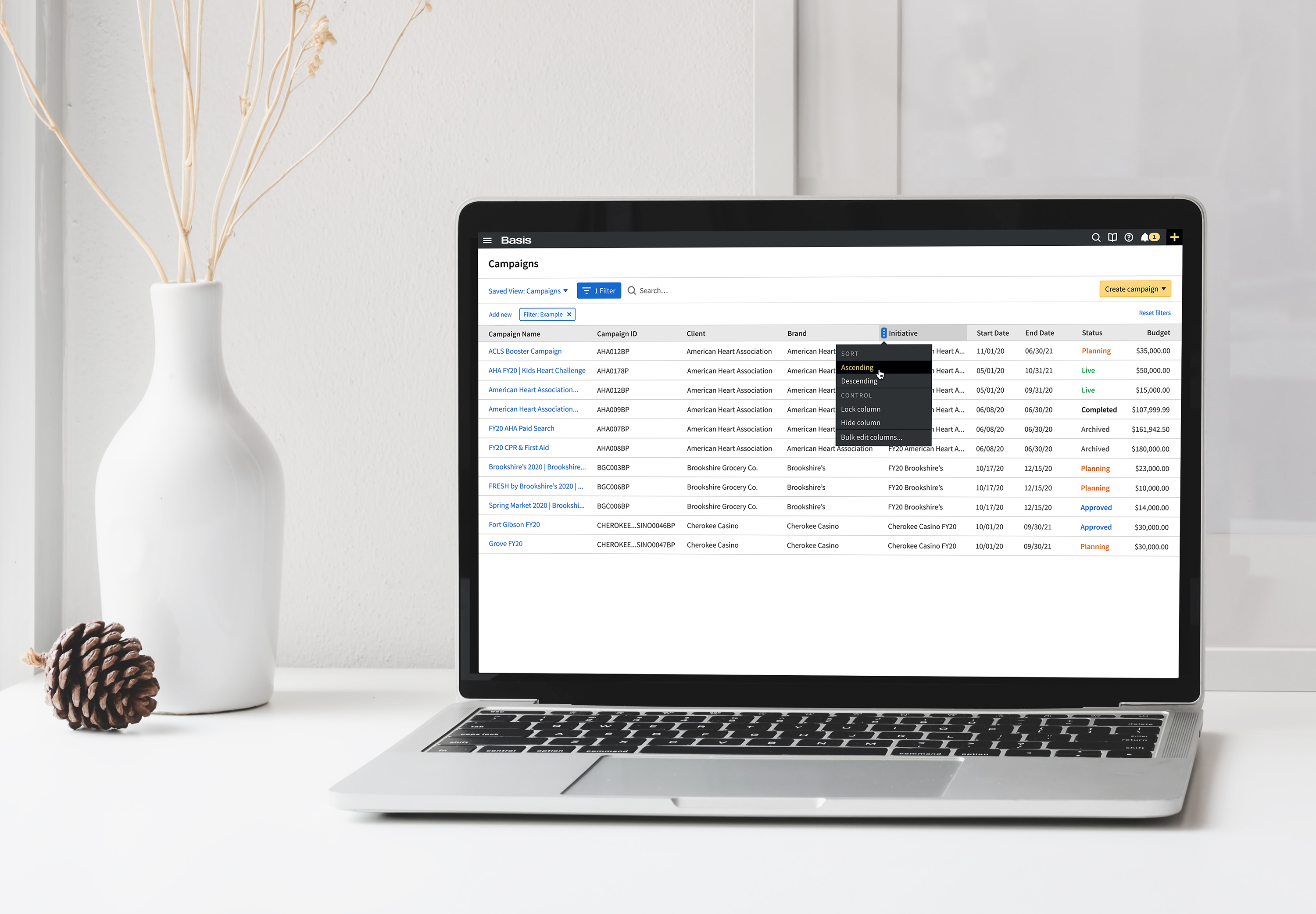
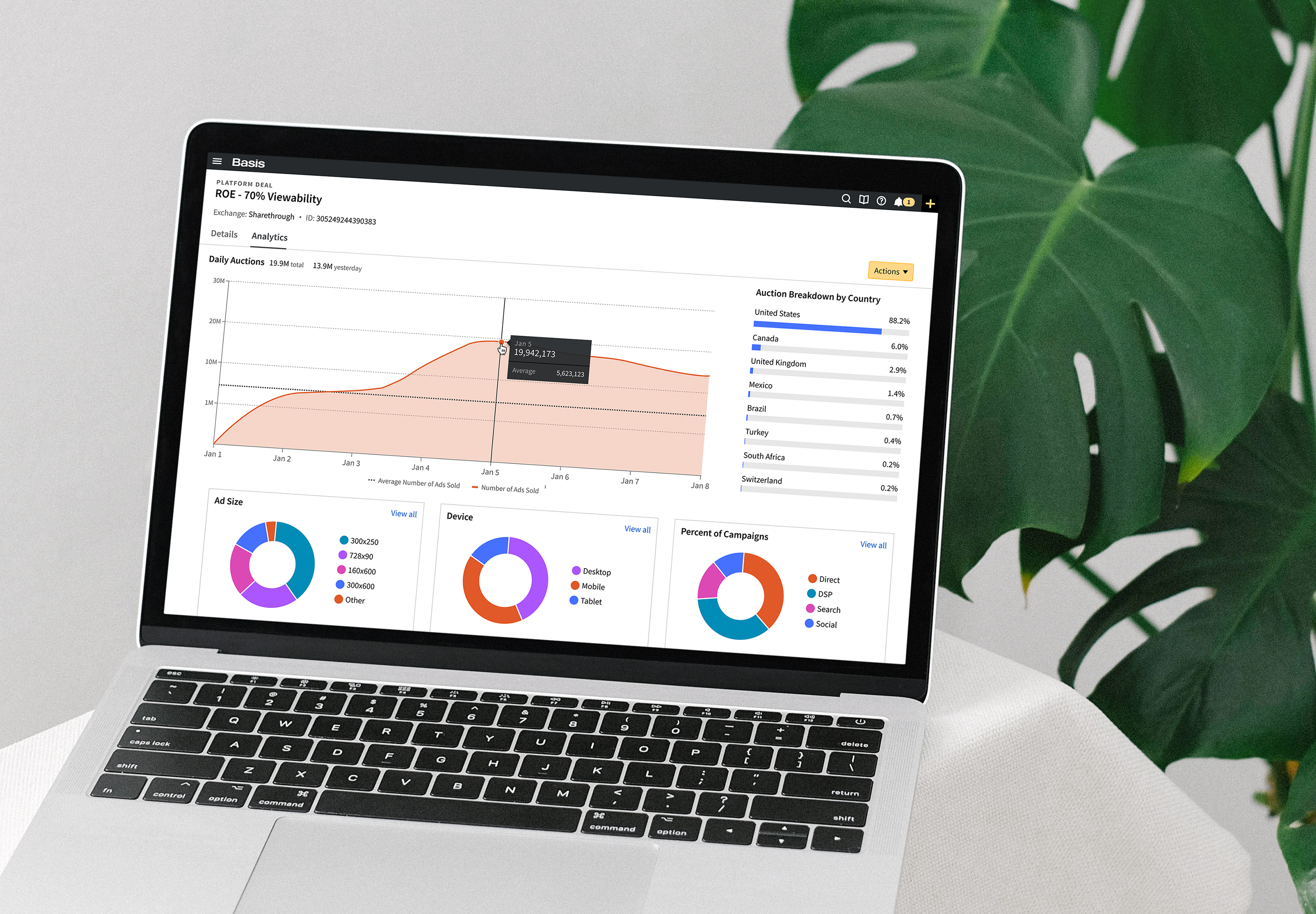
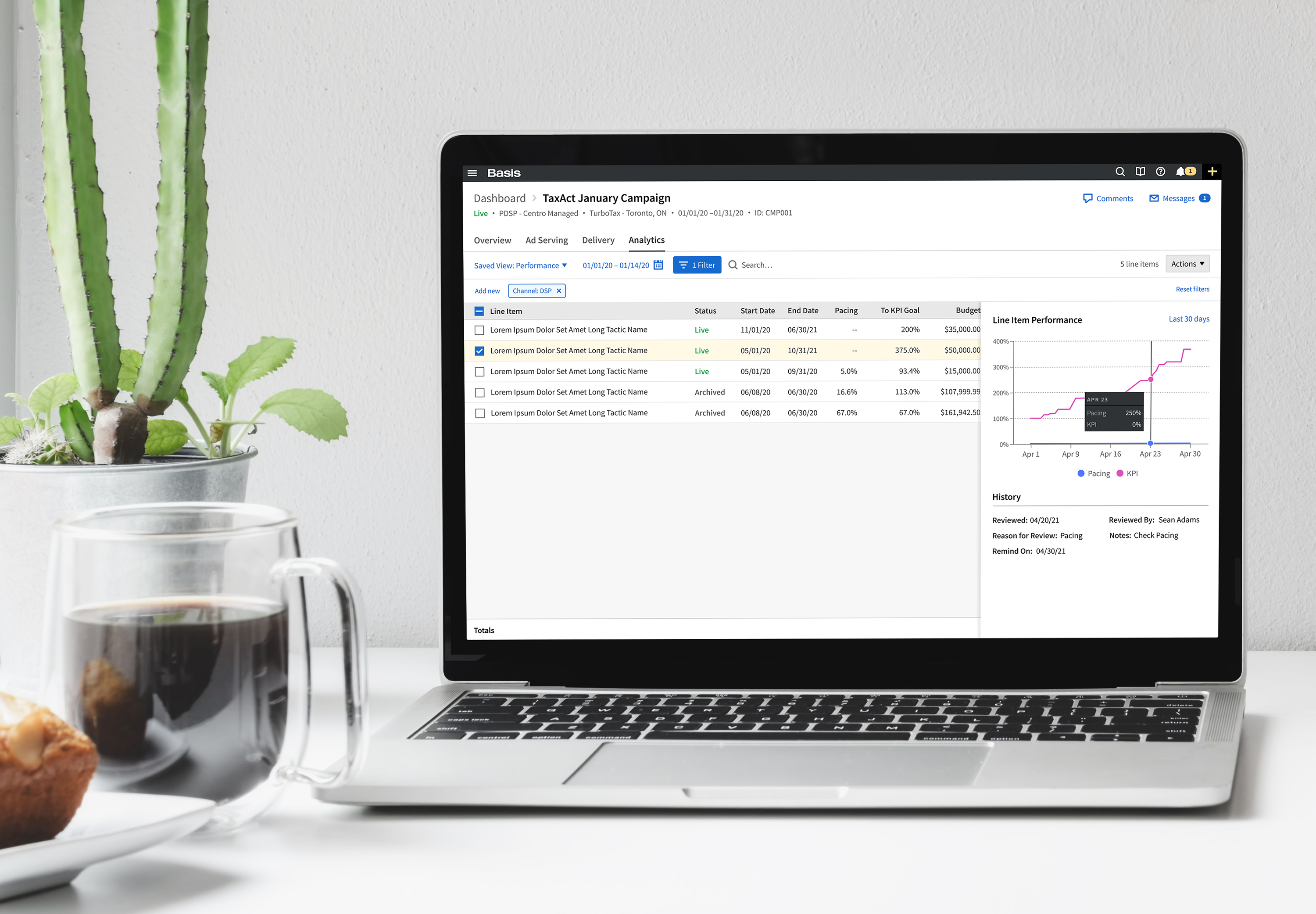
Examples from Basis


company
Basis Technologies
categories
Component Design
Data Visualizations
Design Ops
Design System
Documentation
Product Design
Project Management
Prototypes
UX/UI
QA
User Testing
Research Studies
All work is owned by respective clients and protected under copyright law