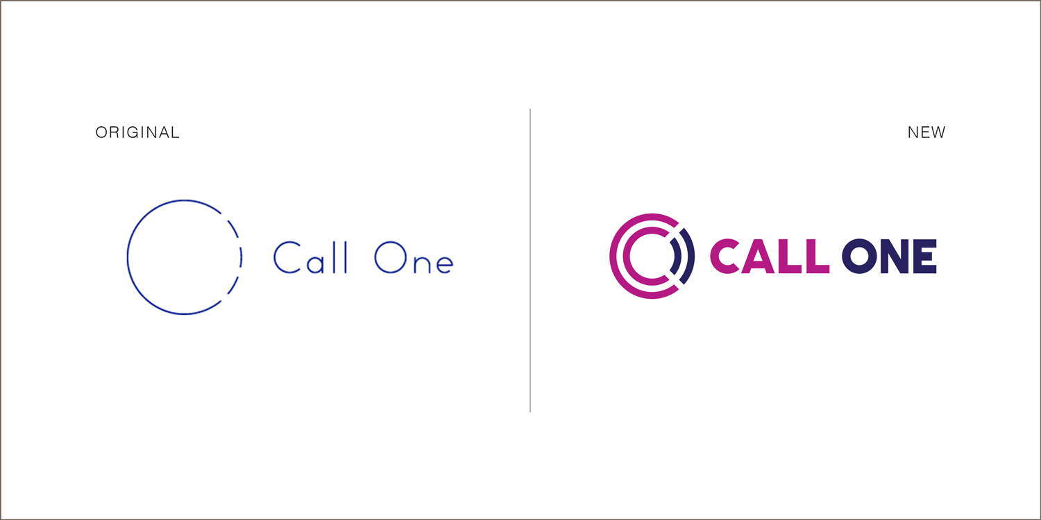
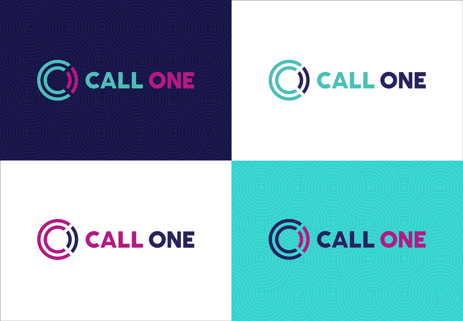
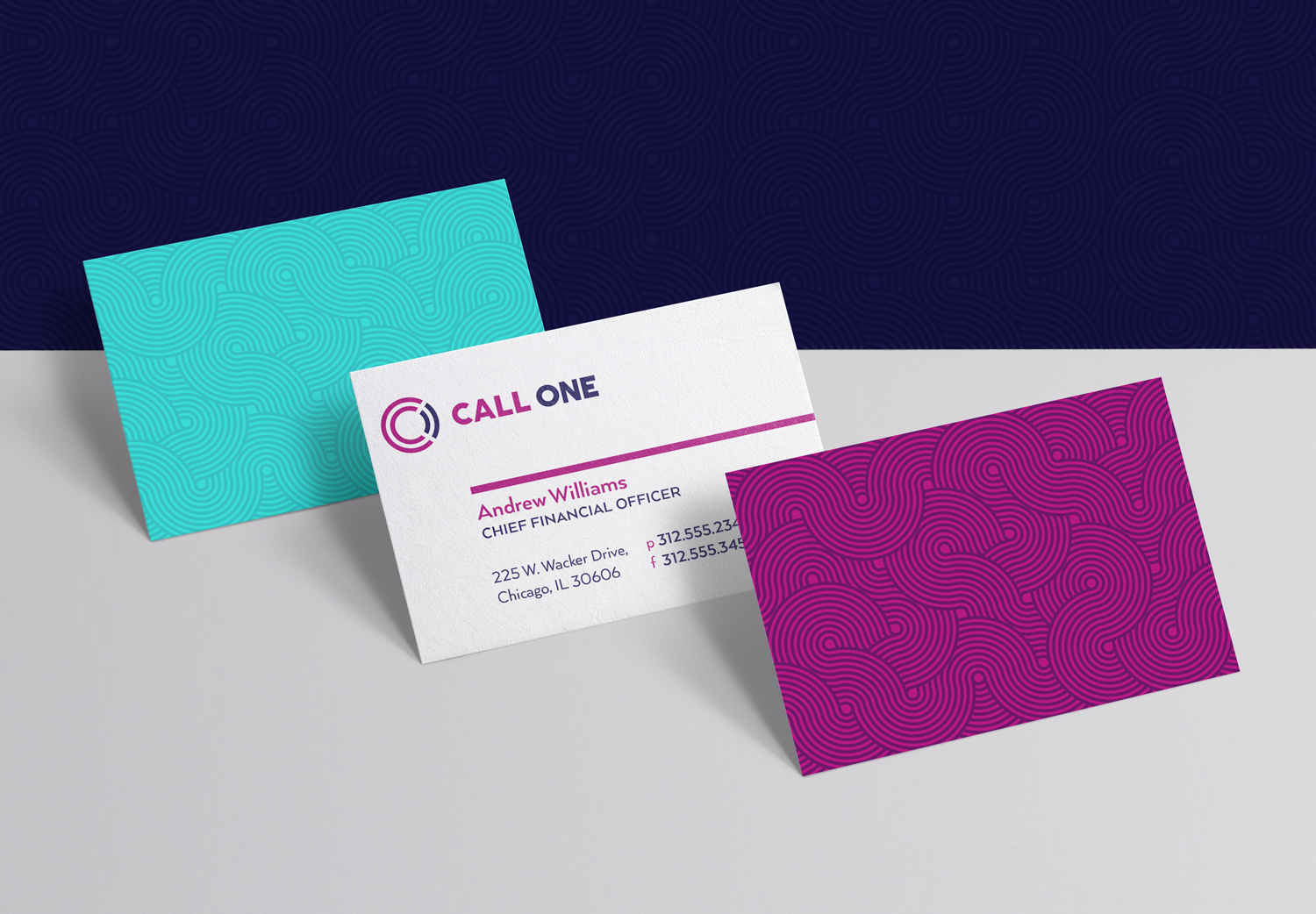
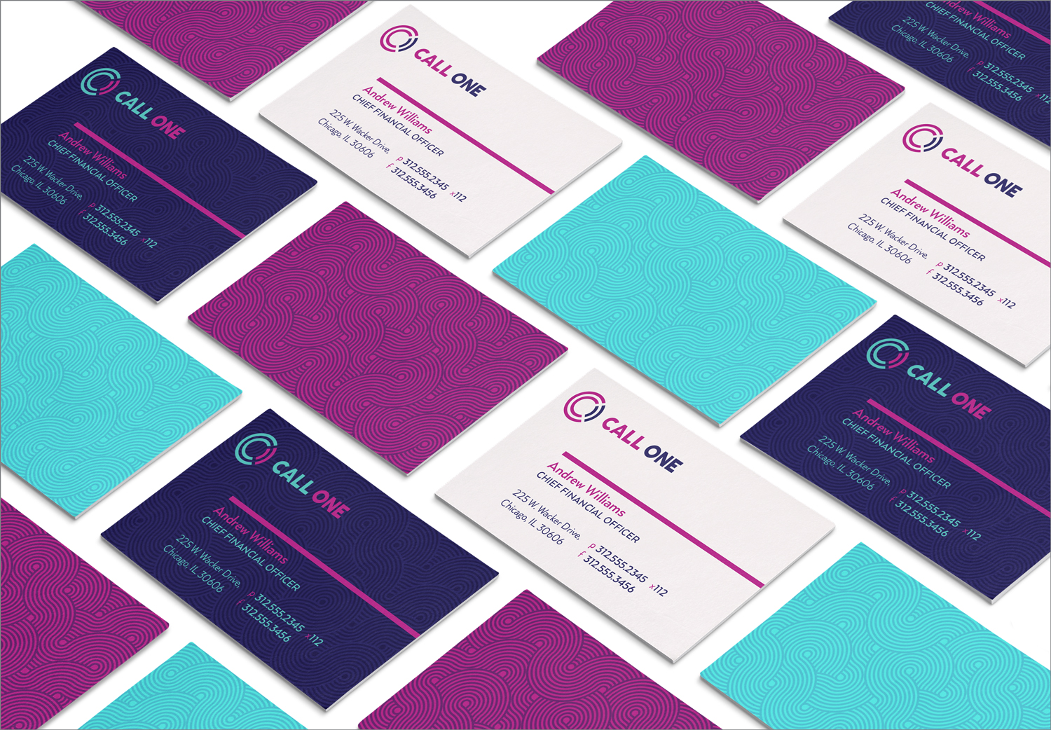
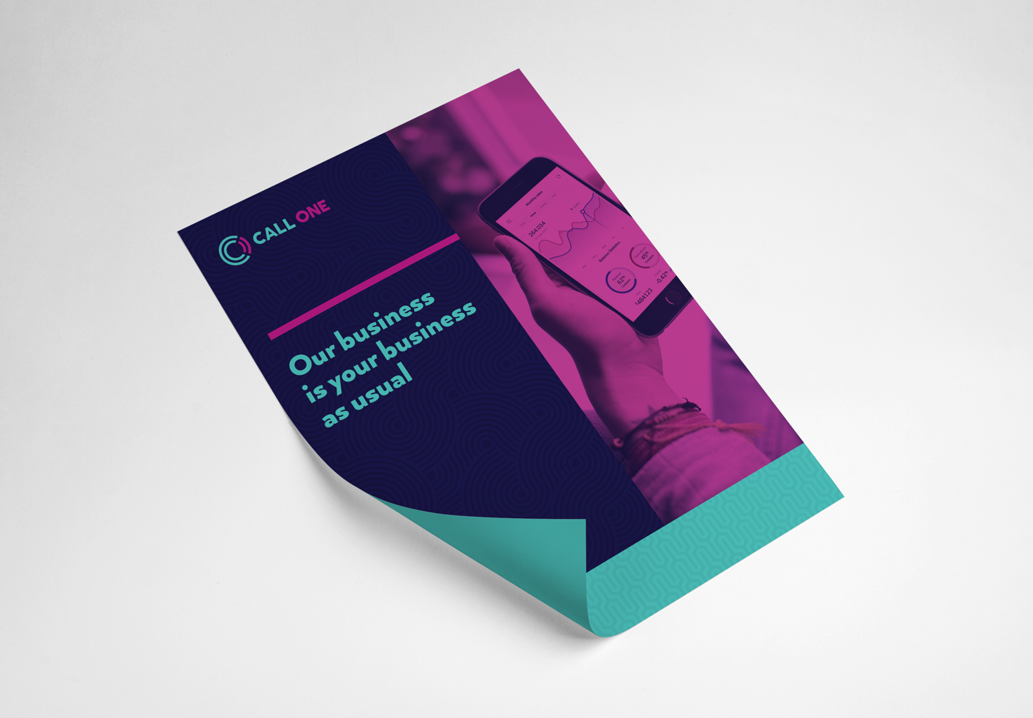
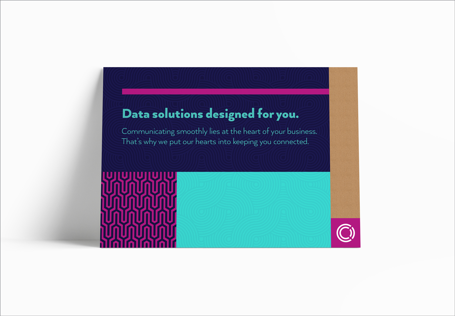
Call One, a Chicago-based business technology company, provides small- to midmarket businesses with a full range of technology products and services, including data, phone, cloud, managed services and consulting, to help companies more effectively manage their IT infrastructure. While their new mark is based on the same concept as their original logo (combining the C and O), the new execution is more refined, modern, geometric and legible. This redesign of their brand utilizes geometric flowing patterns to imply connectivity and a bold use of color in their brand expression to make an impact in the marketplace.

client
Call One
agency
Simple Truth
audience
B2B
categories
Art Direction
Branding
Collateral
Design
All work is owned by respective clients and protected under copyright law